A front porch sets the tone for your home, and 2027 is all about making that first impression count without overthinking it. This collection of 32 sharp front porch decor ideas proves that a welcoming entry can be both stylish and unfussy, whether you lean toward farmhouse charm or coastal calm.
From tiered carts and symmetrical urns to cozy seating with vibrant pillows, each look is designed to work with your actual porch, not a Pinterest fantasy. You will find practical ways to layer seasonal interest, define the entry, and make the space feel lived-in from the moment someone steps up to the door.
Tiered cart display for seasonal charm
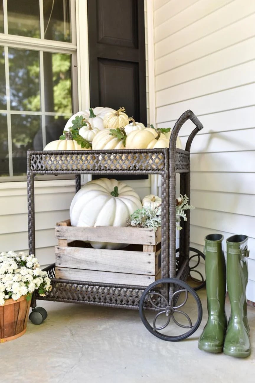
A tiered cart near the porch wall turns a narrow spot into a layered display that looks intentional. Pumpkins crowd the shelves, a wooden crate holds boots and potted flowers, and the whole arrangement feels roomy without spreading across the floor. The wicker, wood and metal mix keeps the farmhouse look from going precious, and the rubber boots add a practical note that says this porch gets used.
Farmhouse entry with wicker baskets and corn stalks
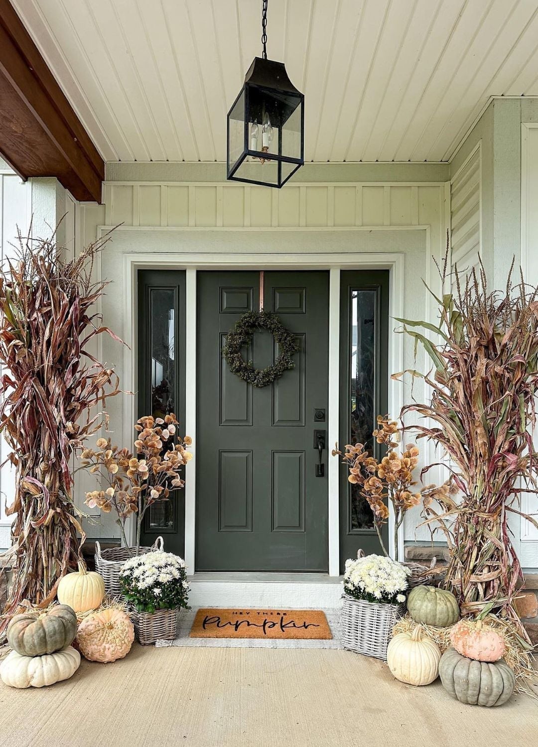
This porch gets the palette right. A dark green door anchors the cream, beige and brown accents, and the white wreath keeps things from turning muddy. Corn stalks flank the door, wicker baskets sit at the base, and pumpkins repeat the warm tones. The hanging lantern adds a daytime glow that softens the dark green. Symmetry around the door creates a calm entry that does not need constant rearranging.
Ladder display for burlap banners and mums
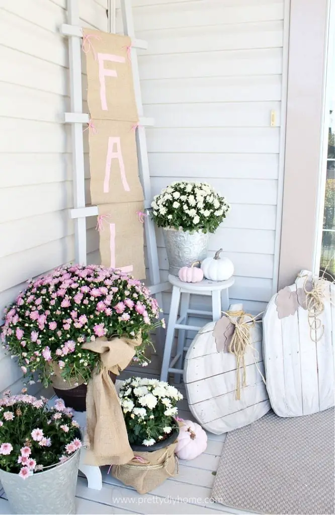
A ladder leaning against the wall uses vertical space on a compact porch. This one holds a burlap banner with pink letters, potted mums and a few pumpkins, with a stool at the base to anchor the arrangement. The burlap, wood and twine keep the texture consistent, and the pink in the banner pulls the eye up. The compact layout works because nothing sits on the floor except the ladder and the stool. Everything else hangs or rests on the rungs, which frees up walking space.
Symmetrical urn planters and garden statues
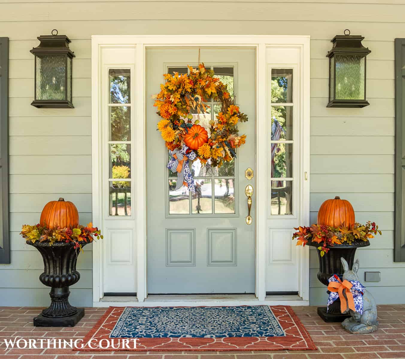
Symmetry does the heavy work here. Urn planters frame the door, a garden statue sits to one side, and lanterns balance the light. The fall wreath on the door repeats the orange and yellow tones from the planters. An outdoor rug ties the brick floor to the palette. The arrangement feels formal but the ceramic urns and fabric wreath keep it from feeling stiff.
Comfortable seating with vibrant floral pillows
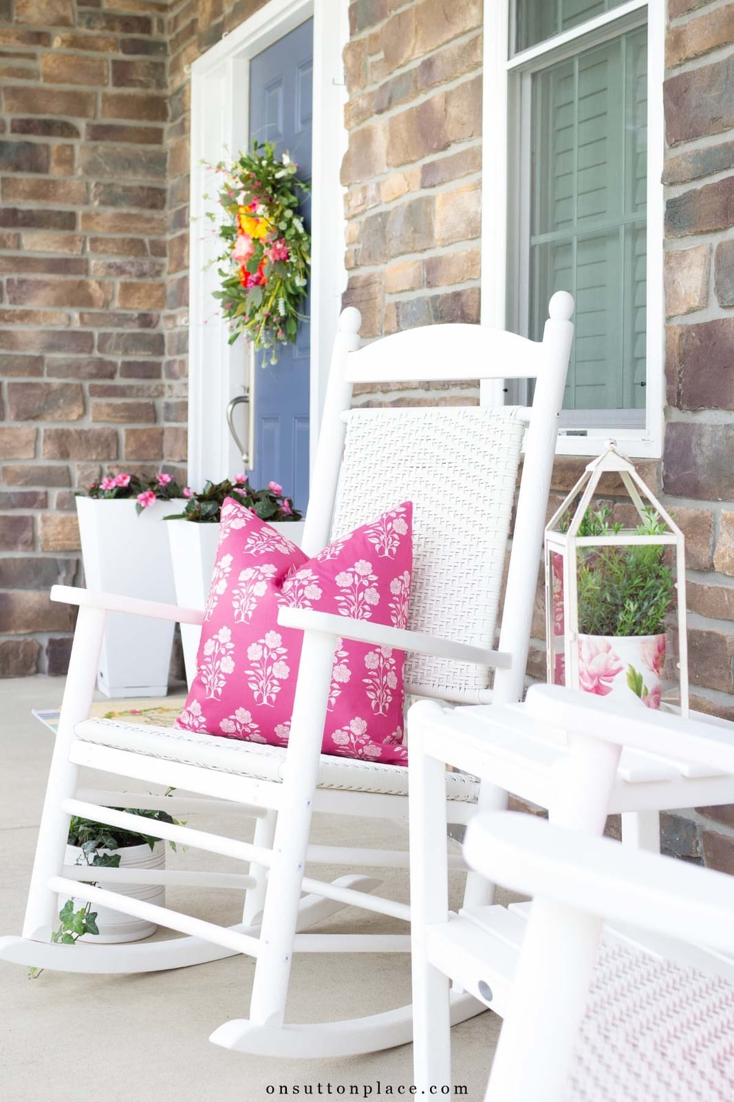
A practical rule for porch seating is to let one piece set the color direction. White rocking chairs stay neutral, then bright pink floral pillows add the bold note. The pink pulls from the flowers in the planters and the wreath on the door. A lantern on a side table and a stone floor keep the look grounded. The pillows make the chairs feel like somewhere you actually want to sit, not just look at.
Abundant pumpkin display on porch steps
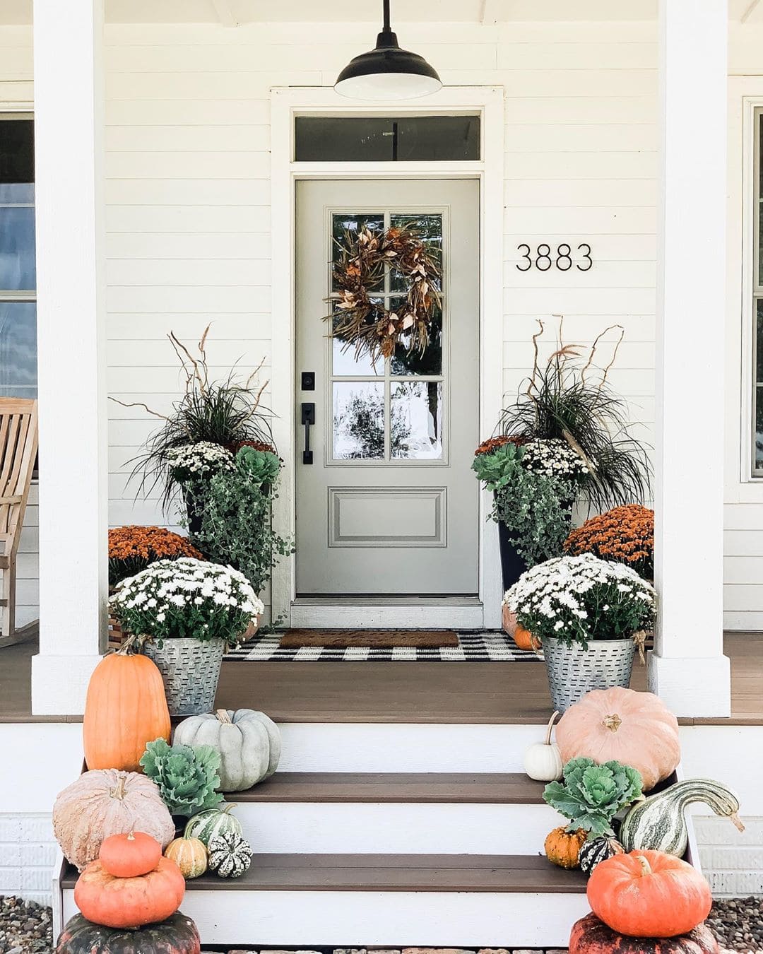
You could line up one pumpkin per step and call it a day, but this porch proves that more is actually more when the layout has a clear path through the middle. The steps are packed with pumpkins in orange, white, and green, plus a few pots of mums tucked between them, so the entrance feels generous rather than crowded. A barn-style overhead light keeps the scene visible after dark, and the wide view lets you see how the abundance stays orderly by sticking to a limited palette. The trick is to start with the largest pumpkins on the bottom step and work up in size, so the display naturally narrows toward the door. Leave the top step mostly clear so you can actually open the door without knocking anything over.
Autumnal leaf wreath and wheat stalk arrangements
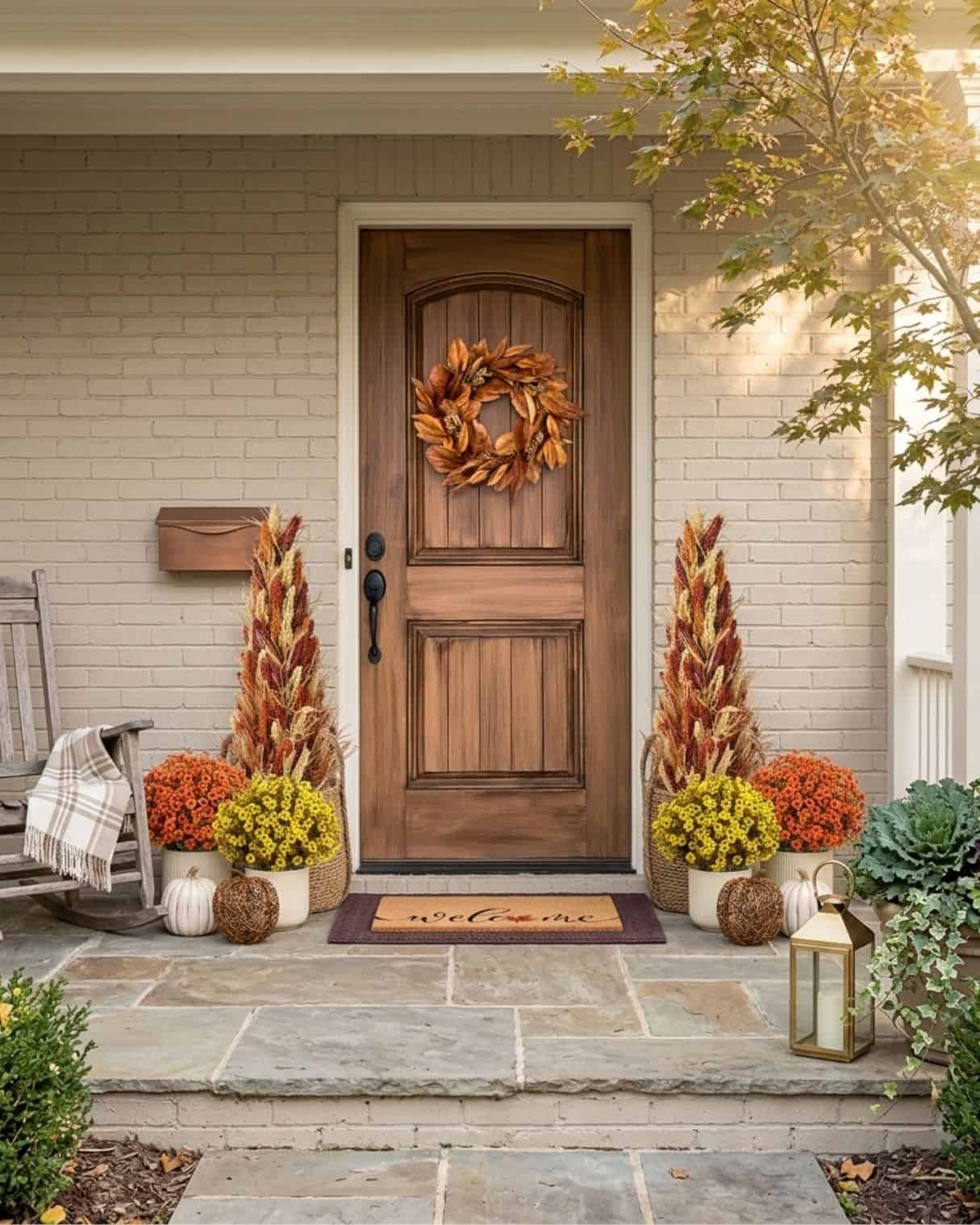
The ornate leaf wreath on the wooden door is the main event here, but the real trick is how the wheat stalks and potted mums mirror each other on either side of the entry. That symmetry makes the porch feel finished without needing a single permanent change, which matters if you rent. A rocking chair and a pair of lanterns fill the corners without blocking the door swing. The palette of brown, orange, yellow, and beige keeps everything seasonal without screaming fall from every angle.
Large corn husk wreath and porch swing
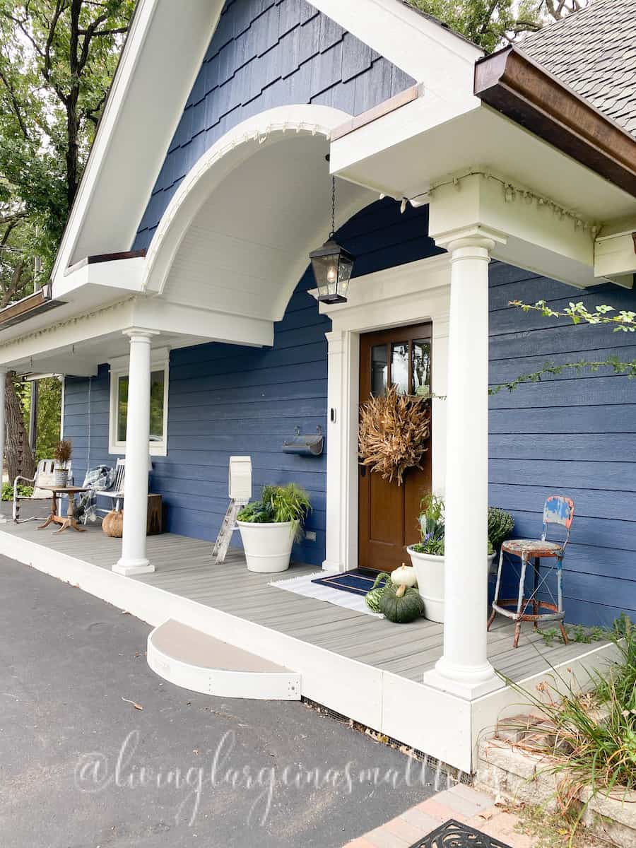
A corn husk wreath that big demands a porch that can handle its scale, and this one delivers with a wrap-around layout and a generous swing. The blue door and white trim give the natural brown wreath something to pop against, while string lights and a hanging lantern soften the whole scene after sunset. A small stool and a pair of planters keep the ground level from feeling empty next to the swing. The lesson is that a single oversized piece works best when everything else stays simple and low to the ground.
Stacked pumpkins and welcome mats for entryway
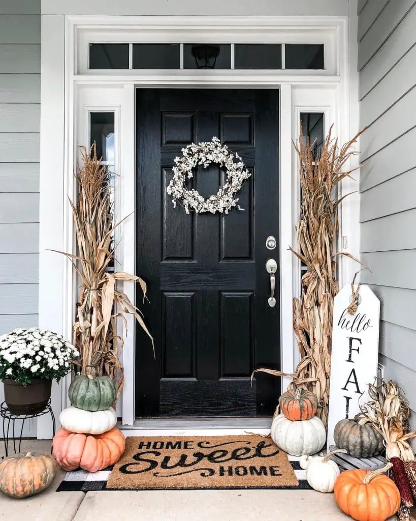
Stack pumpkins vertically instead of spreading them out to make a compact porch feel full without looking messy. In this entry, a few pumpkins are stacked on top of each other beside the door, with corn stalks leaning against the wall to draw the eye up. A black front door and a white wreath provide contrast, while a natural fiber welcome mat grounds the whole setup. The symmetrical arrangement around the door keeps the narrow space balanced, and the stacked method means you get a big visual impact without taking up precious walking room. It works especially well on porches where every square inch counts.
Yellow wreaths with bunny figures and egg garlands
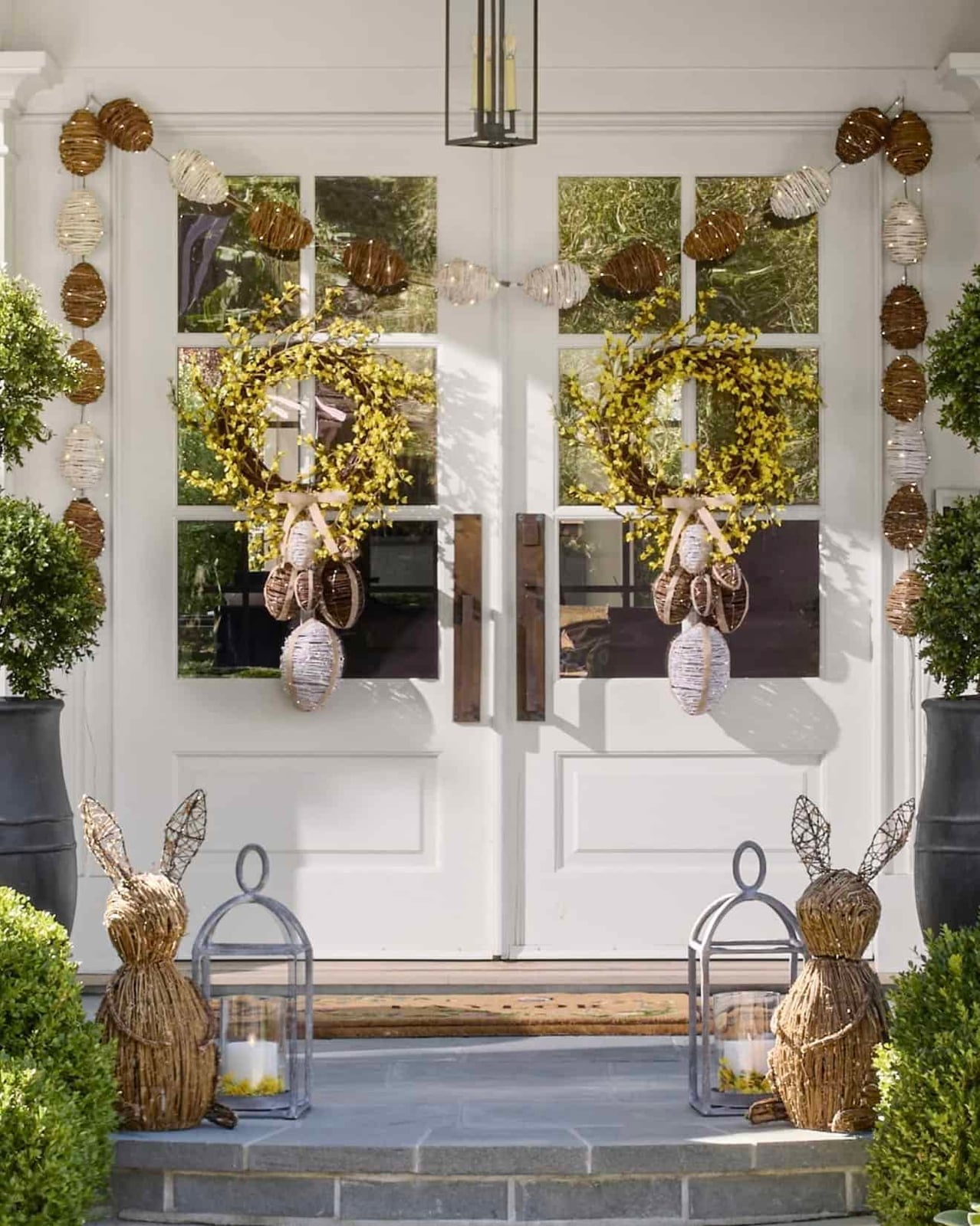
Two large yellow floral wreaths flank the door, each one tied with a bow and matched by a pair of bunny figures sitting on the steps below. An egg garland drapes across the door frame, tying the wreaths together without competing with them. The white wicker and rattan pieces on the porch keep the background neutral so the yellow looks cheerful rather than overwhelming. A lantern with a candle on the step adds a warm glow that echoes the wreath color after dark.
Pumpkins and corn stalks glow with string lights
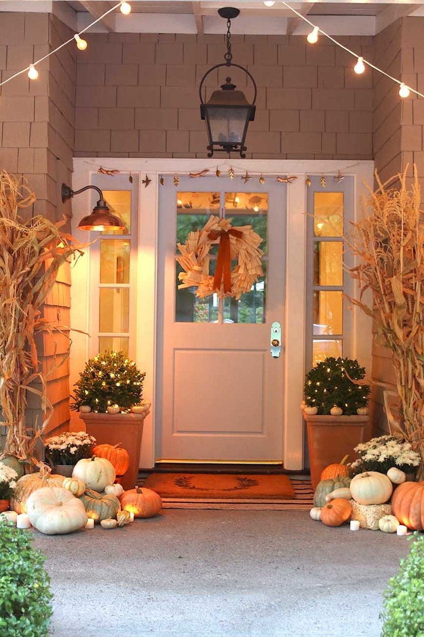
When you cluster pumpkins and corn stalks near the entry, a symmetrical porch layout helps the eye travel straight to the door. A pair of planters flank the steps, a wreath hangs centered above, and string lights arc across the opening to pull the whole scene together. Lanterns and sconces add warm pools of light that prevent the display from feeling flat after dark. The result feels abundant without any single piece competing for attention.
Collection of varied pumpkins on brick floor
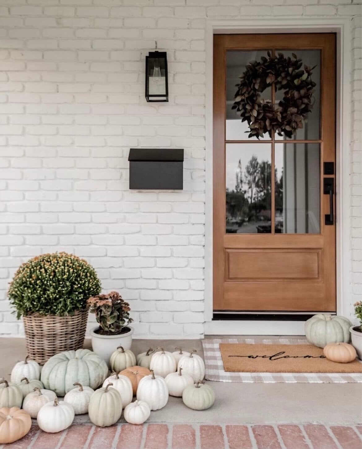
A collection of mixed pumpkins scattered across brick uses a restrained palette. White and green gourds keep the look from tipping into the heavy orange that dominates many autumn porches. The beige of the wicker wreath and the warm brown of the metal lantern act as neutral bridges.
The brick floor itself provides a grounded feel with its red-brown tones without demanding matching accents. A black mailbox and a dark doormat anchor the far edges of the porch, so the pumpkins stay the clear focus.
White bench with navy floral pillows
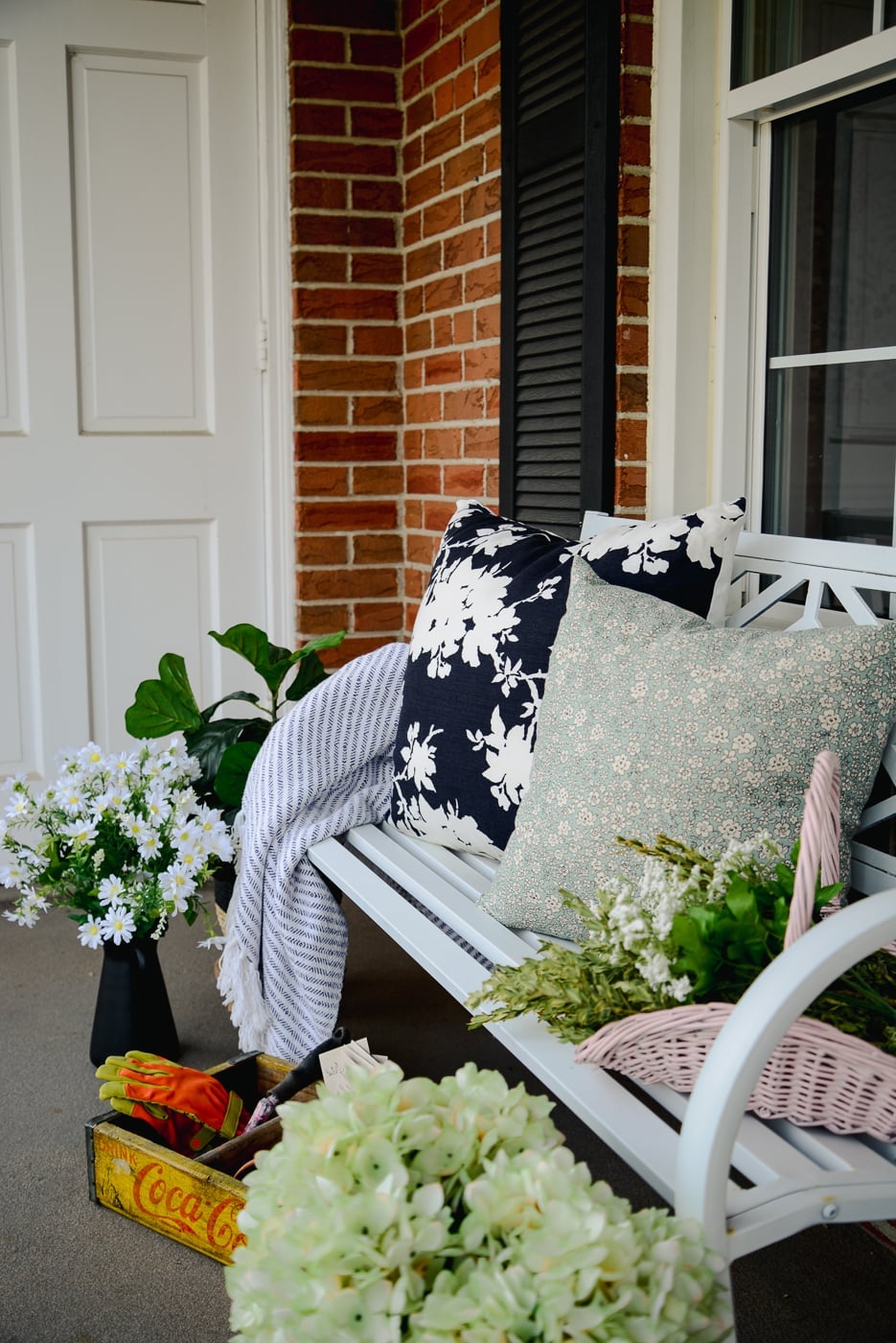
A white bench set against brick is a straightforward choice, but the navy floral pillows shift it from basic to deliberate. The deep blue looks a neutral against the sage green plant and the warm brick behind it. A striped throw adds a second pattern without clashing, because its scale is smaller than the floral. The effect is a seating area that feels styled rather than just placed.
Green and white pumpkins arranged with jute mats
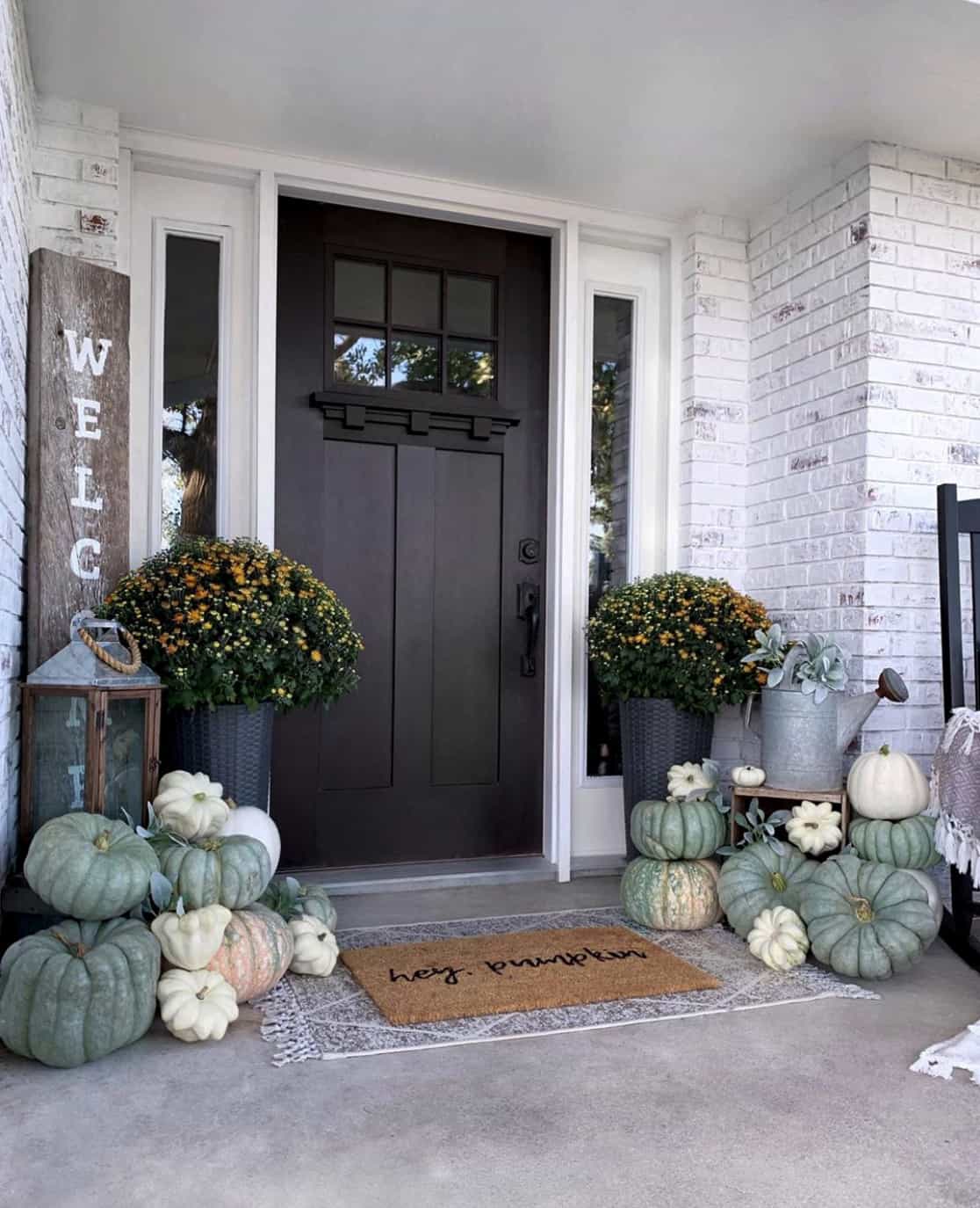
This porch works because it commits to a narrow palette. Green and white pumpkins pair with a jute doormat and a muted gray door, so the only real contrast comes from a few orange mums tucked into a ceramic pot. The brown lantern adds a warm note without introducing a new color family.
What keeps the arrangement from feeling flat is the way the pumpkins vary in height and shape. Tall ones near the door frame lead the eye outward to shorter gourds clustered by the steps. The jute mat repeats the natural fiber tone of the wreath, tying the whole entry together without matching.
Black door with topiaries and green wreath
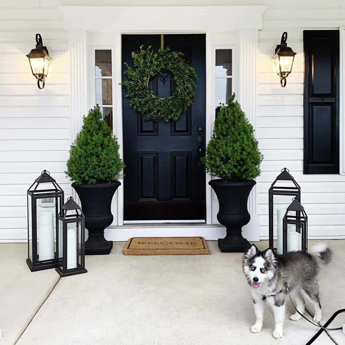
A black door is a strong anchor, so the porch should support without competing. Symmetrical topiaries in stone planters frame the entry, and a green wreath repeats the same fresh tone at eye level. The lanterns on either side of the door match in finish and height, creating a balanced line that the eye follows naturally.
A natural fiber welcome mat at the threshold softens the transition from dark paint to brick floor. The overall layout is formal but not stiff, because the greenery adds organic shape against the straight lines of the door and sconces. This approach works best when each piece has room to breathe.
Dark green door with feather wreath and hydrangeas
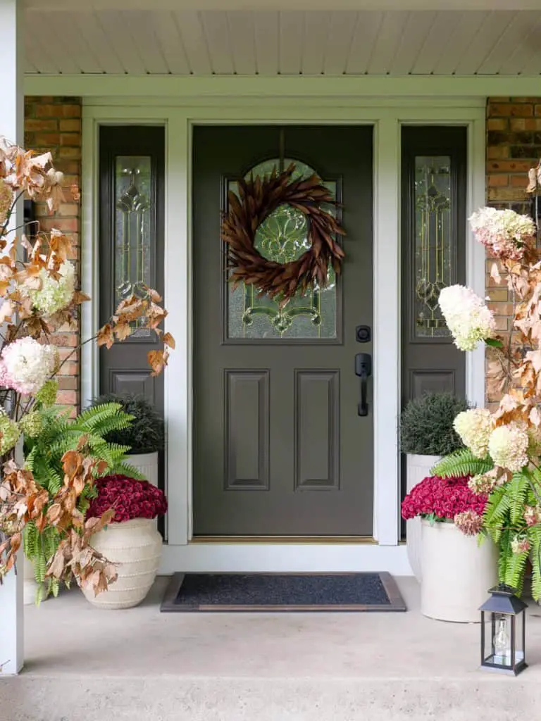
A dark green door sets a calm backdrop for a large feather wreath in brown and white tones. Symmetrical brick planters hold white and burgundy flowers, with a lantern on each side. The palette uses brown, green, white and burgundy, warm and natural. What defines this farmhouse look is the balance: the door decor stands out, and the room around it stays simple. The feather texture adds softness against the brick and the door color.
Ornamental cabbage and mum display
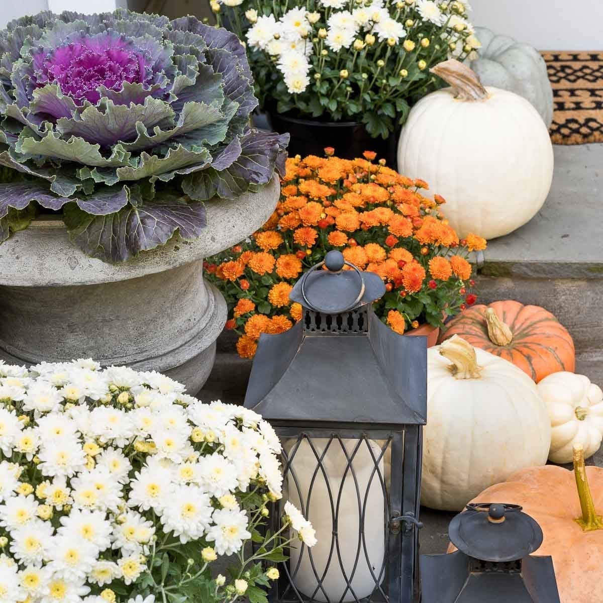
Group plants by size to create a welcoming porch. A large ornamental cabbage anchors the vignette on the steps, with smaller mums in purple and orange around it. White pumpkins and glass lanterns break the green and add light. The palette mixes purple, green, orange, white and gray, a traditional scheme that looks intentional when the largest element sits lowest. For renters who cannot change the porch floor, placing pots on a stone or metal tray defines the zone without permanent marks.
Wheat wreath and potted mums with stone accents
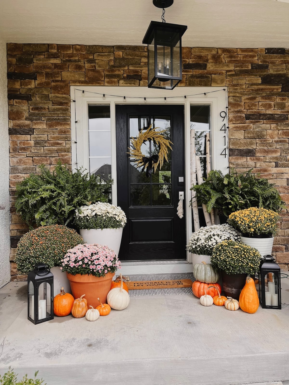
Where a close alternative might use a single wreath and one pair of urns, this farmhouse porch goes bigger. A black door with a wheat wreath is flanked by potted mums and pumpkins on each side, plus a hanging lantern and string lights above. The materials mix terracotta, glass, metal and stone. Each brings a different finish so the eye moves across the space. The palette of orange, white, green, yellow and black keeps the look grounded. What breaks this abundance is the symmetry around the door, which stops the collection of pumpkins and mums from feeling like clutter.
Double wooden doors with sconces and planters
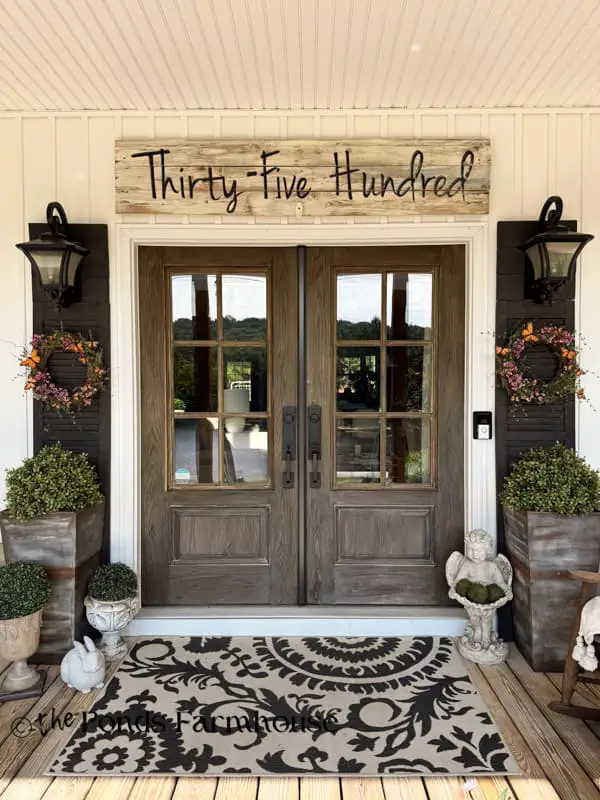
Double wooden doors need a layout that matches their width. Here, large planters sit on both sides of each door, with wreaths centered above and wall sconces at the outer edges. A wooden sign with the house number hangs above the rug. The palette of brown, black, white and green stays consistent across the wood, metal and stone. The symmetry gives the roomy porch a balanced look. Scale down the planters by one size for a single door.
Red door with festive wreath and spring flowers
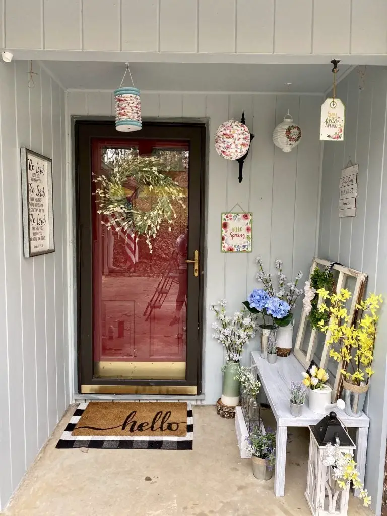
A red door with a festive wreath works best when the scale matches the compact porch. Here, a wreath in green, yellow and blue tones hangs centered, with a lantern on each side and a bench below holding pots of flowers. The palette of white, green, yellow, blue and red keeps the bold door from overwhelming the space. The doormat grounds the entry. What defines this look is the proportion: the wreath is large enough to be seen from the street but leaves room for the flanking lanterns and the bench seating.
Wooden shelf with terracotta pots and greenery
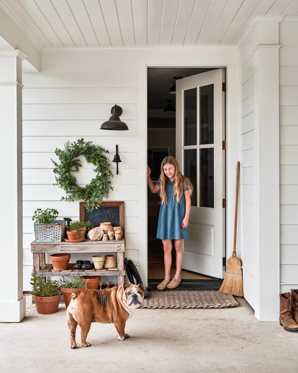
A porch shelf that sits against the wall gives you a spot to layer decor without taking up floor space. The farmhouse look here pairs a wooden shelf with terracotta pots and a wreath on the wall above it, while a broom leans nearby. The layout keeps the walkway clear and groups items where they are easy to see. The white, green, brown and terracotta palette stays simple so the greenery and natural clay tones do the work. A wall sconce adds light right where you need it for evening arrivals. This kind of storage-friendly setup works well for narrow porches where every inch counts. Keep the shelf from looking busy by sticking to one or two materials, wood and terracotta are enough.
Wooden sofa with plaid pillows and string lights
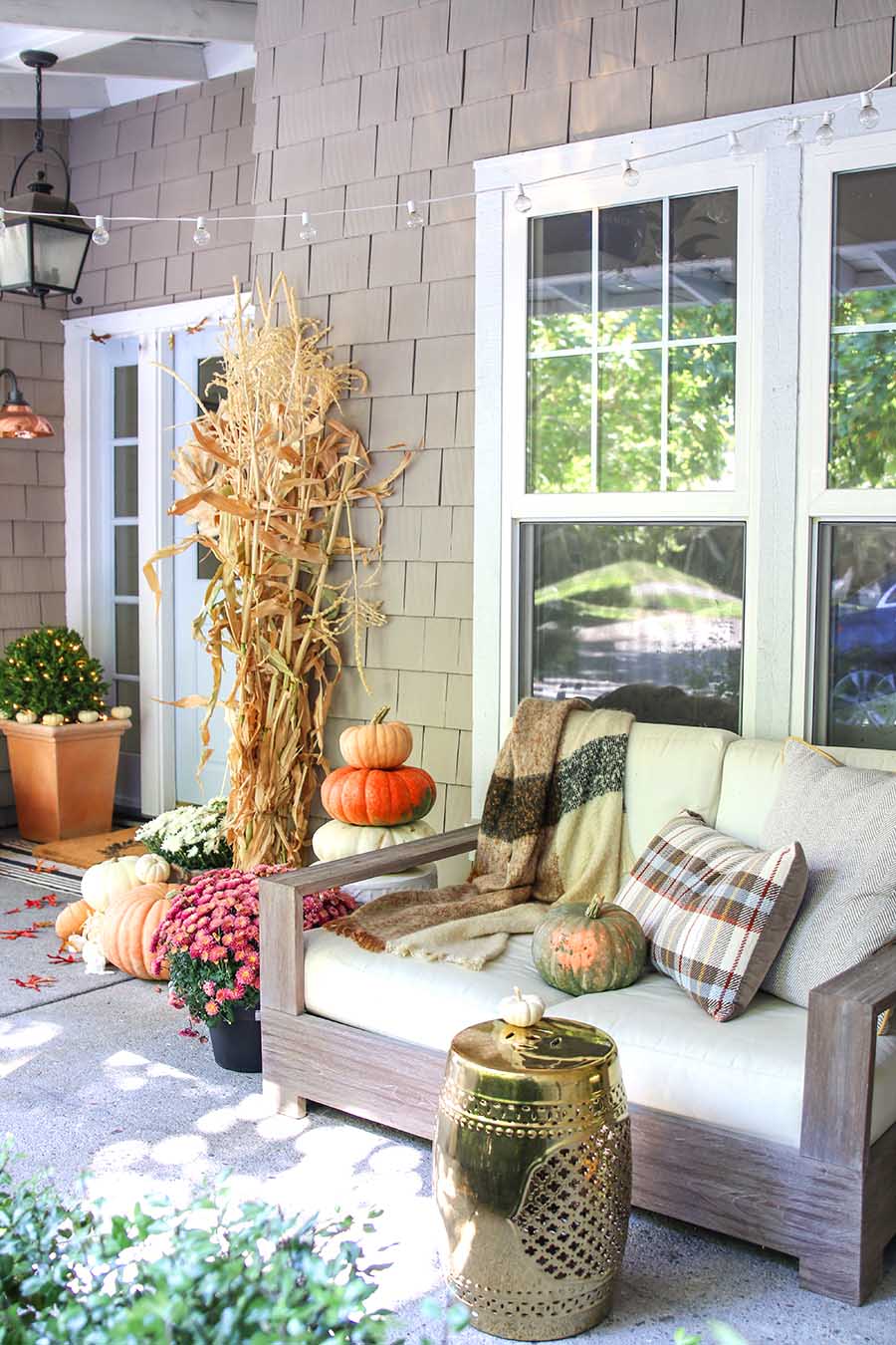
The wooden sofa anchors this porch with its tan frame and cream cushions, while orange, green and brown accents from pumpkins and corn stalks carry the farmhouse palette through the space. A gold garden stool sits nearby as an unexpected metal note against all that wood and straw. String lights overhead and a lantern on a sconce warm the room at night. Plaid pillows on the sofa pull the tan and orange together so the whole seating area looks like a unified arrangement. The layout puts the sofa facing windows, which makes the porch feel roomy and open instead of closed in.
Coastal rattan hanging chairs and striped throws
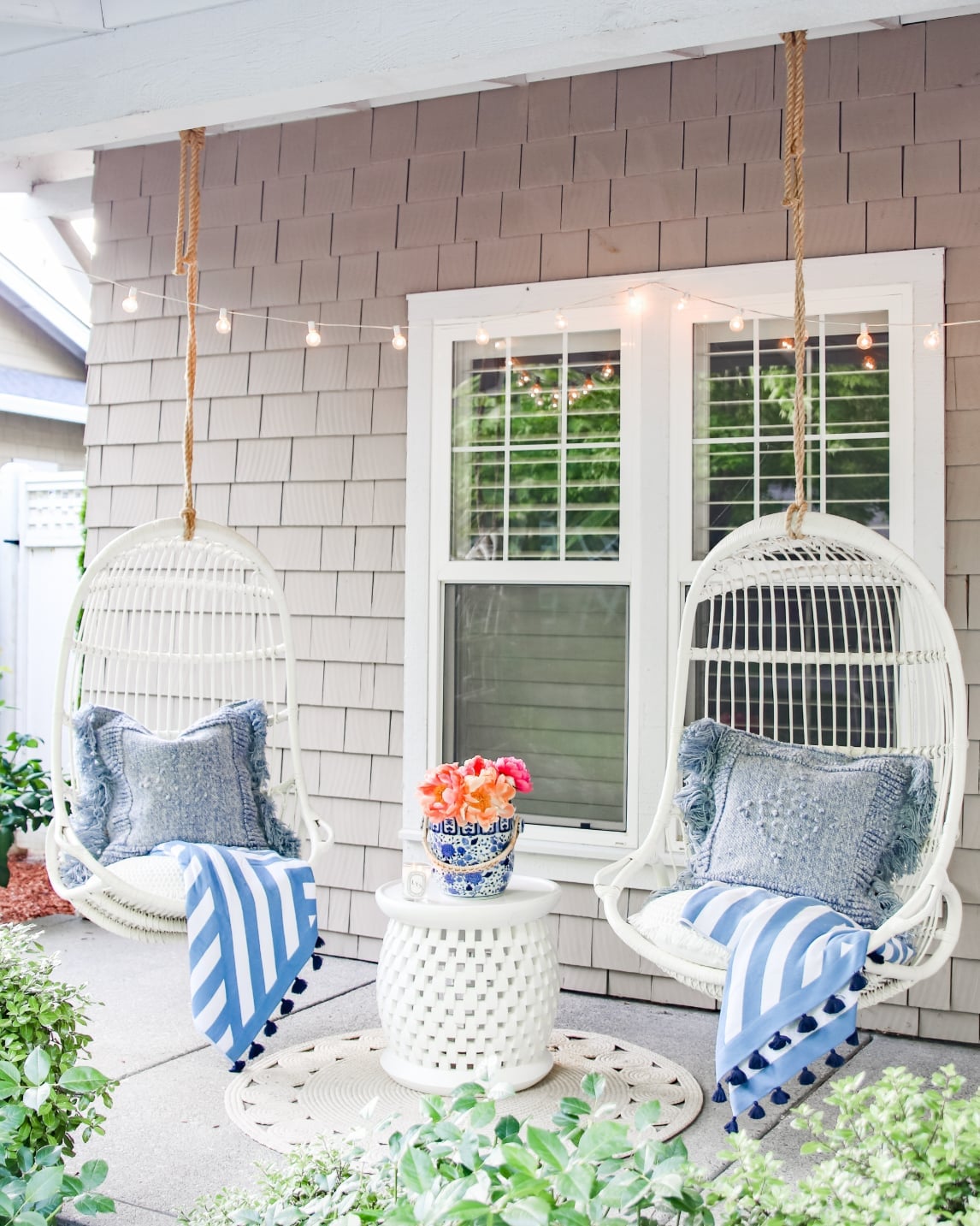
A practical rule for outdoor seating is to pick materials that handle humidity without rust or rot. Rattan hanging chairs do exactly that, the two white chairs here hang symmetrically with a white garden stool between them and a blue and white patterned vase on top. The coastal palette of white, blue, beige and coral comes through in the chairs, the ceramic vase and the linen throws. String lights crisscross above the setup so the space stays usable after sunset. The symmetrical layout creates a clear conversation area, and the rattan keeps the look light enough that the chairs do not overwhelm the porch.
Festive pumpkin array with rocking chair
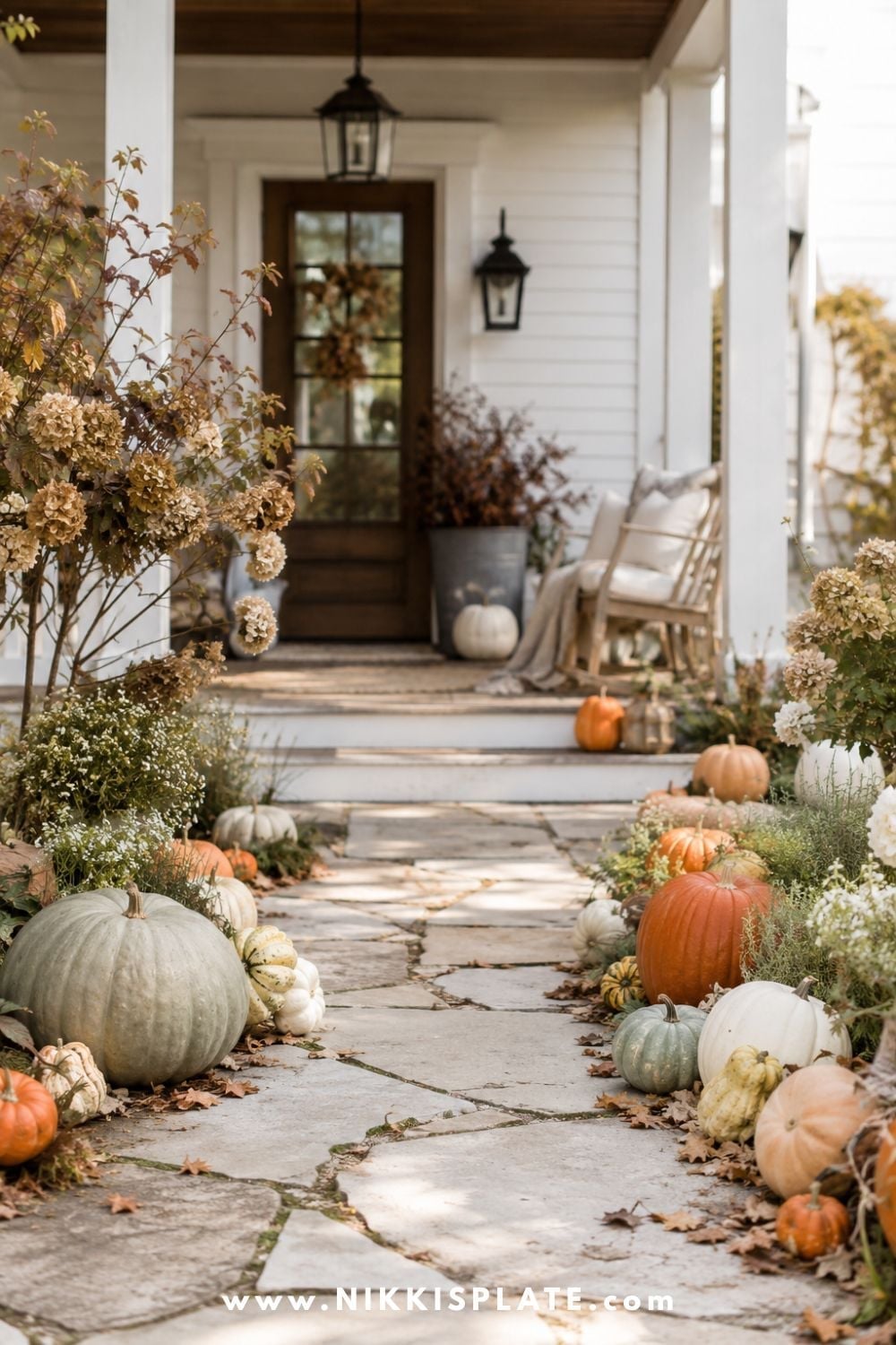
A pumpkin display can feel overwhelming if every surface gets covered. This farmhouse porch takes a different approach by lining the pathway with pumpkins and lanterns instead of clustering them all near the door. A wooden rocking chair sits to one side with a wreath on the wall behind it, so the seating stays usable even with all the fall decor. The natural daylight shows off the orange and green pumpkins against the white and wood tones, and the lanterns add glow for evening. This layout works because it guides the eye toward the door without blocking the walkway. A few large pumpkins spaced apart look more intentional than a pile of small ones.
White wooden chairs with linen cushions
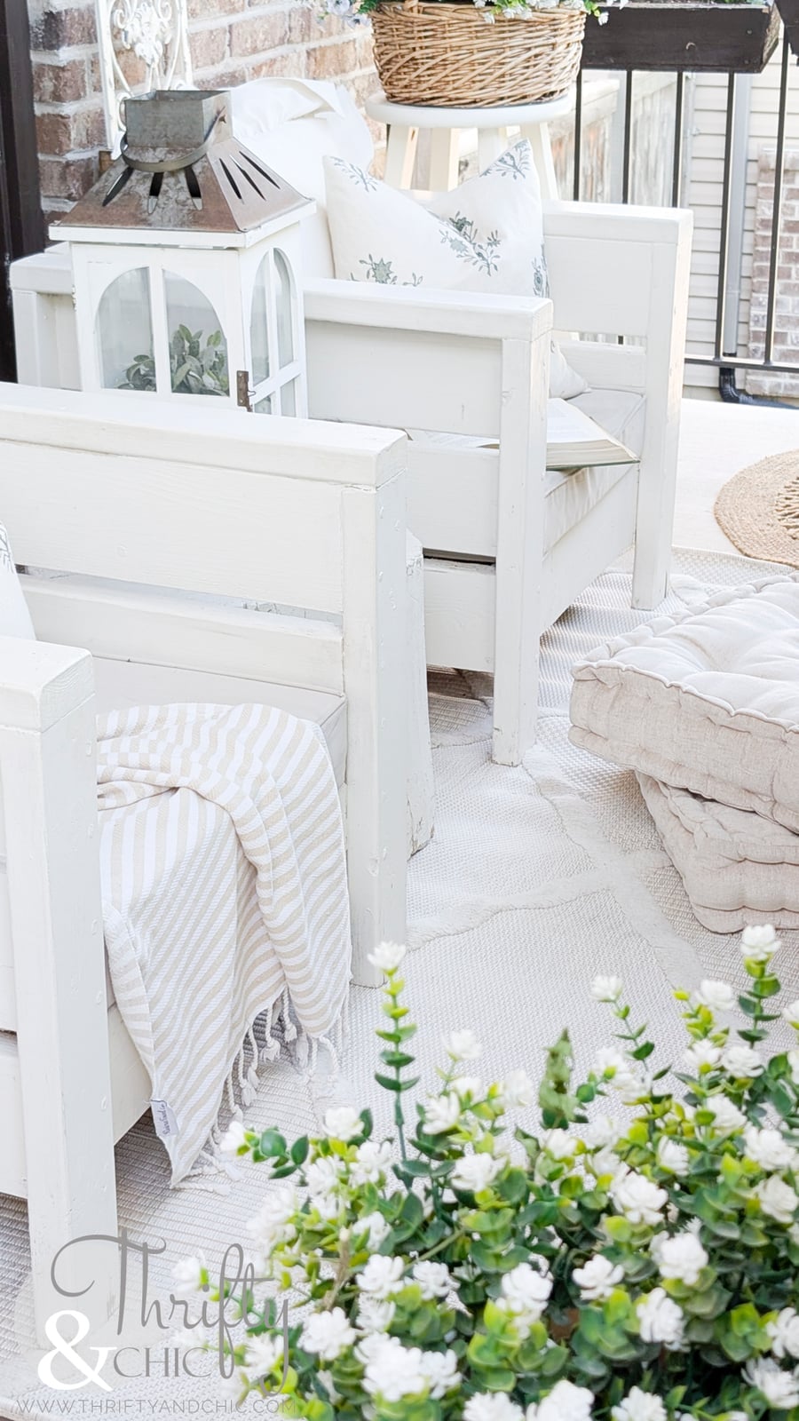
The white wooden chairs stand out against the brick floor because their painted finish catches the light while the brick stays matte. Linen cushions in beige soften the seating, and a striped throw draped over one chair adds a pattern without introducing a new color. A wicker basket and a metal lantern sit nearby, mixing textures that keep the white chairs from feeling too formal. The farmhouse palette of white, beige, green and gray stays calm, and the floor cushions let you sit low or pull up a chair depending on the mood. This setup proves that white seating does not need to look precious when paired with natural materials like linen and wicker.
Shelf unit display with dried corn garlands
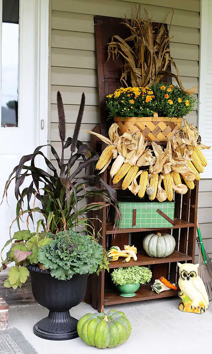
A wooden shelf unit becomes the anchor for a tiered seasonal display that stacks potted plants, pumpkins, and a ceramic owl statue at different heights. The dried corn garland draped across the front ties the green, yellow, brown, and beige palette together without needing a single new purchase. This room-mode approach works because the shelf itself does the organizing: the eye moves up and down the levels instead of scanning a flat surface. The farmhouse palette stays consistent across every level, so the arrangement looks like one composed piece, not a collection of unrelated objects. Keeping the shelf unit against the wall and limiting the footprint to its width leaves the porch open for traffic.
Hanging ghost decoration with lantern light
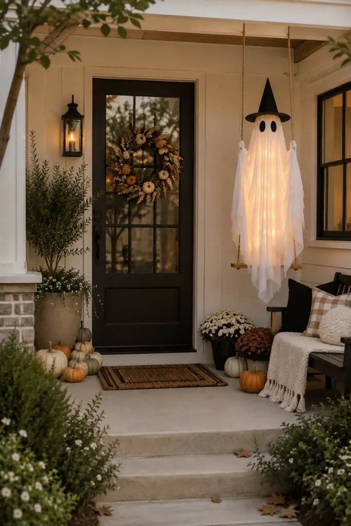
A practical rule for renter-friendly decor: hang your focal piece where it cannot damage the surface below. A fabric ghost decoration suspended from the porch ceiling floats above a black door, with a bench to the right and pumpkins and potted plants flanking the entrance. The white, black, beige, orange, brown, and green palette keeps the spooky element playful rather than heavy.
When you want a welcoming bench without clutter
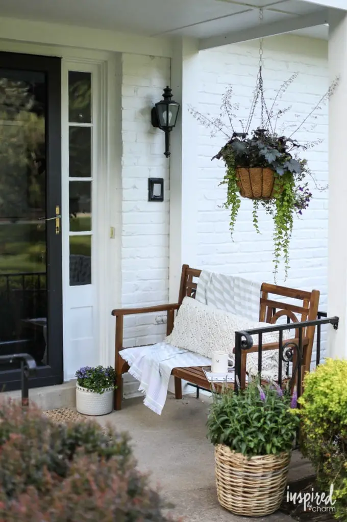
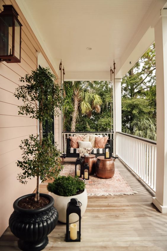
A wooden bench set against a brick wall stays inviting because the hanging planter above it does the decorative work. Potted plants flank the bench on both sides, and a few throw pillows add comfort without piling on more objects. The wall lantern provides enough light for evening use, and the compact footprint keeps the walkway clear. This layout proves that a single hanging basket can replace a table full of accessories.
Black rocking chairs with large white planters
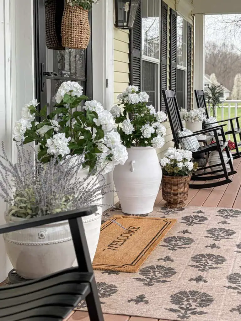
A pair of black rocking chairs gains presence from the large white planters set beside them, each filled with white flowers that echo the ceramic color. The yellow, black, white, beige, and gray palette relies on contrast: the dark chairs anchor the seating area while the pale planters and patterned rug expand the visual width. Scale and proportion matter here: the planters are tall enough to balance the chair backs, and the welcome mat bridges the gap between the two furniture groups. This arrangement avoids the common mistake of undersized accessories that make a roomy porch feel empty.
Grand entrance with nutcracker and garlands
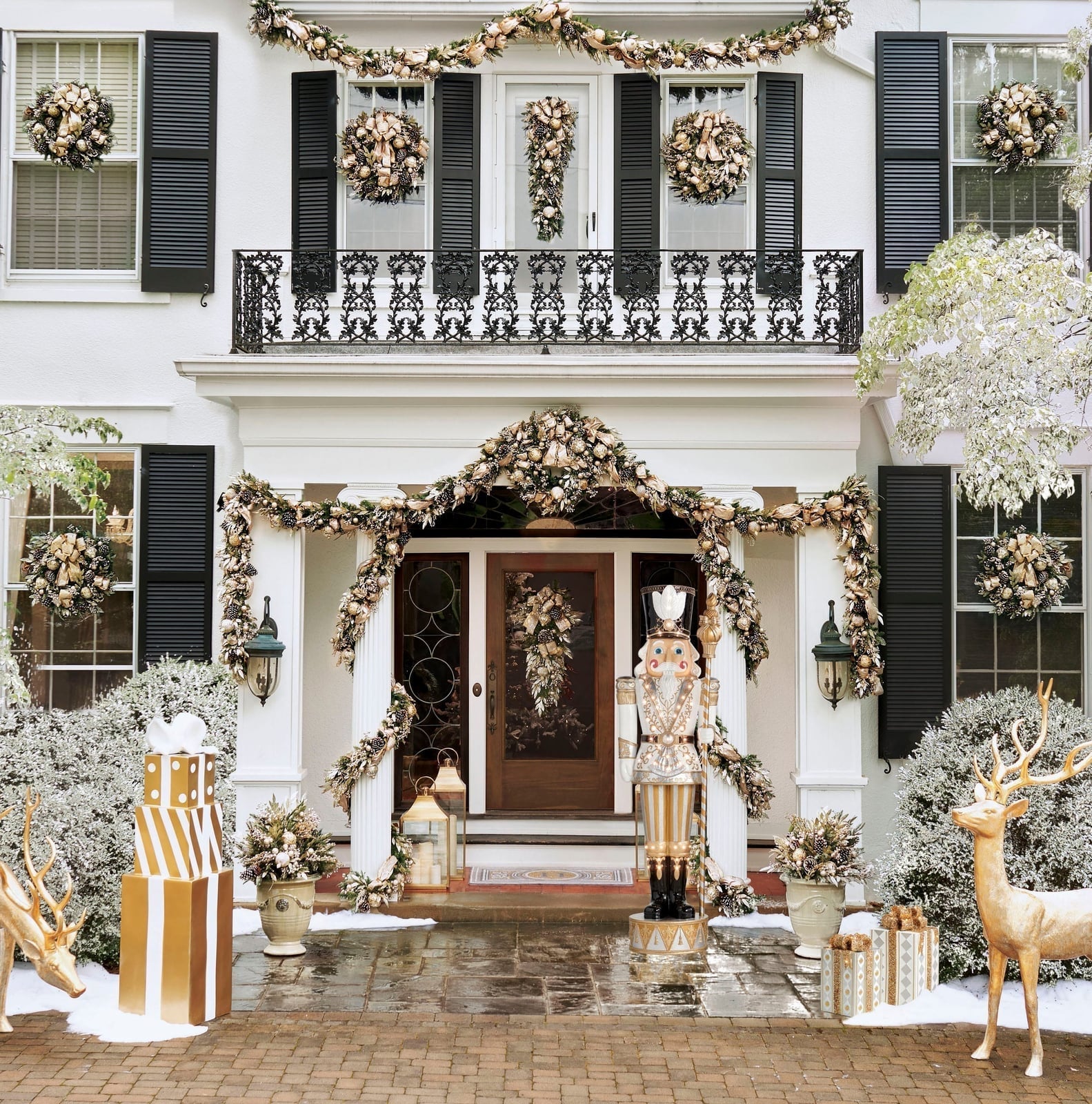
A large nutcracker figure on the porch sets a formal tone that a single wreath alone cannot match. The symmetrical arrangement places wreaths, garlands, reindeer figures, and gift boxes in balanced pairs around the entrance, with lanterns and a wall sconce providing warm light. The white, gold, green, and brown palette looks traditional because the nutcracker anchors the scale.
Deep green door with wicker chair and antique trunk
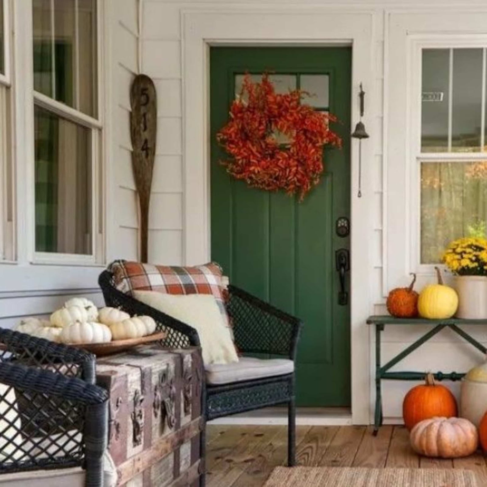
A deep green front door anchors the whole porch, making it the first thing you notice even with plenty going on around it. The seating area sits to one side: a wicker chair paired with an antique trunk that doubles as a side table or extra storage. Pumpkins and a wreath add seasonal color in orange and white, while an oar leans against the wall for a subtle coastal or cabin touch. The layout keeps the door as the hero element and everything else as supporting cast, so the compact space feels balanced rather than crowded.
Light gray door with woven basket of hydrangeas
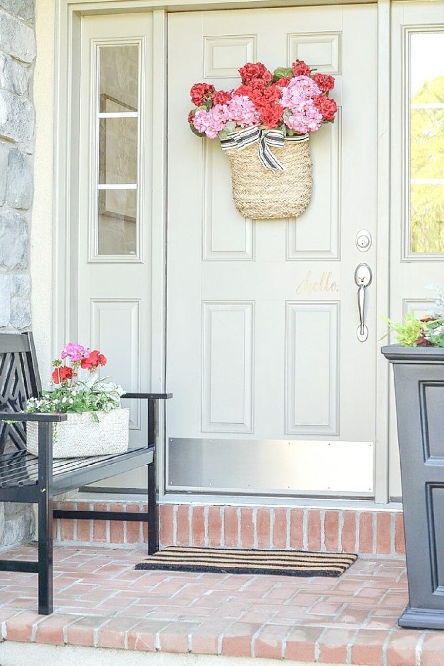
This look proves that a light palette can still feel warm and inviting. The light gray door is the backdrop for a woven basket filled with pink hydrangeas, creating a soft focal point without competing with the black bench to the left or the striped doormat below. The pink and red tones in the flowers add just enough contrast against the beige brick and wood siding, while the straw basket keeps everything grounded in natural texture. It is a balanced, approachable entry that works because the palette stays in a narrow range: cool gray, warm beige, and one punch of floral color.
Final Thoughts
A sharp front porch in 2027 is less about buying a specific look and more about deciding how you want the door to feel when you walk up to it. The ideas here share a few practical threads: keep the floor clear enough to open the door fully, use plants and pillows to add softness, and let one or two items anchor the arrangement so it does not look scattered. If you want the porch to shift with the seasons, choose containers and cushions that can swap out easily. If you prefer a single year-round setup, pick neutral furniture and rotate just the wreath or the flowers. Either way, the goal is a porch that looks like it belongs to the house, not like it was styled for a photo. Start with what you already have, then add one new piece that makes you smile when you pull into the driveway.