Color trends for 2027 lean into bold contrasts and unexpected pairings. From playful pink and light blue bedrooms to deep blue velvet sofas with gold accents, these 30 trendy color palette ideas show you how to make any room feel fresh and current.
Expect saturated hues like emerald green and teal alongside softer shades like peach and lavender, all balanced with neutrals for a look that feels intentional without being fussy.
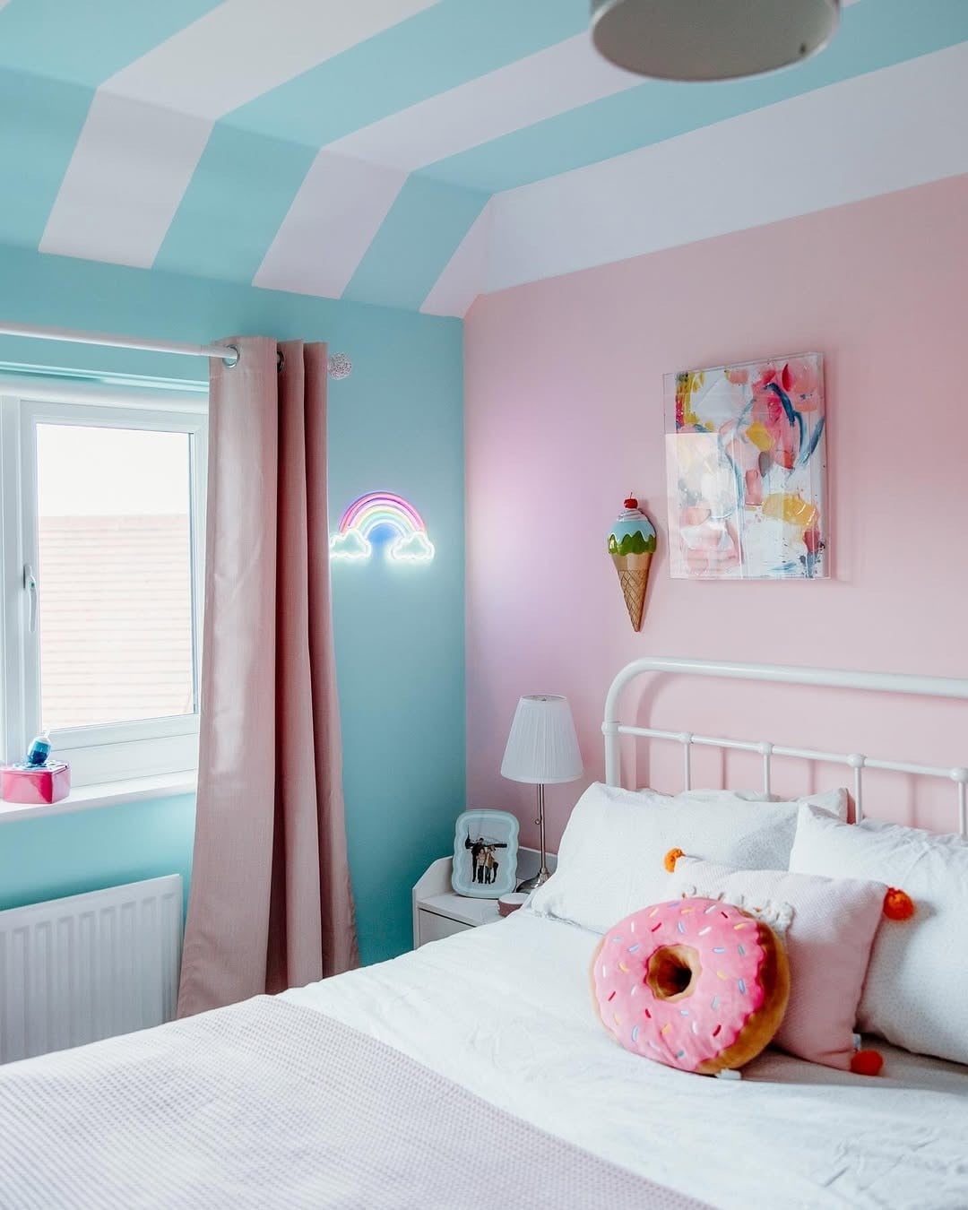
Playful pink and light blue bedroom with chevron ceiling
A chevron striped ceiling in pale blue sets a playful rhythm above a pink and white bedroom. The palette leans on light blue and pink, with a metal bed frame and white bedding keeping the look clean. A rainbow neon sign adds a soft glow, while the bedside lamp keeps the room functional. The color ratio here is roughly equal parts pink and blue, with white as the neutral buffer. What makes this work is the ceiling pattern: it breaks the white expanse without competing with the bedding. The donut pillow reinforces the playful note without tipping into clutter.
Boho living room with deep blue velvet sofa and gold accents
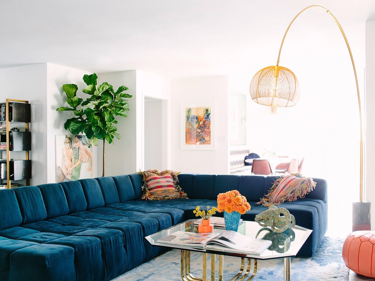
This is a boho living room that leans on contrast rather than clutter. The deep blue velvet sectional sofa anchors the space, while gold accents in the arc floor lamp and brass details add warmth. A glass coffee table keeps the area light and open. The palette mixes deep blue with white, orange, and gold, creating a balanced ratio of about 60 percent blue to 20 percent warm accents and 20 percent white. The fiddle leaf fig plant introduces organic green, which breaks the cool blue without fighting it. Window light softens the velvet sheen.
Trendy white, navy, and light blue dorm room with string lights
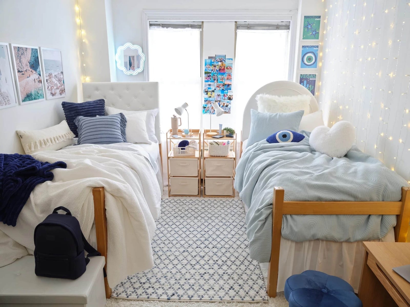
Start with a navy and light blue palette on a white base to make a compact dorm room feel both personal and pulled together. Two twin beds face each other with a patterned rug between them, creating a symmetrical layout that maximizes floor space. The string lights draped across the ceiling add a warm, diffuse glow that softens the contrast between navy and white. Linen bedding in white and light blue keeps the texture light. The teal accents in the rug add a subtle third note that keeps the navy from feeling heavy.
Serene modern farmhouse bedroom with pale yellow walls
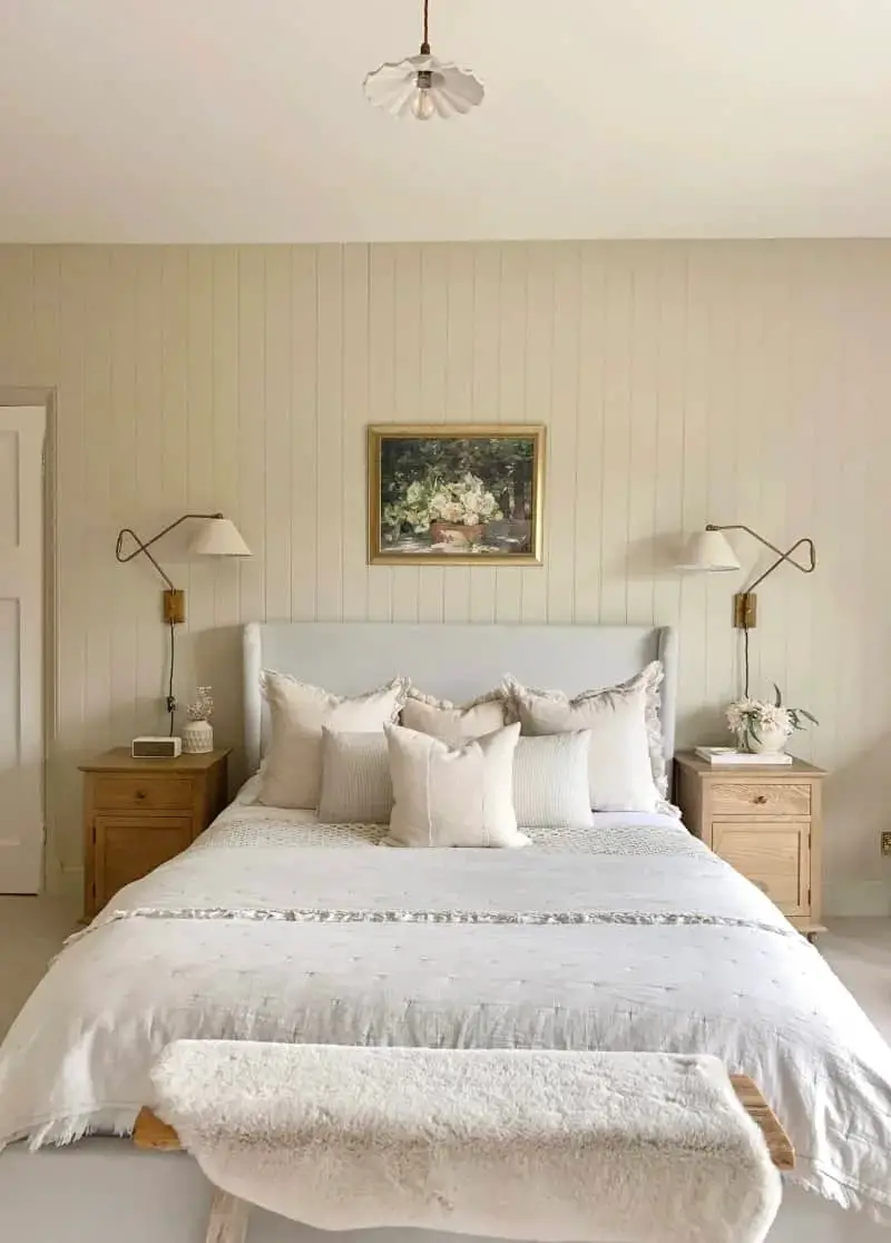
Pale yellow walls bring warmth to this modern farmhouse bedroom without the intensity of a saturated shade. The palette pairs pale yellow with cream, white, and light blue, with the yellow appearing only on the walls. The upholstered headboard in cream and the wooden nightstands keep the textures grounded. Wall sconces provide soft, even light on each side of the bed, reducing the need for overhead fixtures. The paneled wall adds architectural interest without extra color. The color ratio here is about 40 percent yellow, 40 percent cream and white, and 20 percent light blue accents in the bedding.
Eclectic hallway with vibrant yellow ceiling and blue accents
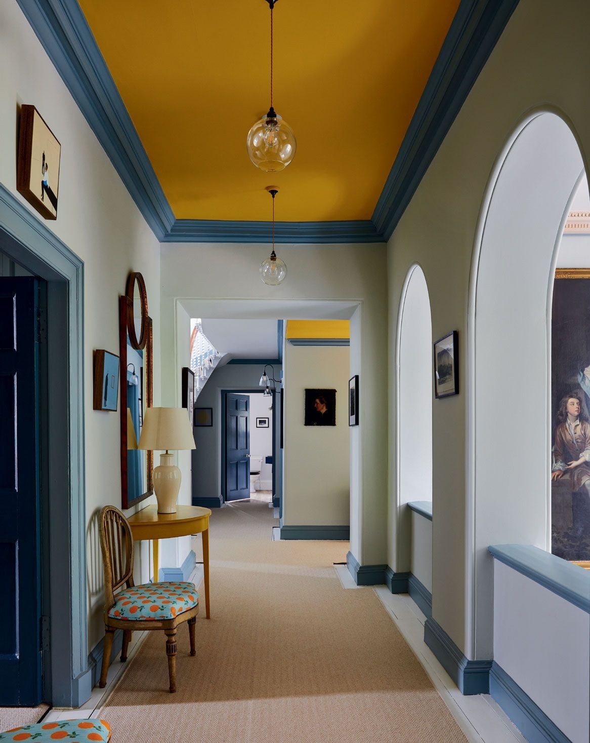
Hallways need a focal point to avoid feeling like a tunnel. Here, a vibrant yellow ceiling draws the eye upward, while blue accents in the trim and a large painting anchor the walls. The palette mixes yellow, blue, cream, and orange, with the yellow covering about 30 percent of the visual field. The wooden chair and console table add warmth. Pendant lights provide task lighting, while a table lamp adds a softer glow near the painting. The arched doorways break up the long sightline and keep the space from feeling monotonous.
Blush pink sofa against a gallery wall
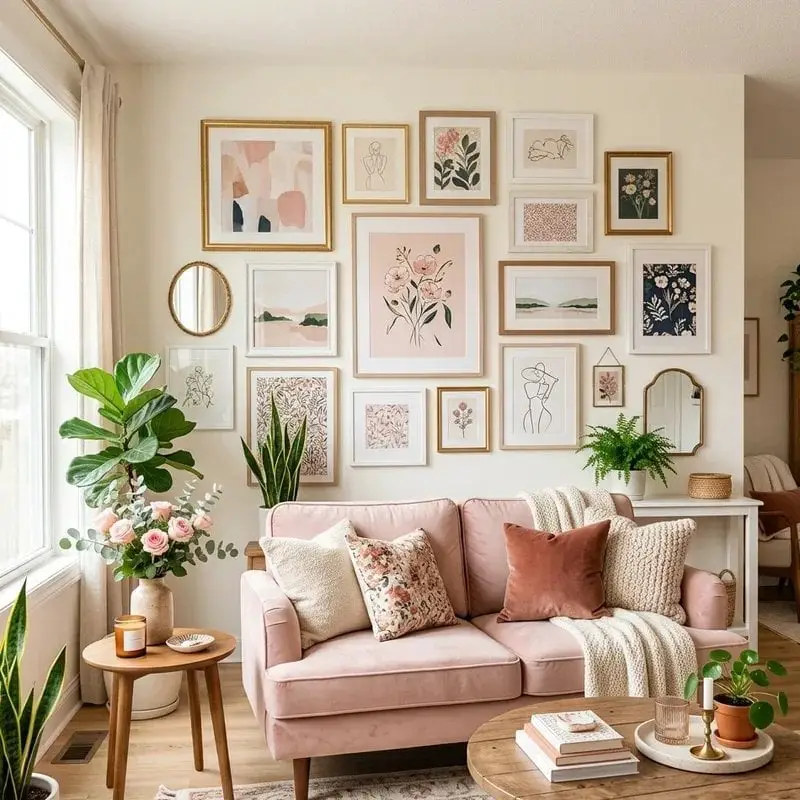
A blush pink sofa against a gallery wall looks boho. The palette includes blush pink, cream, sage green, navy, and gold. The pink anchors the room, cream keeps it airy, and sage and navy add depth without weight. The gallery wall is the focal point, so the velvet sofa stays simple, the round coffee table stays low, and the side table in glass and brass does not compete. A linen throw or a wood accent keeps the look from tipping into precious. For a renter, this is a low-commitment palette: swap the art, swap the throw, and the whole room shifts.
Modern living room with striped sofa and olive green armchair
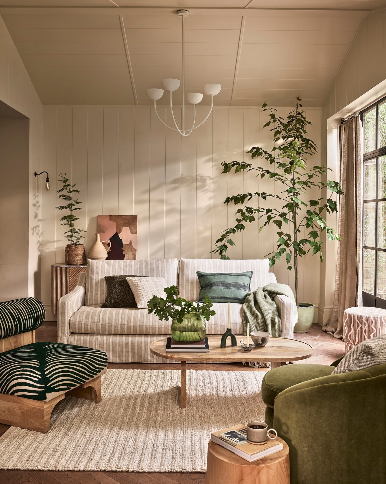
A beige and cream striped sofa sits opposite a wooden coffee table, with an olive green velvet armchair off to the side. The palette is beige, cream, olive green, dark green, blush pink, and brown, and the mix of linen, metal, and woven textures keeps it from feeling flat. A large potted plant and a wall sconce add height, while the chandelier pulls the eye up. The style is modern, but the striped sofa breaks the minimalism just enough to feel lived in.
Airy living room featuring a soft peach palette and pink sofa
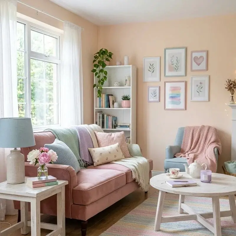
Peach walls and a pink velvet sofa set the tone, with a blue armchair and pastel throws adding contrast. The palette is soft, but not timid: peach, pink, and blue work because the white bookshelf and round coffee table act as neutral pauses. A table lamp and window light keep the room bright. The style is modern, and the standout is the pastel palette itself. What defines it is the ratio of warm to cool: two parts peach and pink to one part blue. A single dark accent, say a navy vase or a wood frame, prevents the look from looking sweet.
Teal sofa anchors space with olive green armchairs
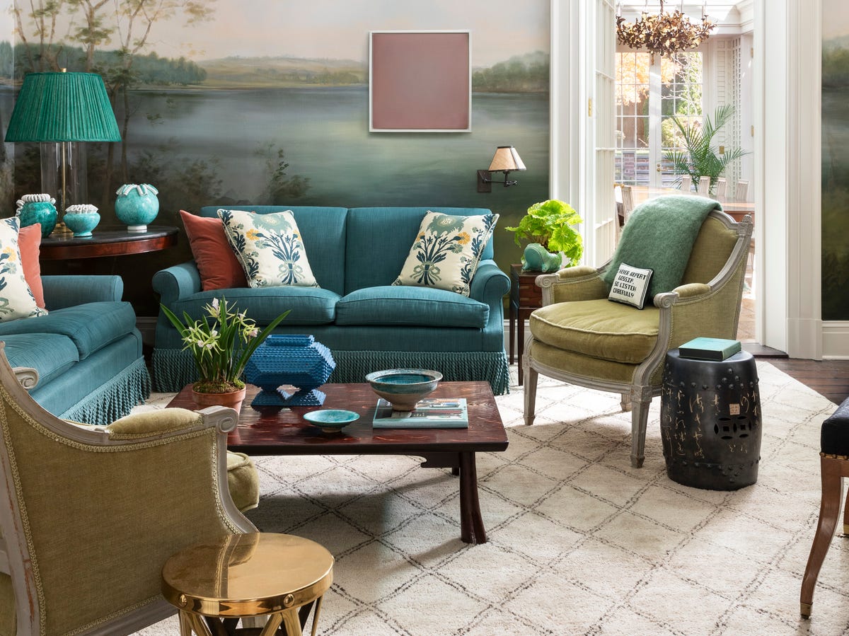
A teal sofa with fringe detail becomes the anchor when paired with olive green armchairs, a dark wood coffee table, and a patterned rug that pulls in both shades. The palette is teal, olive green, blush pink, and the muted tones of a landscape mural on the wall. The seating is arranged around the coffee table, with natural light from a doorway and an ornate chandelier overhead. The style is eclectic, and the balance of saturated color against neutral ground defines the room. The fringe on the sofa breaks the formality, and the brass and ceramic accents add warmth. For a renter, this palette works with existing neutrals: just add the teal and olive as upholstery or throw pillows.
Emerald green walls behind a marble dining table
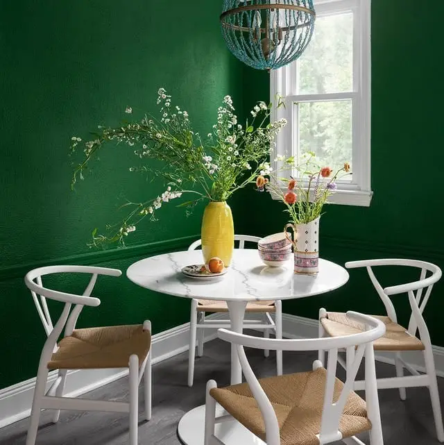
Emerald green walls turn a compact dining room into a jewel box. A round marble table sits centered, with wishbone chairs and a beaded blue chandelier overhead. The palette is emerald green, white, and blue, and the ratio is key: one bold wall, one light table, one accent light fixture. The contrast of cool green against warm wood chair frames defines the modern style. A single brass or gold detail, like a picture frame or a vase, adds warmth to the space.
Framed ‘birmingham color palette’ print for trendy inspiration
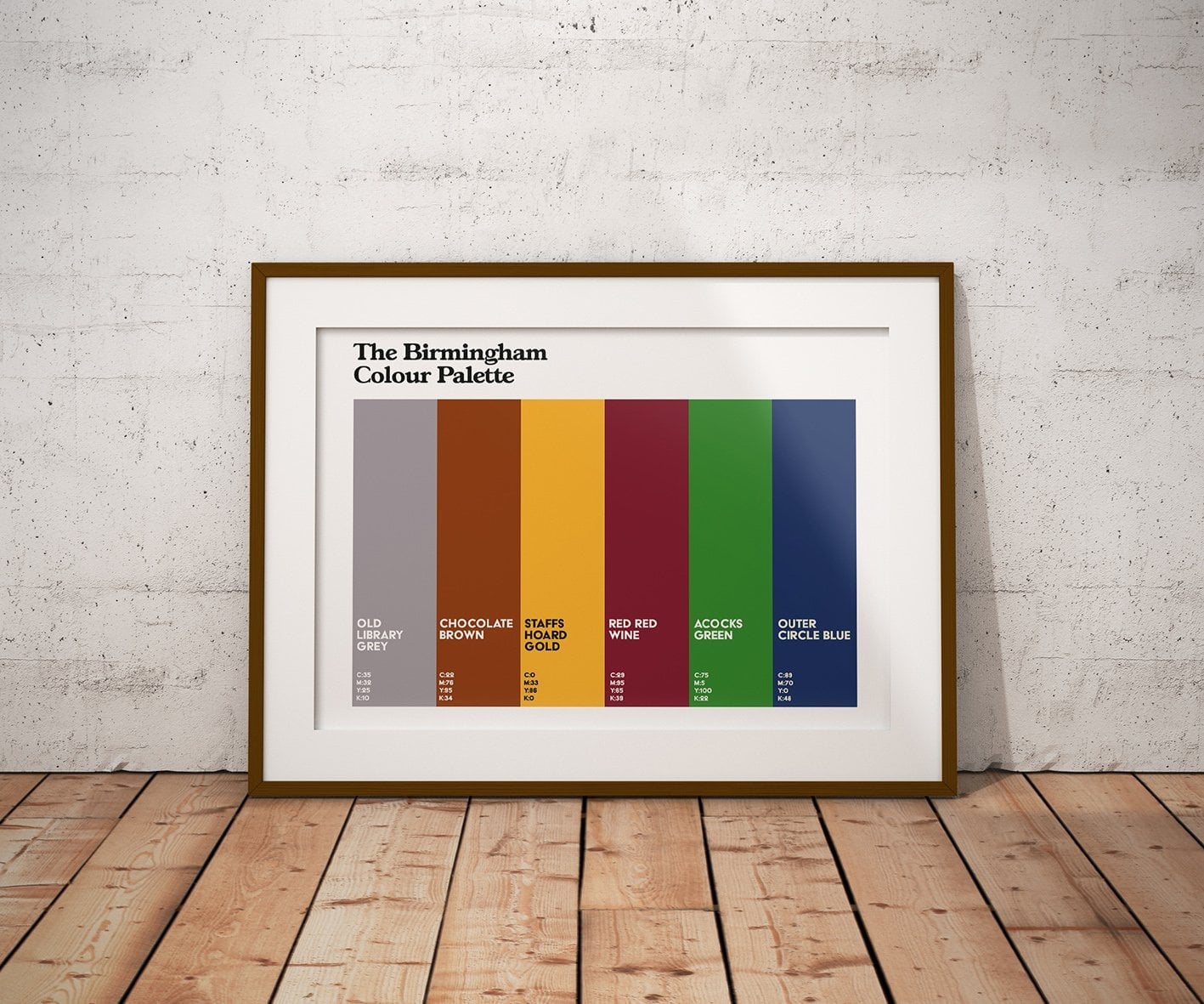
A framed print of a curated color palette works as a quick reference when you are deciding on a room’s direction. This one pulls together gray, brown, gold, burgundy, green, and blue swatches in a simple paper print inside a wood frame. Placed against a plaster wall and lit by natural light, it acts as a style anchor without committing you to paint. If you are testing a new combination, prop a palette print on a shelf or lean it on a mantel first. Live with the colors for a few days before you buy a gallon. The print itself becomes part of the decor, a small piece of art that also answers the question of what goes with what.
Traditional living room with cream sofa and marble fireplace
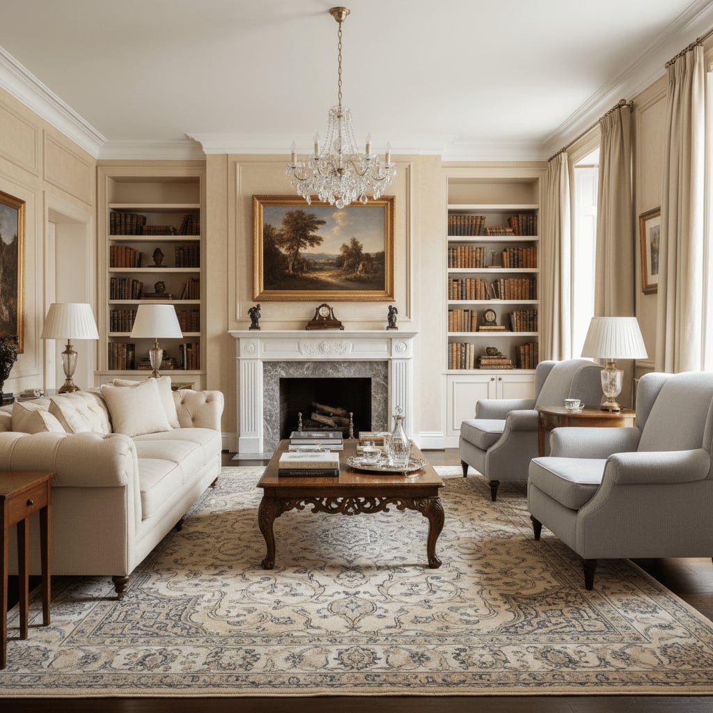
A cream and beige palette risks feeling flat next to a marble fireplace, but this room avoids that by adding dark wood. The result is a traditional living room where the cream sofa and matching armchairs sit against rich wood bookshelves and a deep wood coffee table. The gray veining in the marble picks up the cooler notes in the palette, while crystal chandeliers and table lamps add warmth through reflected light.
The key is contrast without clutter. The cream upholstery keeps the seating light and approachable, while the dark wood frames the space and gives the eye somewhere to rest. If you have a marble fireplace at home, test your cream paint swatch against the stone at different times of day. Natural light shifts the relationship between warm beige and cool gray, and you want the two to look intentional, not accidental.
Red white and blue textile Art on wall
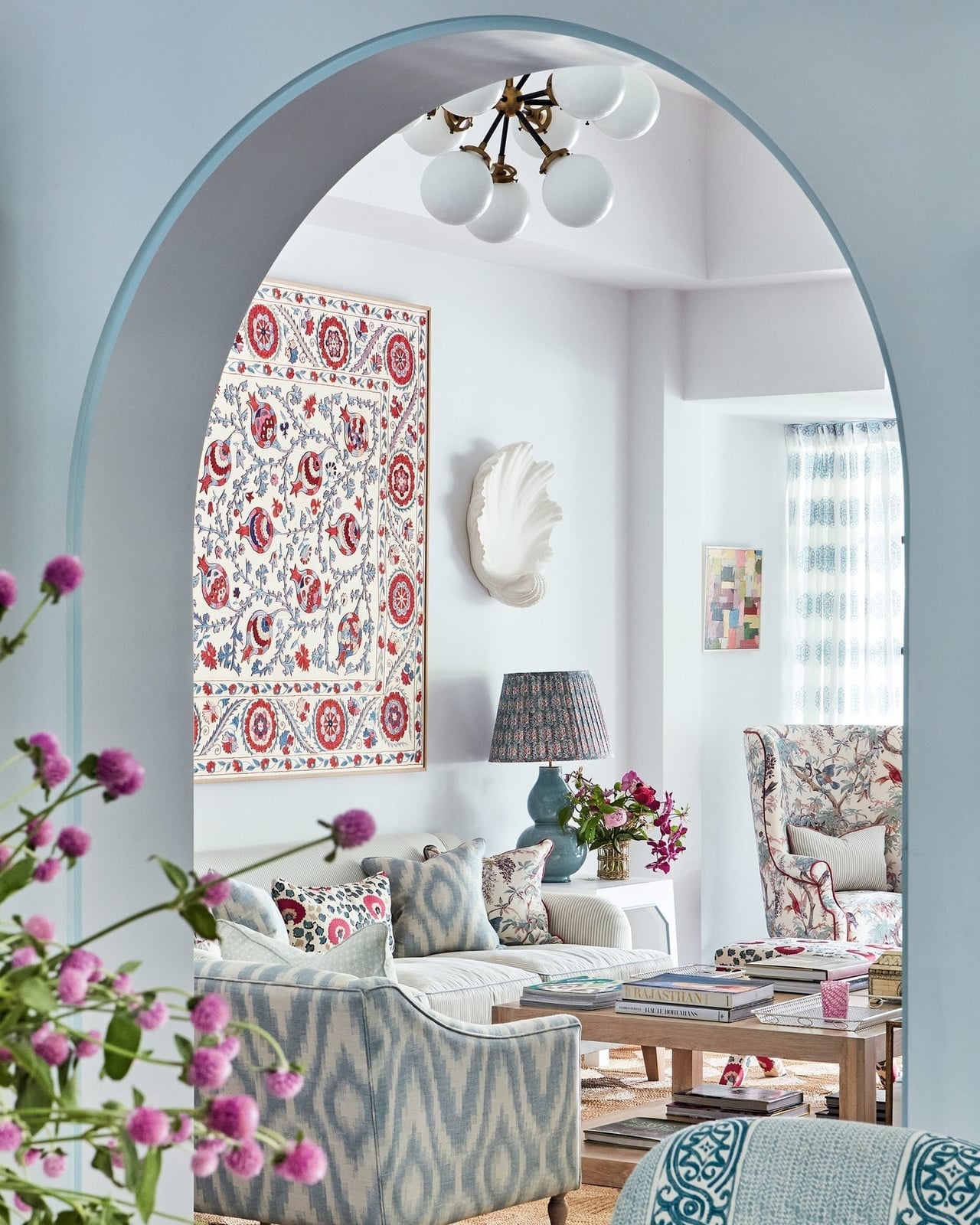
A textile wall hanging in red, white, and blue sets the palette for this living room without a single painted wall. The fabric piece mixes deep red and light blue against a white background, and the room follows its lead. A white sofa, a blue armchair, and a wood coffee table keep the look grounded. The overhead chandelier and a table lamp add enough light to keep the red from feeling heavy. The textile does all the color work. You do not need to paint or reupholster. If you find a wall hanging with a palette you love, use it as your starting point and pull the other pieces from it.
Aqua walls with coral curtains and teal bed
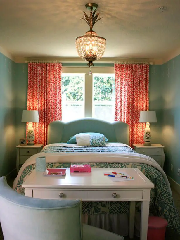
This bedroom pairs aqua walls with coral curtains and a teal upholstered bed, and the combination works because the colors share the same level of saturation. None of them fades into the background. The coral curtains are patterned and become the standout element, while the teal bed adds a darker anchor. White is limited to small accents, so the room feels intentional rather than random. If you are drawn to bold color but worry about overwhelm, try this approach: pick one wall color, one fabric color for curtains or bedding, and one furniture color. Keep the ratio uneven, let one shade lead and the others support. A chandelier and table lamps keep the space from feeling too dark.
Lavender pink and red palette creates bold effect
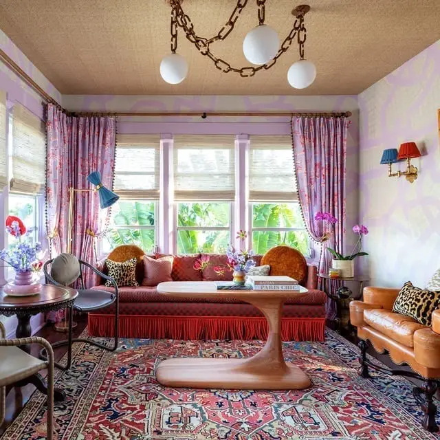
A palette of lavender, pink, and red sounds risky until you see how it plays out in a roomy living room with a fringed sofa, a leather armchair, and a sculptural coffee table. The trick is balance: lavender and pink take up most of the soft seating, while red appears in smaller doses, a pillow, a pattern on the rug, a detail in the art. Gold and brown accents through the wood and metal pieces keep the palette from floating away.
Start with one dominant color, then add the second and third in decreasing amounts. Here, lavender leads, pink follows, and red acts as the exclamation point. A cream or neutral base in the rug or walls gives the eye a place to rest between the bold notes. Pendant lights and wall sconces add layered illumination that keeps the room from feeling one-dimensional.
Sage green peach coral pink and dark gray palette
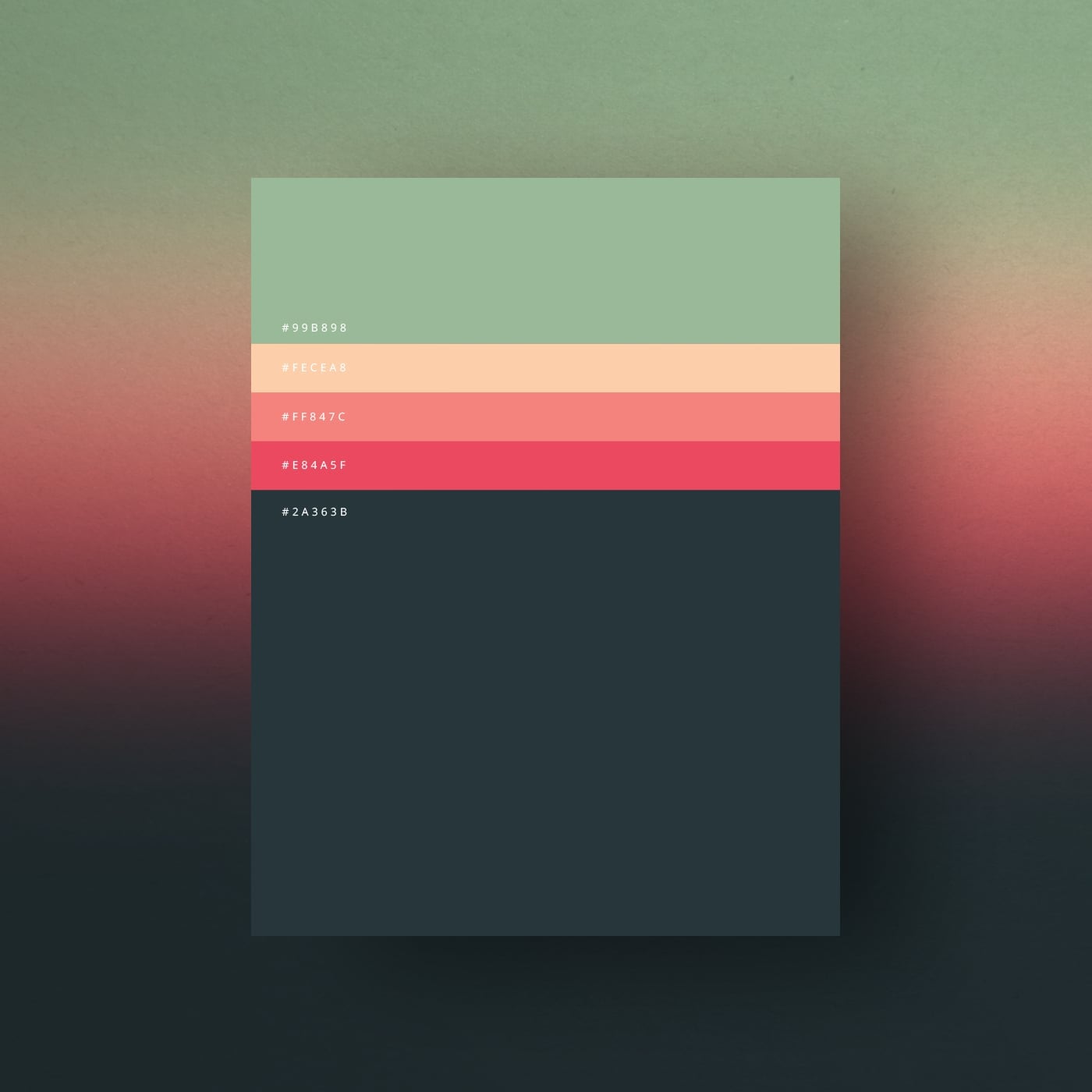
A single set of color swatches can hold five distinct moods at once. The sage green and peach here soften the coral and pink, while the dark gray keeps everything grounded. What defines this palette is the ratio: three warm tones balanced by one cool green and one neutral gray. The trick to making it work is letting one color lead. Use the gray for large surfaces like a sofa or wall, then pull in the others through pillows, vases, or art. Break the rule only when you want the room to feel more playful than neat.
Modern bedroom with teal accent wall and ceiling stripes
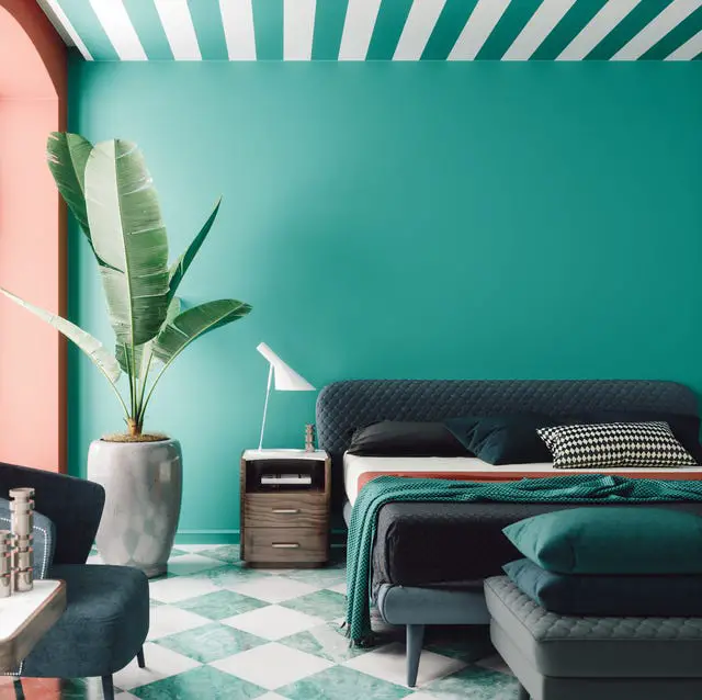
A practical rule for renters who want a bold wall without a full paint commitment is to use removable wallpaper on just one surface. Here, the teal accent wall behind the bed anchors the room, while the ceiling stripes draw the eye up. The palette mixes teal with coral, white, gray, and dark blue for depth. The quilted headboard and the armchair add texture, while the modern white desk lamp provides task lighting. To keep the look cohesive, repeat the accent color in smaller pieces like the potted plant or a throw pillow.
Blue and white stripes on sofa and ottomans
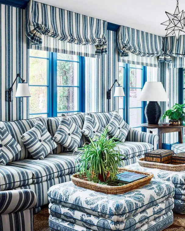
A blue and white striped sofa looks crisp and classic, while the same pattern on ottomans can tip the room toward nautical or traditional. The difference comes down to the supporting pieces. The wall sconces and a wooden coffee table keep the look grounded. The palette here is straightforward: blue and white, with no third color competing. What makes it work is the scale of the stripes. Narrow stripes on the sofa feel tailored; wider stripes on the ottomans add weight. A table lamp with a warm shade breaks the crispness just enough to keep the room from feeling like a ship cabin.
Brown and yellow palette with large sectional sofa
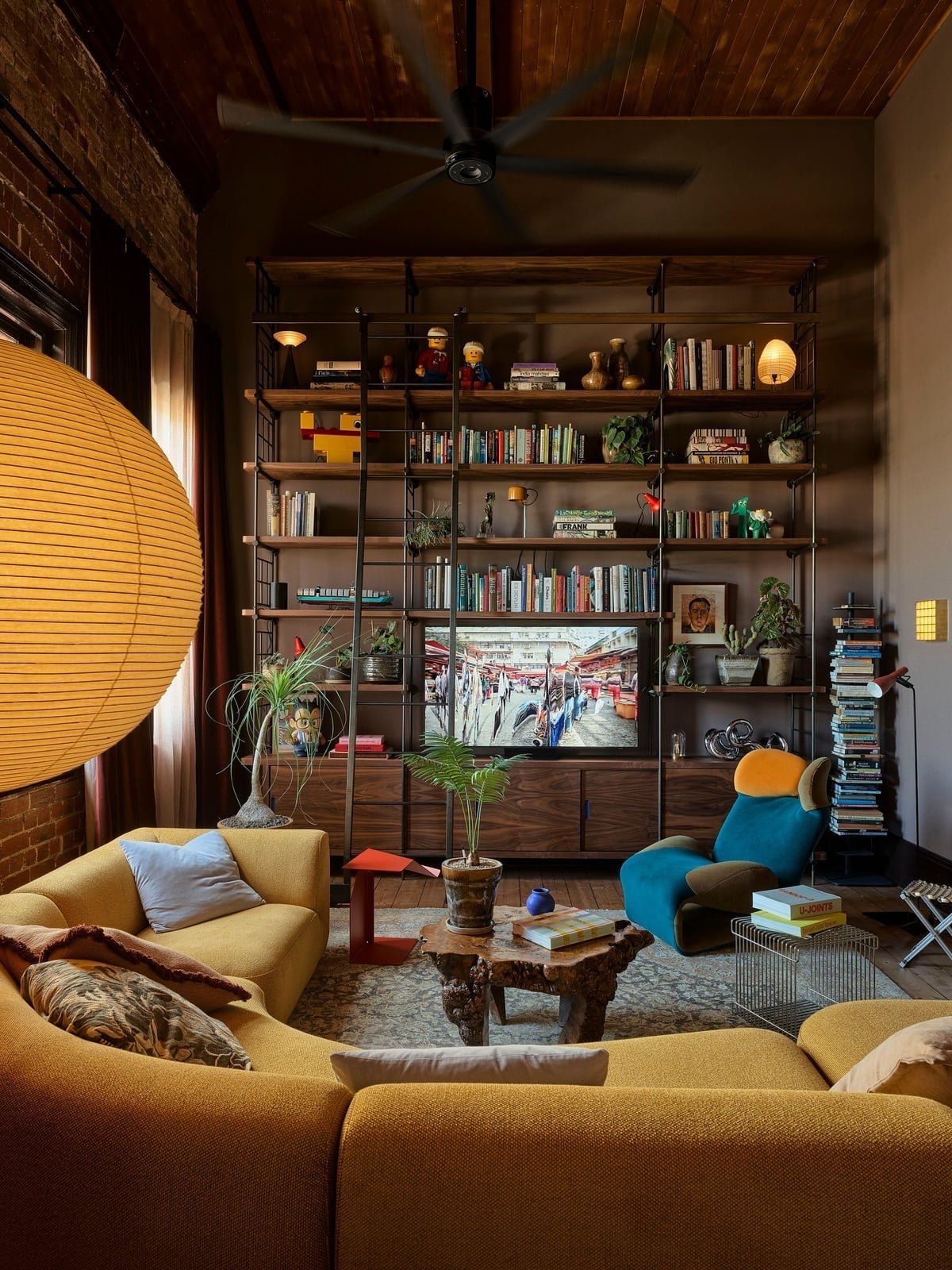
A large yellow orb lamp becomes the unexpected anchor in a room where brown and teal already do the heavy work. The palette here is brown, teal, yellow, and orange, with the brown coming from the sectional sofa and the bookshelf. The yellow lamp breaks the earthiness without overwhelming it. The metal and brick materials in the room add texture that keeps the warm tones from feeling flat. A wall sconce and table lamps layer the lighting, so the yellow lamp can stay as a focal piece rather than the sole light source.
Pink walls and yellow sofa for maximalist look
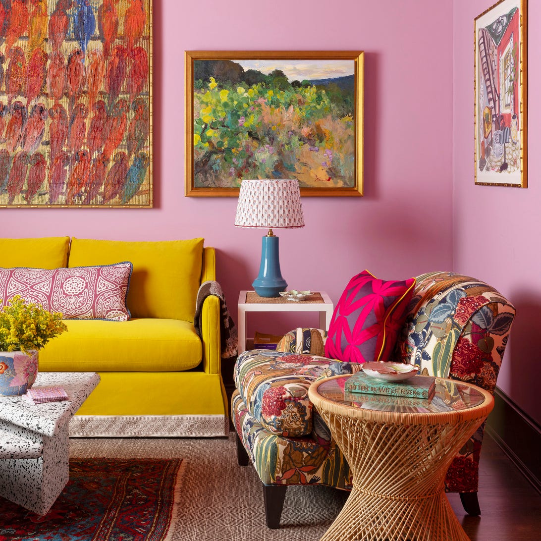
This is a room that commits to its colors. Pink walls and a yellow sofa set a high-energy base, and the patterned armchair adds another layer without clashing. The key is that the floral armchair pulls in shades from both the walls and the sofa, so it looks part of the family. The rattan side table and terrazzo coffee table provide neutral breaks in texture and material. A table lamp on a small surface keeps the lighting focused. In a compact layout like this, the rule is to let one piece carry the pattern and let the rest follow in solid tones.
Travertine coffee table with peacock artwork
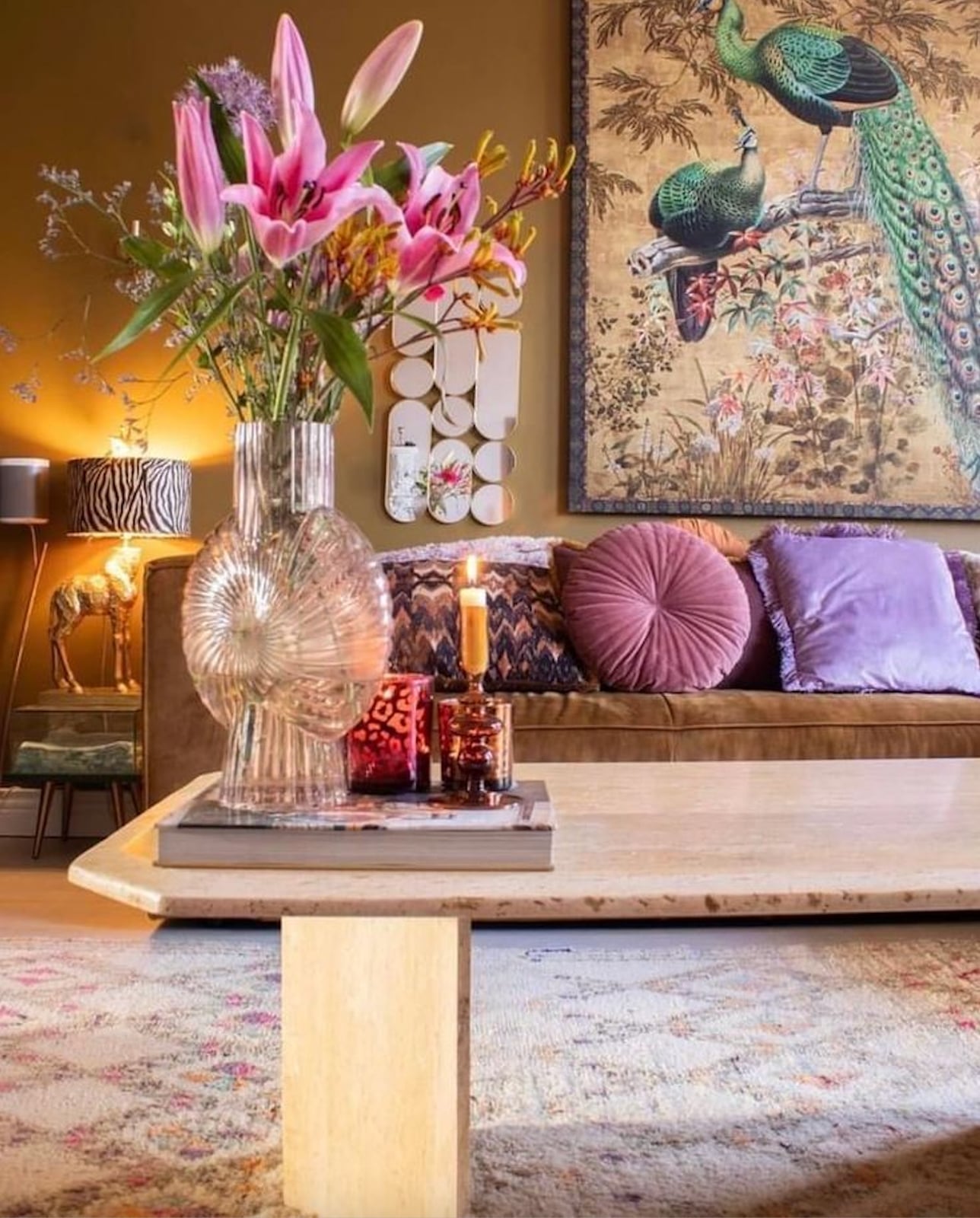
A coffee table works best when it anchors the seating without blocking the view. In this eclectic living room, a travertine coffee table sits between a brown velvet sofa and a large peacock artwork, tying the earthy palette of brown and gold to the vibrant pink, purple, and green in the art. The glass vase on the table adds a light, airy touch, while ambient lamp and candle light soften the whole scene.
The key to this look is letting the coffee table act as a bridge between the bold wall art and the neutral sofa. The travertine material brings natural texture that keeps the bright colors from feeling overwhelming. A rug underneath defines the seating zone, making the layout feel cohesive and grounded.
Farmhouse living room vignette with green plant and white planter
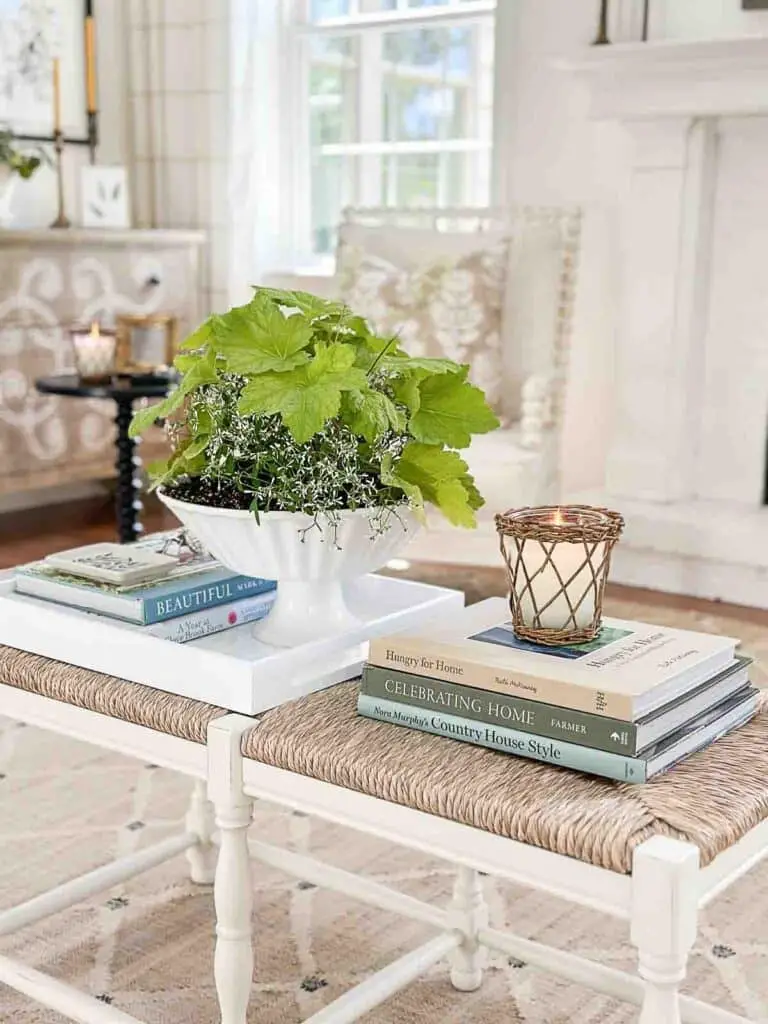
A green plant in a white ceramic planter sits at the center of a farmhouse coffee table vignette, surrounded by a stack of books, a woven candle holder, and a white tray. The light highlights the beige and white palette, with touches of blue in the books. This arrangement uses simple materials like wood and woven fiber to create a calm, balanced display that feels lived in without being cluttered.
Modern kitchen nook with red island and blue pink walls
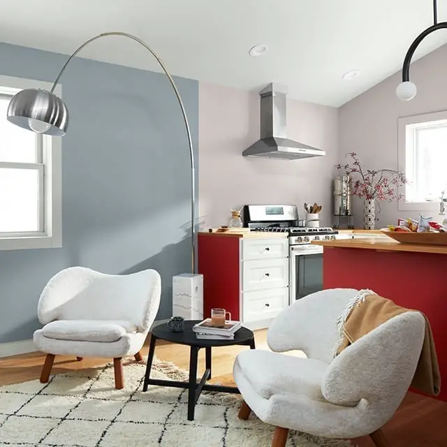
A bold red kitchen island anchors this modern open-plan space, while the walls in blue and pink create a playful backdrop. Two boucle chairs sit by a small black coffee table under an arc floor lamp, with natural light from the side balancing the overhead lights. The mix of wood, marble, and metal finishes keeps the vibrant palette grounded. The rule here is to let one strong color, like the red island, lead, and use softer shades on the walls to avoid visual chaos.
Rust and purple accents on neutral palette
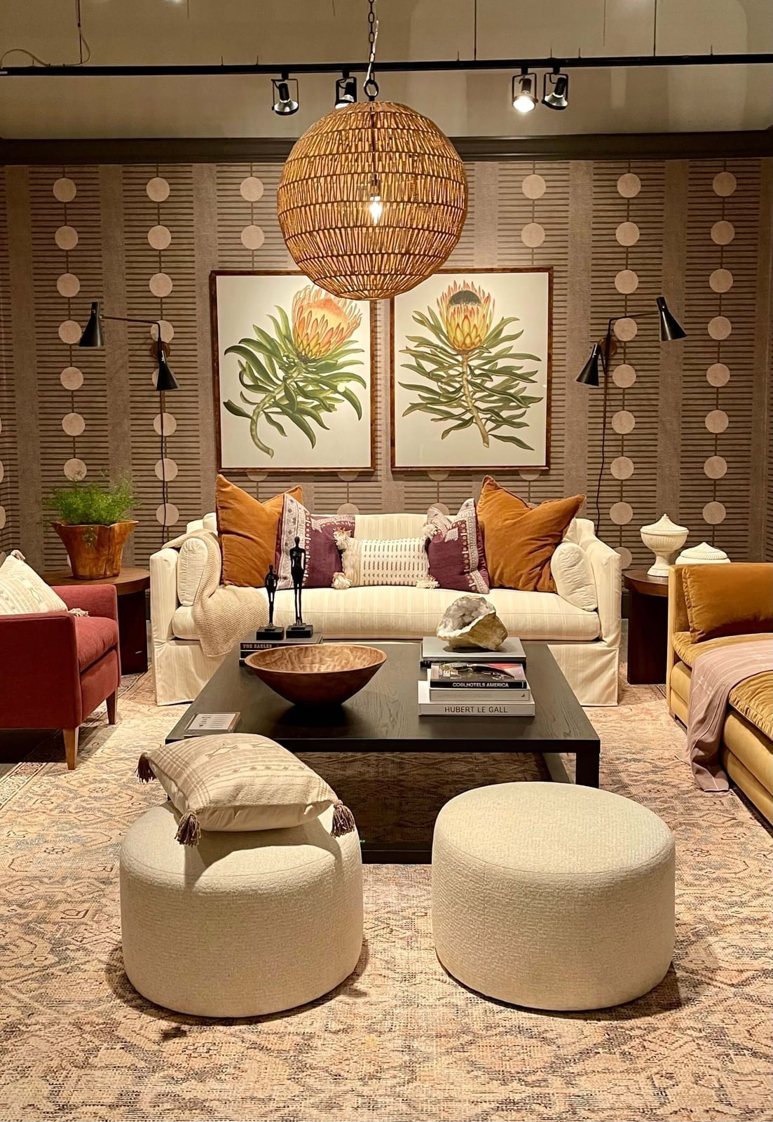
Some palettes aim for harmony, but this eclectic living room proves that contrast can be just as cohesive. A beige and cream neutral base gets energy from rust and purple accents scattered across the sofa, ottomans, and artwork. A large woven pendant light hangs above the coffee table, with wall sconces and track lighting adding layers of illumination.
Keep the neutral backbone solid so the rust and purple feel like deliberate pops. The rattan and linen textures soften the bold hues, making the room feel warm instead of jarring. This approach works well for anyone who wants a lively space without committing to a full saturated scheme.
Traditional living room with dark blue walls and patterned armchair
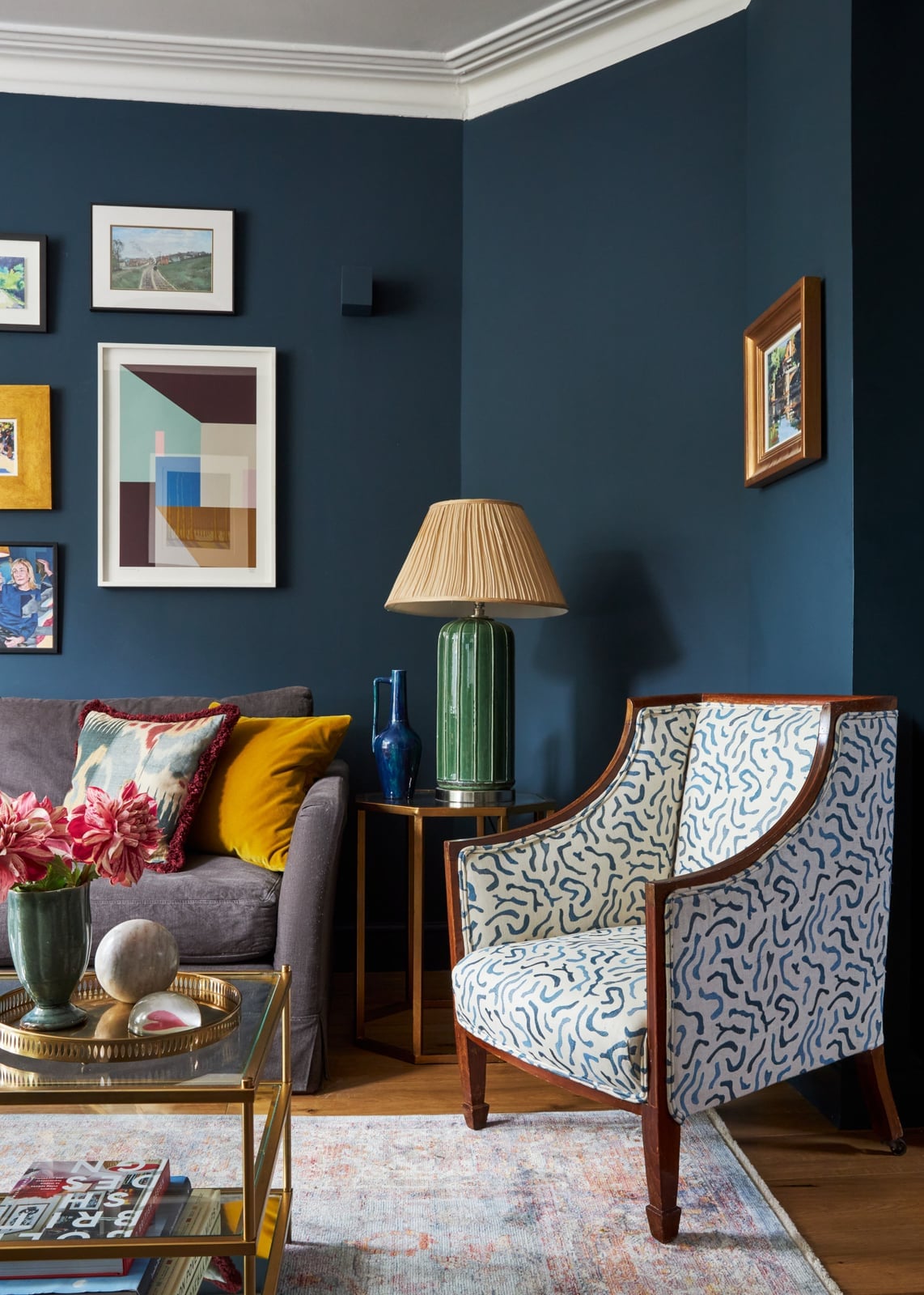
A patterned blue and white armchair with a yellow cushion stands out against dark blue walls in this traditional living room. A dark sofa, brass coffee table, and a side table with a lamp complete the corner seating arrangement. The muted rug ties the darker tones together, while the table lamp and ambient natural light keep the room from feeling too heavy. The mix of patterns and solids creates depth without needing extra clutter.
Deep purple accent wall above white fireplace
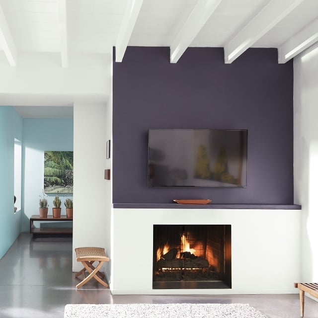
This living room goes bold with a deep purple accent wall that wraps the fireplace and stretches upward, while the fireplace itself, the built-in surround, and the mantel stay crisp white. The dark wall anchors the space without making it feel closed in, partly because the rest of the palette sticks to white and light blue, and partly because the fireplace glow and natural light keep the purple from looking heavy. What defines this look is the ratio: one saturated wall against a mostly neutral room, with the white fireplace acting as a visual break. The style works because the purple has a clear job, not competing with the wood stool and bench that add warmth nearby.
Vibrant paint swatches for trendy 2027 color inspiration
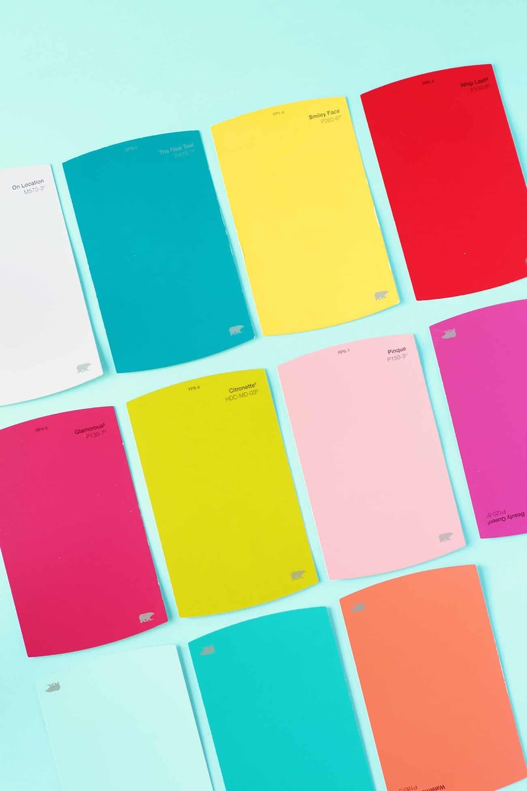
A full paint deck might feel like a practical tool, but this spread of vibrant paint swatches treats color selection as its own design moment. The swatches fan out across the surface in teal, yellow, red, pink, lime green, light pink, light blue, and coral, along with a few white cards that give the eye a place to rest. The arrangement is scattered rather than ordered, which makes the palette feel playful and open-ended rather than prescriptive.
For renters who can’t paint entire rooms, a color swatch fan like this one works as a pinboard or desk accessory that keeps the 2027 palette visible without commitment. The mix of brights and pastels on paper shows how saturated and soft tones can sit side by side, a trick you can borrow when choosing throw pillows or art for a neutral rental.
Terracotta sofa with peach walls and patterned rug
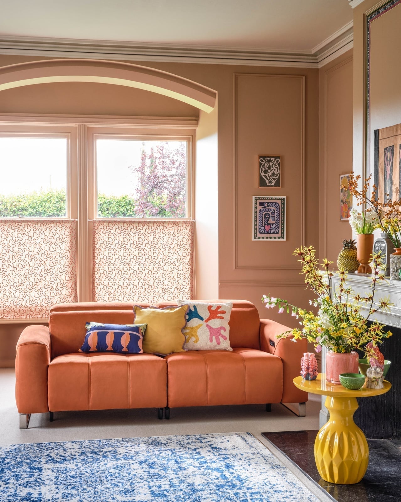
A terracotta leather sofa faces the windows in this living room, with peach walls and a patterned rug that brings in yellow, blue, and white. The sofa is the clear anchor here, its warm leather finish grounding the softer peach on the walls. A yellow side table sits next to the fireplace, adding a second warm accent without crowding the scheme. The style breaks the expected neutral sofa rule by letting the terracotta carry the room, while the rug’s pattern keeps the layered palette from feeling flat.
Eclectic living room with teal walls and pink coffee table
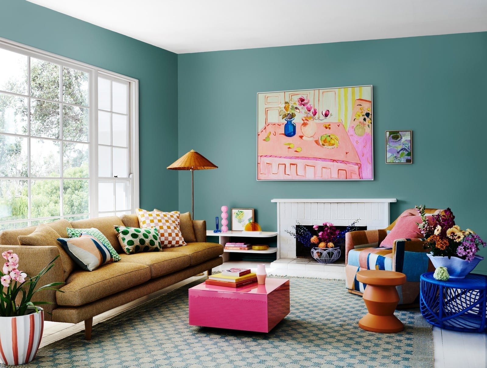
Teal walls and a pink coffee table set the tone in this living room, with a brown sofa and a blue rug adding weight to the scheme. The pink coffee table is the unexpected piece here, and it works because the teal walls are deep enough to hold their own against a bright accent. A floor lamp and side tables in wood and metal keep the look from tipping into overly coordinated territory. The sofa faces the coffee table, with an armchair off to the side, so the layout keeps the pink table as the functional center without letting it float visually.
Color swatch fan offering diverse trendy palettes for 2027
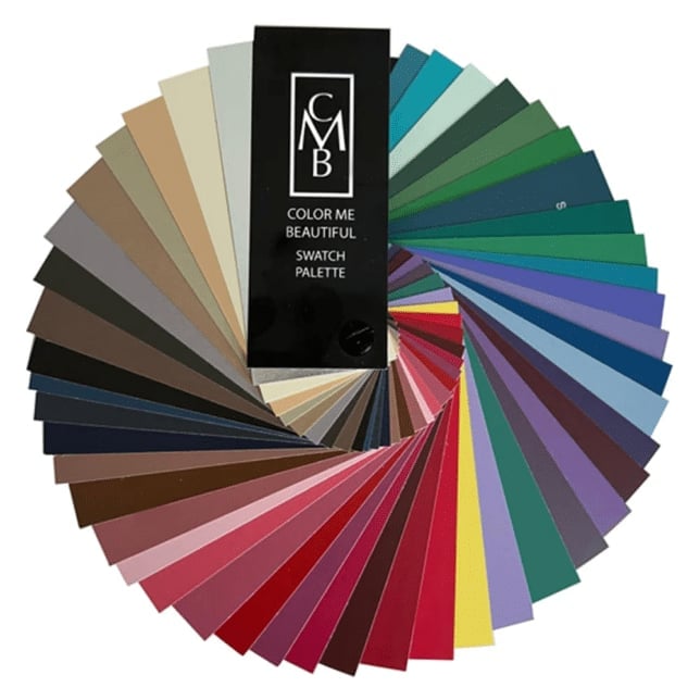
A single paint chip can feel limiting, but a color swatch fan that fans out into a circular arrangement shows the range of 2027 palettes in one glance. This fan moves through neutrals, earth tones, jewel tones, pastels, and brights, with each card slightly overlapping the next so you see how the groups relate. The studio lighting keeps the colors true, which matters when you’re comparing a muted earth tone next to a vivid jewel shade.
For anyone who tends to pick one palette and stop, a swatch fan like this encourages you to borrow from multiple families. The circular layout makes it easy to hold up individual cards against fabric or furniture, so you can test how a pastel reads next to a bright without committing to a full gallon of paint.
Final Thoughts
The best takeaway from these 30 palettes is that trendy color in 2027 is about confidence, not perfection. You can start small with a painted ceiling or a single velvet sofa, then layer in complementary accents over time. The rooms that feel most current are the ones where the owner clearly chose colors they enjoy living with, not just what looks good in a swatch. Let that be your guide and the rest will follow naturally.