Your front door is the first thing anyone sees, and 2027 is all about making it count. We’ve rounded up 27 cute front door colors that range from classic deep blues to unexpected vibrant oranges, each with a practical tip to help you pull off the look.
Whether you’re refreshing a brick colonial or a farmhouse porch, these ideas show how a single coat of paint can transform your home’s personality. Get ready to find a shade that feels like you, with real-world examples that prove curb appeal doesn’t have to be complicated.
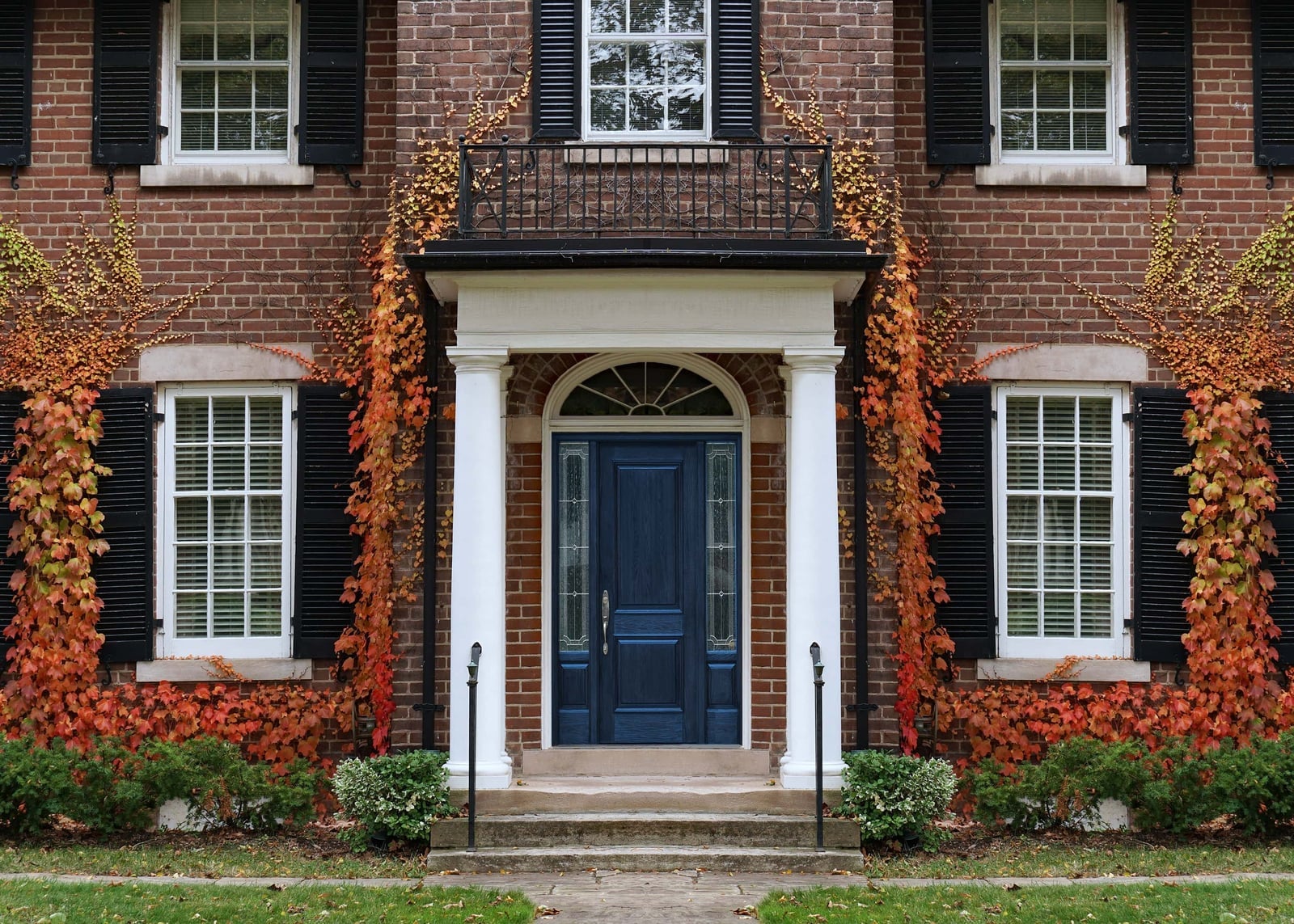
Deep blue front door with traditional brick home charm
A deep blue door against warm brick looks a palette done in thirds: one part dark pigment, two parts earth tone. The white columns and black shutters frame it without competing, and the arched window above lets the color hold the center. This is a style that leans on contrast rather than matchy-matchy, so the green shrubs and orange flowers become punctuation, not clutter. What defines it is the ratio of deep to light, and what breaks it is adding another saturated color to the brick or trim.
Vibrant blue door on a rustic stone porch
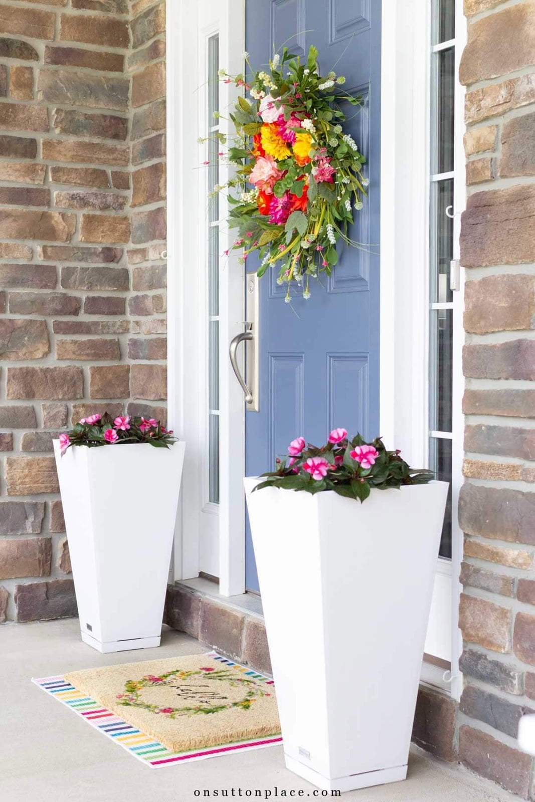
This look works because the blue door is the only saturated note. The stone walls, beige doormat, and white planters stay quiet, so the color looks deliberate rather than loud. A floral wreath in pink and green keeps the palette from feeling cold, and the two planters in white match the door frame instead of the stone. The ratio of blue to neutral is about one to four, which is a useful starting point for anyone trying a bold shade on a small porch.
Warm yellow walls and patient dog waiting
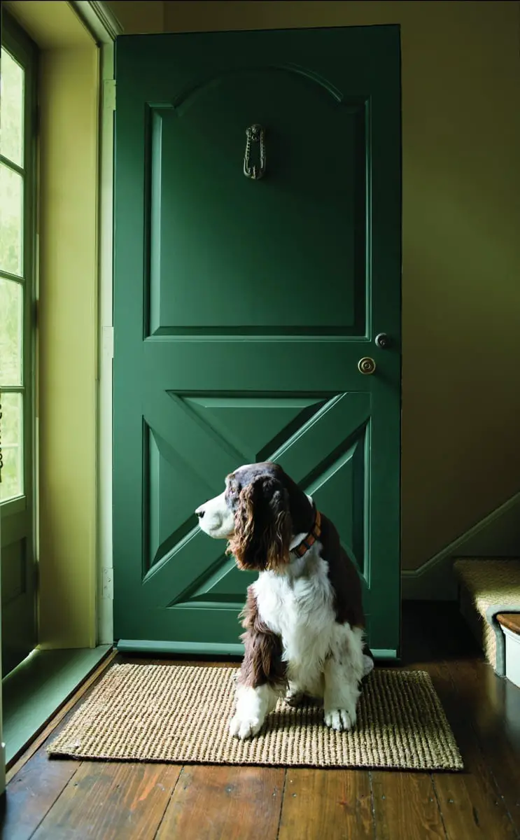
How do you make a dark green door feel inviting? The answer here is the wall color. The pale yellow walls warm up the deep green and keep the entryway bright. Light bounces off the yellow and hits the door, so the green looks rich. The doormat in woven natural fiber adds a textured layer that breaks up the smooth painted wood and metal. A wooden floor keeps the whole thing grounded. If your entryway gets good daylight, a warm wall color can make a dark door feel like a feature instead of a block.
Light blue door with brass accents on a brick facade
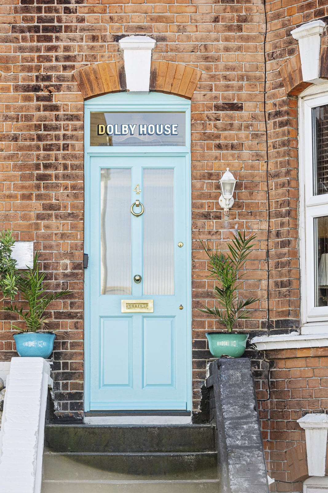
The wall lantern casts a warm glow on this light blue door, which is a good trick for a shade that can look icy in direct sun. The brass door knocker and letterbox pick up that warmth and connect the door to the brick red of the facade. The potted plants in green add a natural note that keeps the palette from feeling too curated. For a light blue door, brass hardware is a practical choice because it bridges the cool paint and the warm brick without adding another color.
Olive green double doors with bee knocker detail
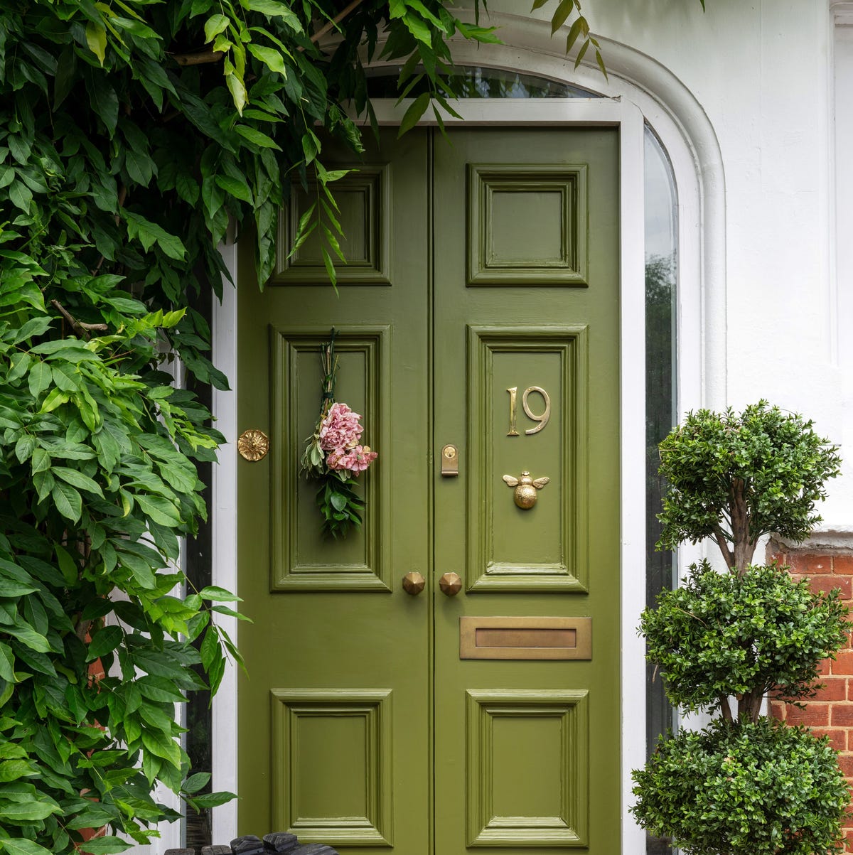
Treat double doors as a single unit, not two separate pieces. Here the olive green forms one color block, and the gold bee knocker and house number sit in the same visual line. The hanging flowers and topiary tree flank the doors without crowding them, which keeps the entrance feeling open. The brick path and porch floor stay neutral so the green and gold hold the attention. If you have double doors, choose one hardware finish and repeat it across both leaves for a unified look.
Tall green ferns frame cream siding
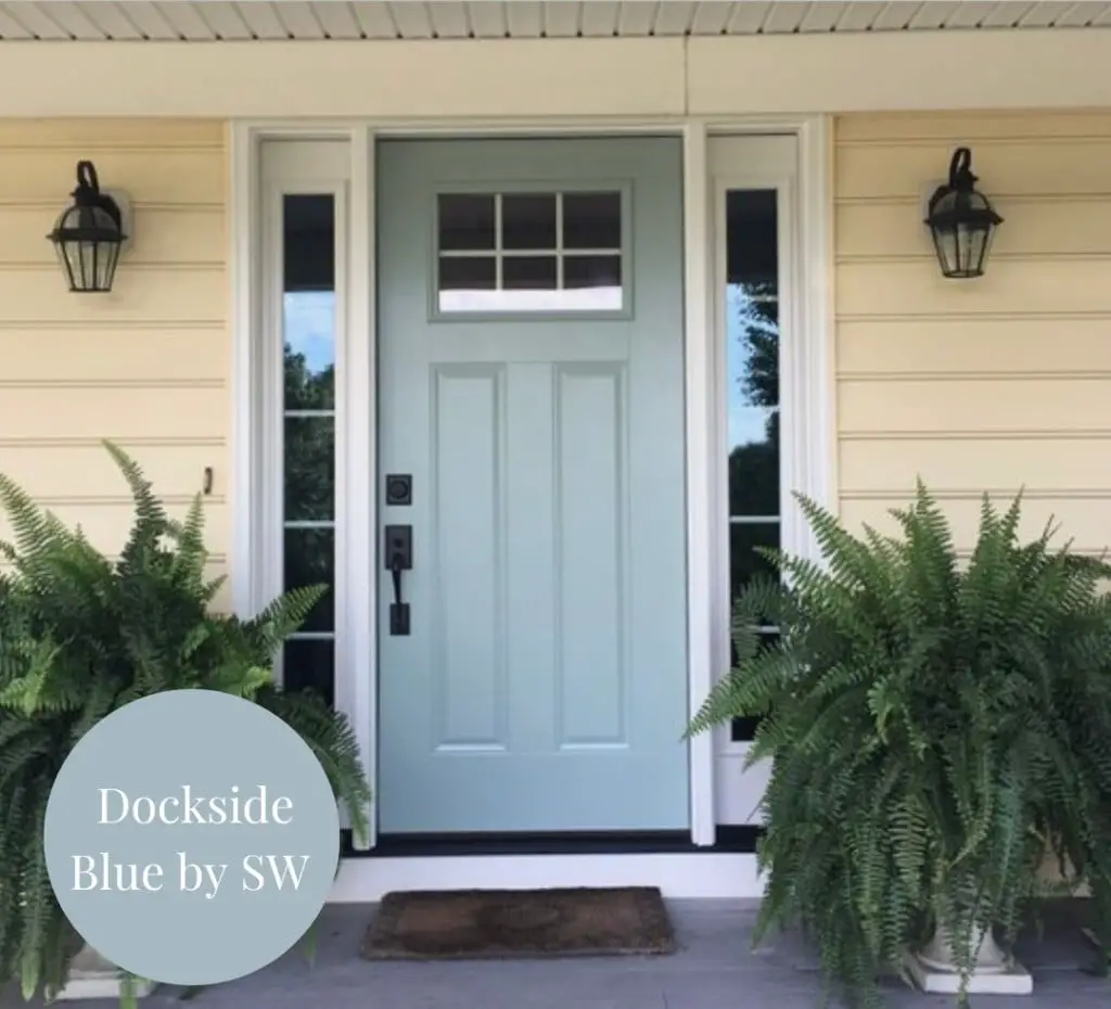
A light blue door with grid windows is a friendly alternative to the navy or cobalt you see on every block. This version reads softer against cream siding, so the porch feels open rather than closed in. The centered door and sidelights keep the layout symmetrical, which makes the entry feel settled even when you swap out seasonal plants. Tall ferns in simple pots add height without blocking the door itself. Wall sconces on either side echo the vertical line of the ferns, pulling the eye up rather than just across the doormat. The palette works because the blue is muted enough to sit next to black hardware and a stone floor without clashing. What defines this look is the ratio of color to neutral: one painted element against cream, green, and gray. The black doormat and lanterns break the softness just enough to keep it from going saccharine.
Dark green door with festive fall wreath
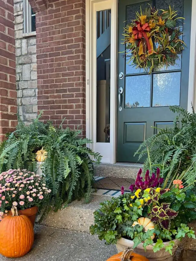
A dark green door holds its ground against brick and stone because the shade is deep enough to look a neutral. The fall wreath brings in orange, pink, yellow, and burgundy, which are colors that would fight a red door but feel lively against green. Potted ferns and mums flank the entrance, and small pumpkins sit at the base. For a renter, this is a low-commitment way to test a color family: the door itself stays, and the seasonal layers do the work. A dark wreath hanger in a matching metal keeps the hardware consistent without a permanent change.
Mint green door in a cheerful cottage setting
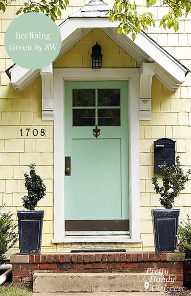
Mint green on a front door looks cheerful without being loud. Against a yellow cottage exterior, the cool tone balances the warmth, and white trim keeps both colors from feeling heavy. The black mailbox and lantern light fixture add the contrast that stops the palette from floating away. This is a palette that works because the mint is the only cool color in view: the brick, the yellow siding, and the terra-cotta pots all lean warm. What defines the cottage style here is the proportion of door to porch. The centered door with planters on either side creates a compact, symmetrical front that suits a smaller footprint. The black metal breaks the pastel effect, keeping the look from tipping into nursery territory.
Striking red door with ornate cream trim and urn planters
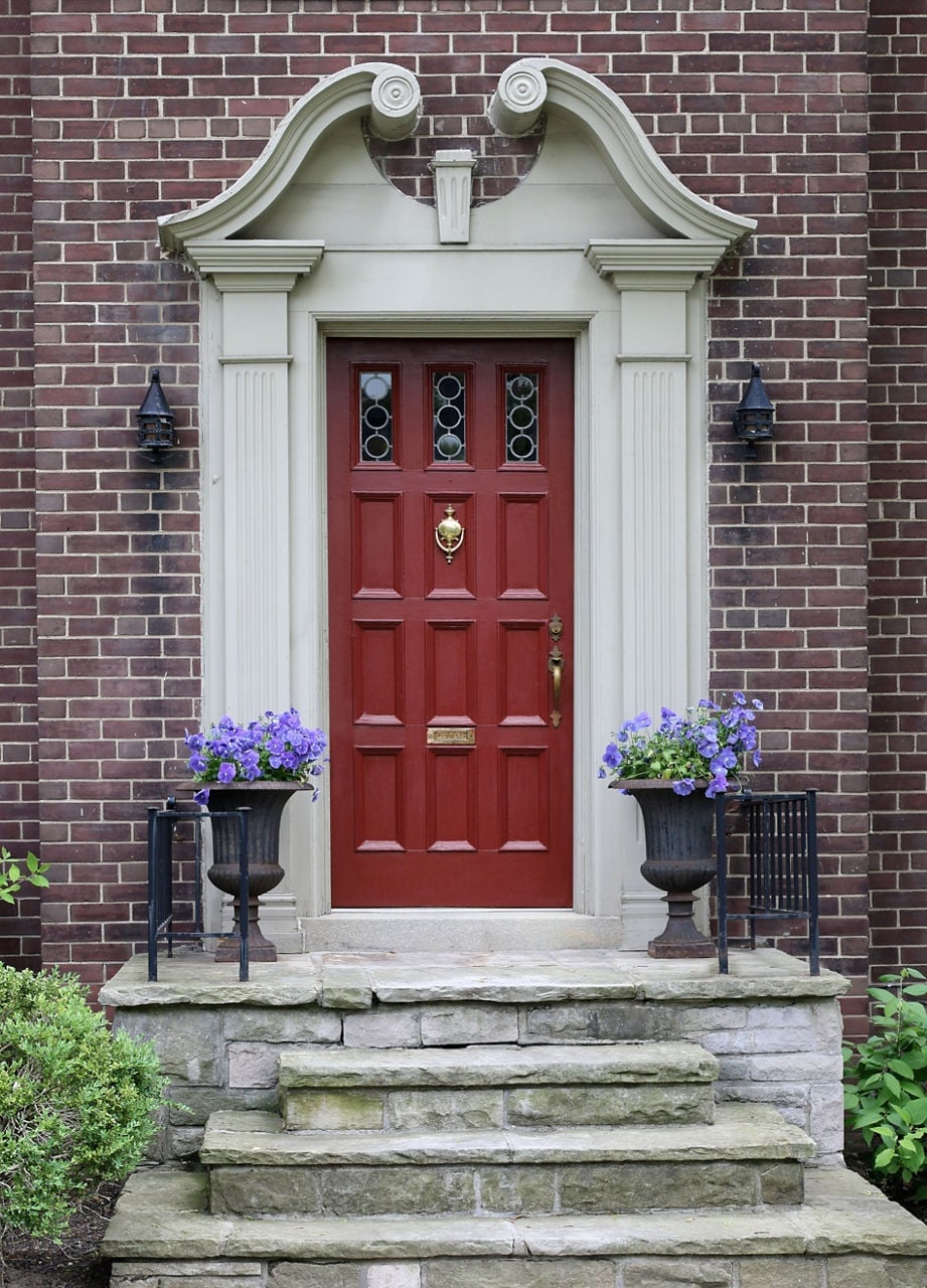
Can a red door look refined rather than loud? Yes, when the trim and materials do the work. This paneled red door sits against dark brick and cream ornate trim, with stone steps leading up to it. The cream trim echoes the stone underfoot, so the red feels anchored. Urn planters on either side add height and a formal line that matches the traditional style. Wall sconces frame the door at eye level, which helps the red appear deliberate. What makes this palette hold together is the use of dark brick as a backdrop. The brick absorbs light, so the red pops without glare. The metal planters and stone steps are all matte finishes, which keeps the gloss on the door from feeling out of place. If you want a red door that lands stately instead of flashy, pair it with heavy stone and a trim that matches the porch floor.
Welcoming beige front door with stately columns
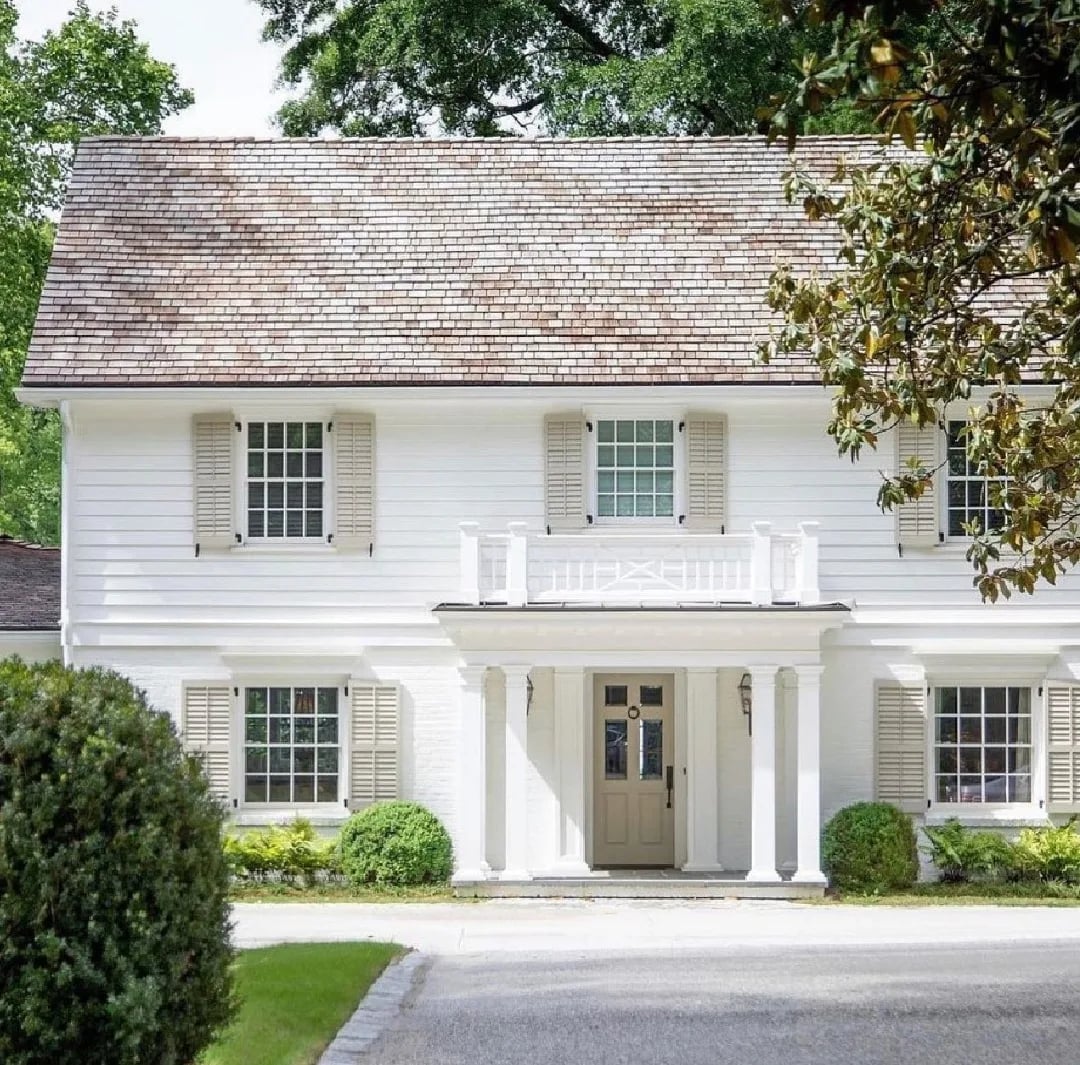
This entrance uses a beige door between white columns and flanking windows, with a balcony above and wall sconces at eye level. The scale looks roomy because the columns are wide enough to frame the door without crowding the windows. A beige door works here because it steps back visually, letting the architecture lead. The palette is beige, white, green from the landscaping, and brown from the brick and stone. The beige door is the softest element in the lineup, which makes the entrance feel approachable rather than imposing. What defines this look is the proportion of door to column: the columns are thicker than the door trim, so the entrance feels substantial without needing a bold color.
Classic blue door with teal overhang and brass lanterns
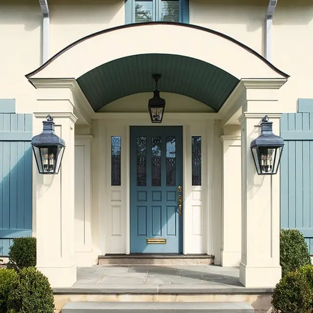
A front door becomes the focal point when its palette connects to the architecture around it. This traditional blue paneled door sits centered with sidelights, and the teal overhang above ties the entry to the porch ceiling. Brass hanging and wall lanterns add warmth against the blue, cream trim, and gray shutters frame the look on both sides. The palette ratio here leans heavily on the blue door, with teal and brass as supporting notes. Green foliage nearby keeps the color story feeling natural.
Red flowers add contrast to green door
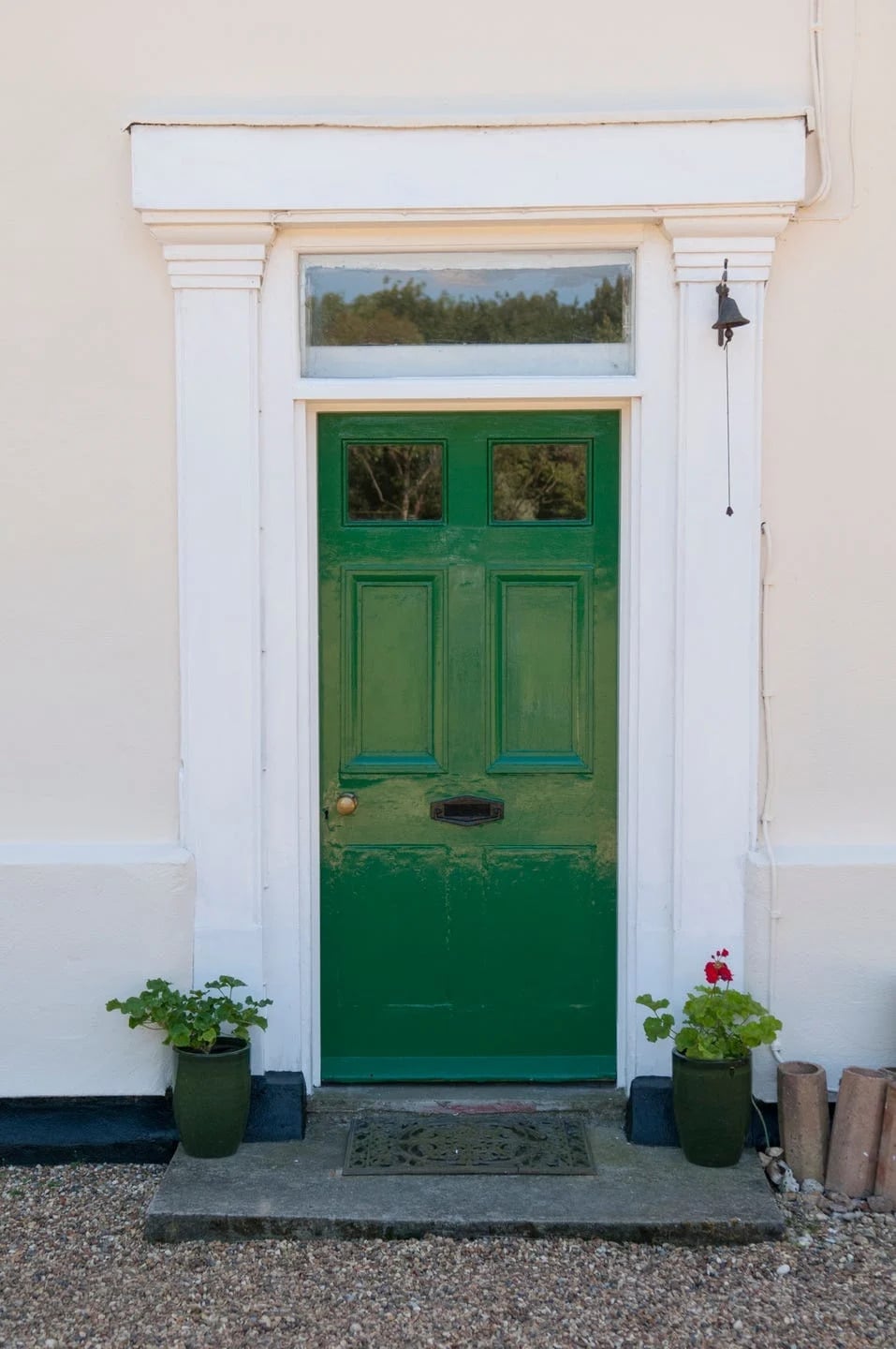
A vibrant green door could feel like too much color on its own, but this traditional entry proves the opposite. The green paneled door sits centered with flanking planters, and the white trim and cream stone keep the palette grounded. A doormat in a neutral tone and a small bell on the door add detail without clutter.
The real trick here is the red flowers in the planters. Green and red sit opposite each other on the color wheel, so the red blooms make the door pop without adding another competing hue. The compact porch keeps everything within arm’s reach, which makes this a smart approach for smaller entries. Gravel underfoot and stone walls reinforce the natural feel, so the palette avoids being too loud.
Green boxwood bushes frame teal door
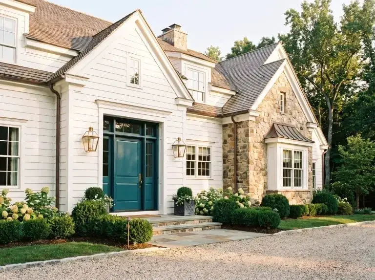
The teal door here pulls double duty: it stands out against the white farmhouse siding and stone steps, but the flanking boxwood bushes keep it from floating visually. Green boxwoods are a natural match for teal since both share blue undertones. The outdoor lanterns on either side of the door echo the warmth of the metal accents, while the gravel path leads the eye straight to the entrance. The palette is teal first, with white and stone as the quiet backdrop and green as the framing note.
Classic black door with marble steps and brass knocker
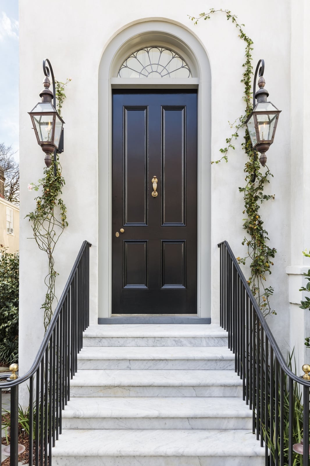
This black paneled door is the kind of classic that works on almost any traditional home. The marble steps and metal railings add a formal feel, while the arched transom window above the door lets in light and breaks up the dark mass of the door. Gas lanterns on both sides cast a warm glow that softens the black against the white trim. The brass knocker is a small detail that adds a neat finish without overdoing it. The materials here do the work: wood for the door, marble for the steps, metal for the railings and lanterns, and glass for the transom. Each one has a distinct role, and none of them compete.
Deep green door with dark gray shutters and brick exterior
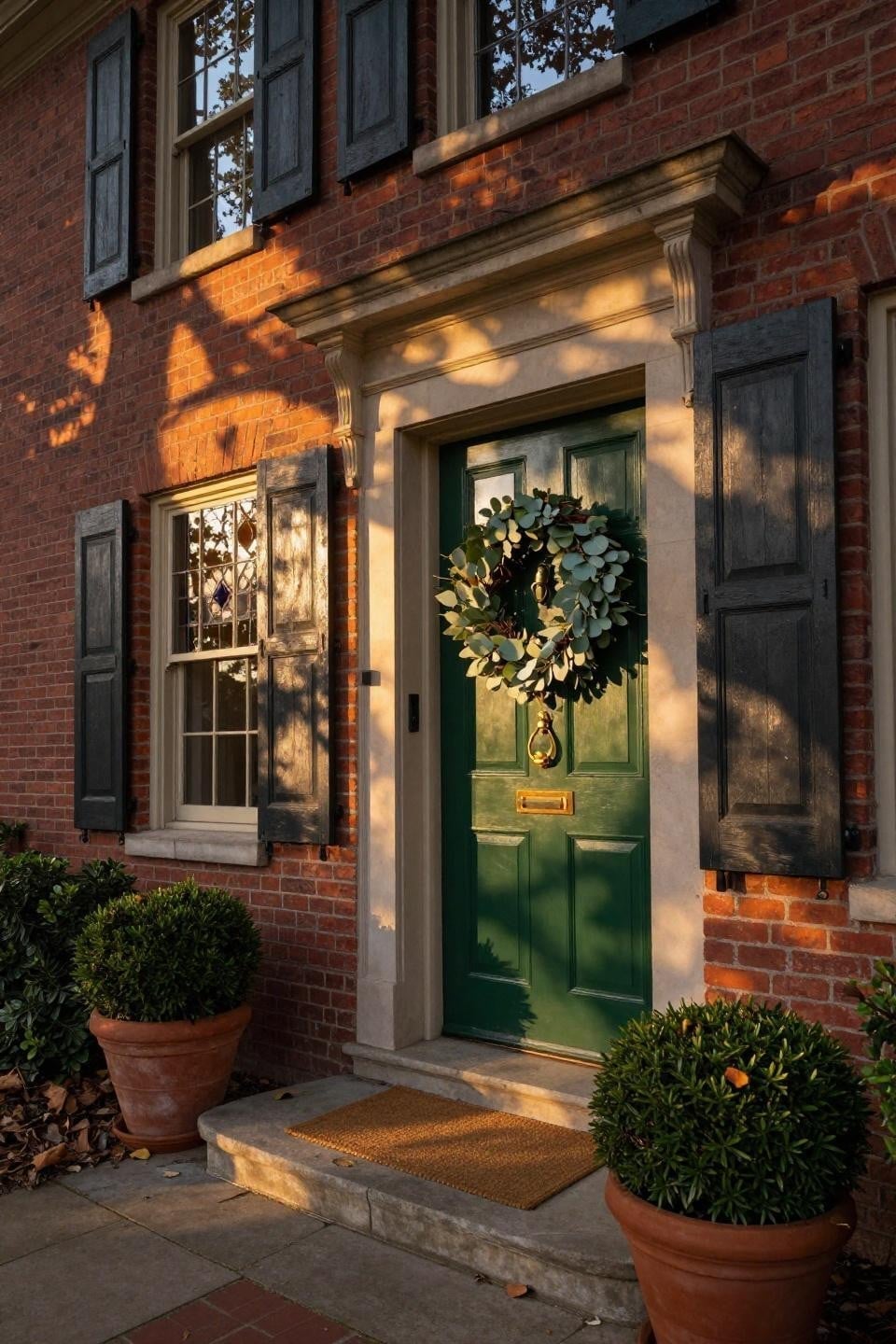
A practical rule for choosing a front door color is to look at the fixed elements you cannot change. Here, the brick exterior is a warm red tone, and the deep green door works because green and red are complementary. The dark gray shutters on the flanking windows add a neutral anchor that keeps the green from feeling too bold.
The wreath on the door and the terracotta pots on either side add texture without shifting the palette. Natural sunlight during golden hour warms up the brick and softens the green, which is a reminder that your door color will look different at various times of day. This entry feels compact but complete because every element supports the same palette story.
Sage green door with glass panes and flowering vine, close-up take
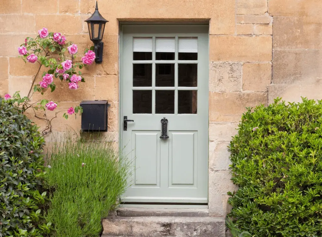
A sage green front door looks a softer alternative to olive or forest green, especially when paired with stone and pink flowers. The paneled door includes glass panes near the top, which let light pass through and keep the entry from feeling closed off. A flowering vine climbs the wall beside the door, adding a natural vertical line that draws the eye upward without needing a tall planter. Flanking bushes frame the door symmetrically, while a black wall lantern and mailbox provide the contrast that keeps sage from looking washed out. The palette here is three parts muted green to one part warm pink, with black accents as the anchor. What breaks the scheme is the vine itself: it introduces an organic curve against the straight lines of the door and siding, which prevents the look from feeling too rigid.
Taupe door with sidelights on a farmhouse porch and lantern sconces
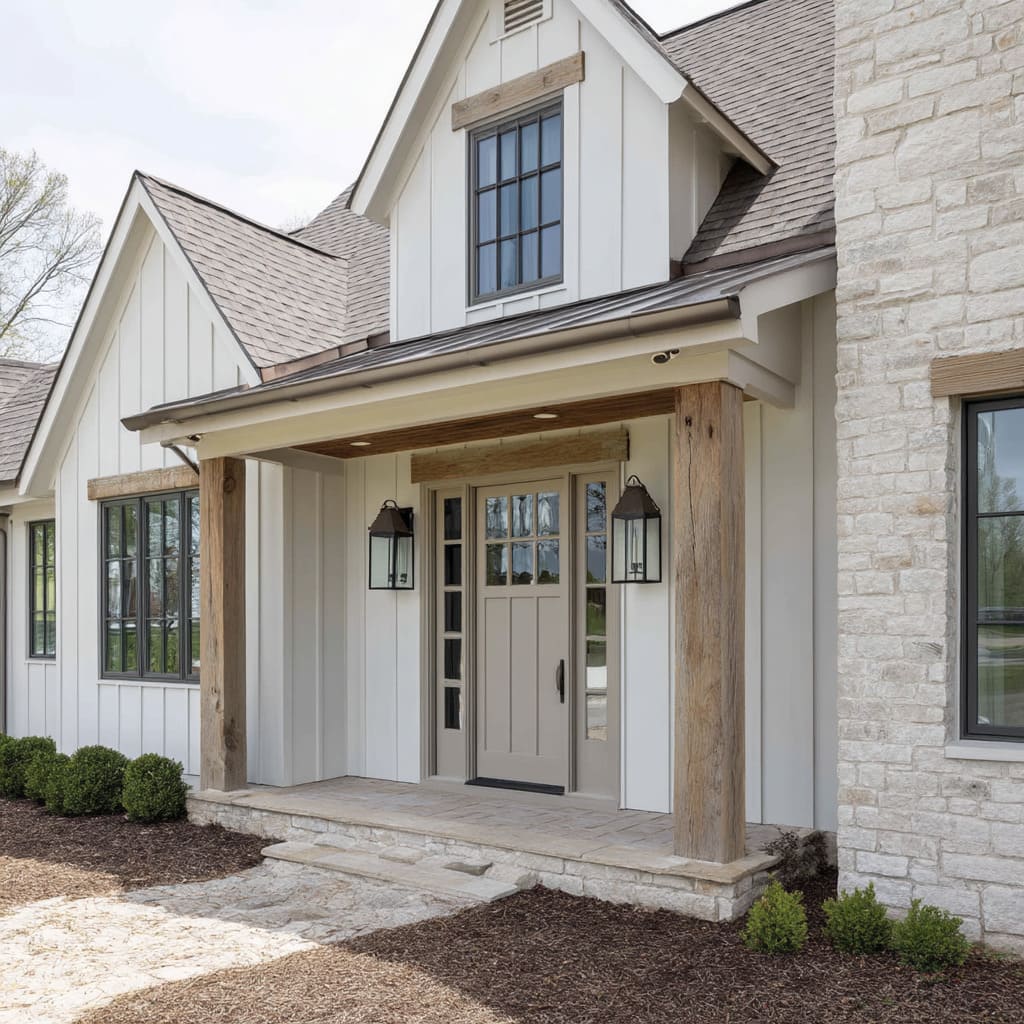
For a neutral front door, choose a taupe that sits between the white trim and the natural wood tones in the porch. Here the taupe paneled door includes glass sidelights on both sides, which make the entrance feel wider and let light into the entryway without sacrificing privacy. The covered porch keeps the door shaded, so the taupe appears as a warm gray. Lantern sconces on both sides of the door add symmetry and provide light for evening arrivals. The stone steps extend the neutral palette underfoot and connect the porch to the ground. For a renter friendly swap, you can achieve a similar taupe effect by applying a removable door wrap in a matte finish. The key is matching the undertone to your existing trim: a taupe with gray undertones works with white and cool stone, while a taupe with yellow undertones pairs better with warm brick or wood.
Yellow and white wreath on brown door with wall sconces
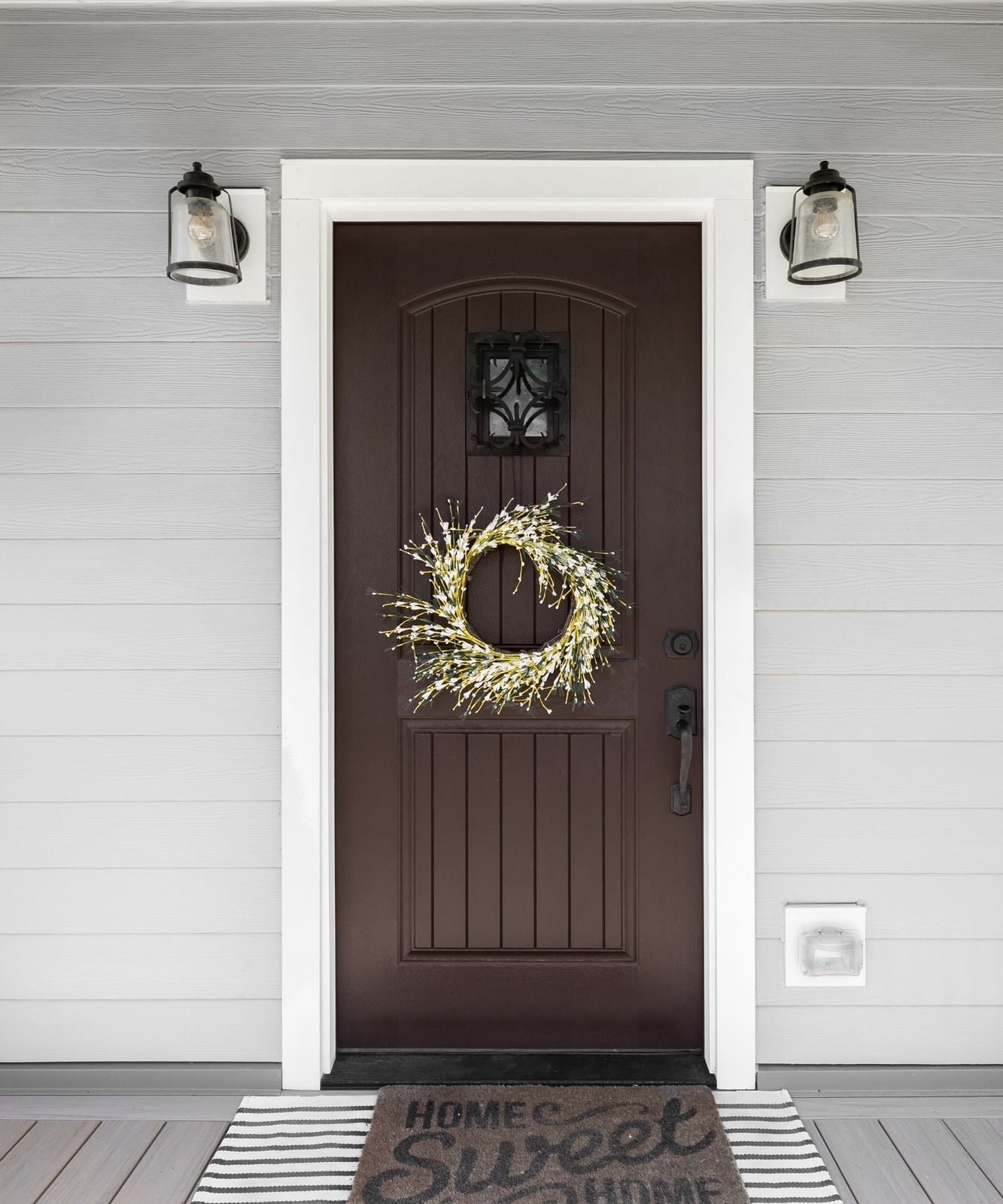
A dark brown front door can feel heavy next to white siding, but a yellow and white wreath changes the equation entirely. The wreath introduces a warm, bright focal point that draws the eye to the center of the door, while the brown recedes into the background and acts as a frame. This is a useful trick for a dark door that might dominate the facade: let the decor do the talking. The door itself is a solid wood paneled style with a single glass pane near the top, and the wreath hangs at eye level so it becomes the main event. Wall sconces on both sides cast light on the wreath after sunset, keeping the yellow visible even in low light. A gray doormat at the threshold adds a neutral layer that stops the brown from feeling too warm against the white siding.
The brown here works because the palette stays clean. White siding and trim keep the background bright, while the gray doormat and green foliage in the wreath add contrast without competing. The ratio is roughly one part brown door to two parts white exterior, with the yellow wreath taking up a small but powerful third note. The yellow is the only saturated color in the composition, so it appears deliberate. If you swapped the wreath for a neutral one, the brown door would feel heavier and the entry would lose its cheerful note.
Purple flowers add color to teal door, close-up take
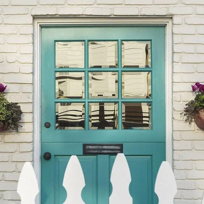
A teal front door against white picket fencing creates a cottage palette that leans cool, so the purple flowers in the potted plants do two things at once: they add warmth and they create a complementary color pair pulled from a garden. The centered door and flanking planters keep the layout compact, which makes the porch feel wider than it is. The style here is defined by a two-to-one ratio of cool to warm: two parts teal and white, one part purple and green. The wood door and brick steps break the palette by introducing natural texture, which keeps the whole look from feeling too neat.
Seashell knob on light blue door, close-up take
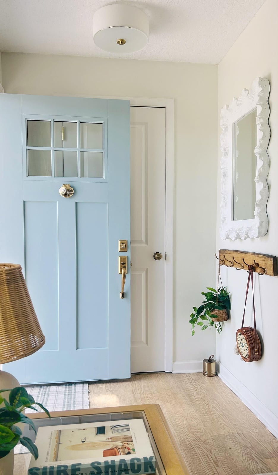
A light blue front door with a seashell knob is a coastal entry that does not need a single stripe or anchor print to sell the look. The door includes a window panel, which lets natural light into the compact entryway, and the brass knob with a seashell detail sits at the right height for the door’s proportions. The white mirror on the wall opposite the wooden coat rack doubles the light and makes the narrow space feel wider. What defines this style is the ratio of materials: one part brass and rattan to three parts painted wood and white wall. The coffee table book on the entry table breaks the symmetry and keeps the coastal theme from looking a theme at all.
Gray traditional door with brass hardware and pilasters
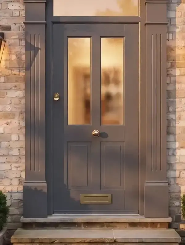
A dark gray front door works best when it has company. Here the paneled wood door sits between two pilasters, which give the entrance a formal anchor without needing a full portico. The brass mail slot and doorknob add warmth against the cool gray, while the brick surround keeps the look grounded. An outdoor lantern mounted beside the door provides evening light without overwhelming the facade. This setup suits a home where the entry is visible from the street but not the main event. The pilasters frame the door visually, so the eye lands on the brass details and not the expanse of brick. For a similar effect, choose a gray with enough pigment to hold its own next to red brick. A flat or satin finish helps the door recede slightly, letting the hardware catch attention.
Black farmhouse door with glass pane and topiaries
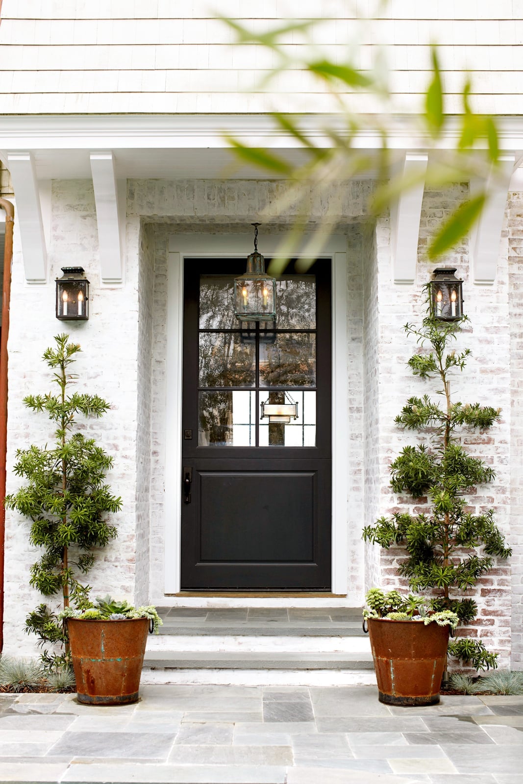
A black front door set against white brick creates immediate contrast. Here the door includes a single glass pane, which breaks up the dark surface and lets light pass through. Symmetrical topiaries in pots flank the entrance, while a hanging lantern and two wall lanterns provide layered outdoor lighting. The copper pot on the step adds a warm metallic note that keeps the black from feeling flat. This layout works because the plants and lights mirror each other, creating a balanced approach that guides visitors to the door. For a compact porch, repeating elements on both sides makes the space feel wider without adding square footage.
Pumpkins and flowers decorate blue door
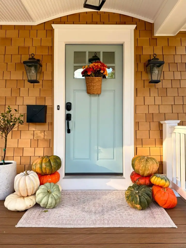
A light blue door can handle seasonal decor without losing its identity. Here pumpkins in graduated sizes flank the door, while a hanging basket with flowers and greenery softens the transom area. The wicker rug at the threshold anchors the entry and catches dirt before it reaches the interior. Lanterns on each side of the door echo the metal of the mailbox and provide consistent lighting. Keep the decor proportional to the door. Stacked pumpkins that reach about a third of the door height feel placed with care. If you swap out decor by season, choose a door color that works with warm autumn tones and cool spring greens alike.
Teal double doors with stone urn planters
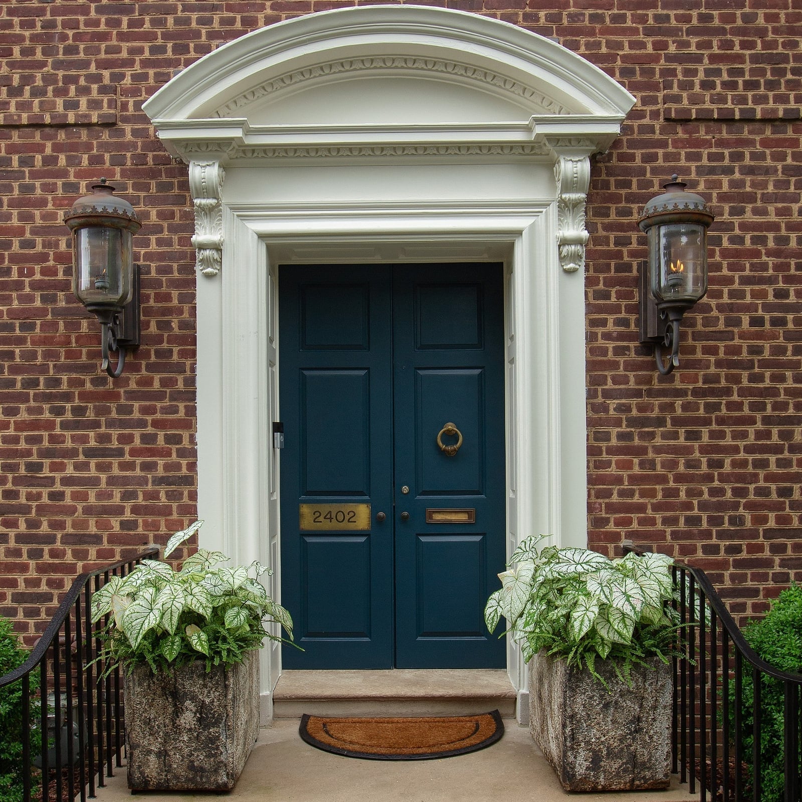
Teal double doors can work with coastal or traditional styles depending on what surrounds them. Here the teal is set against red brick, with white trim and brass sconces on each side. The stone urn planters flanking the entrance add height and permanence, while a coir doormat bridges the gap between the brick floor and the door. The symmetry keeps the look grounded. The planters match, the sconces match, and the double doors themselves create a balanced focal point. If you want teal but worry it might lean too casual, pair it with traditional materials like brick and stone instead of shingle or lap siding. The brass hardware and warm white trim pull the look toward classic styling.
White farmhouse door with lavender hanging basket
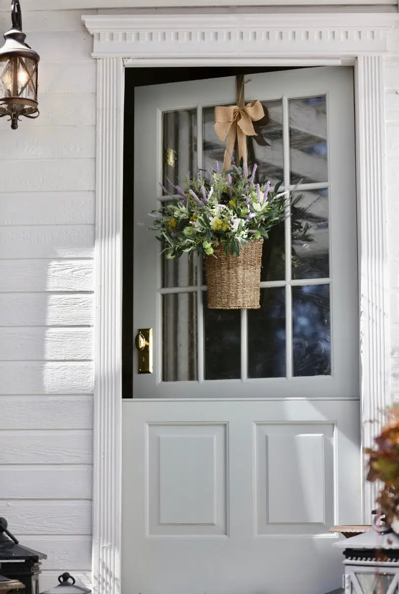
A white paneled door relies on texture and accessories for personality. Here a hanging basket filled with lavender and greenery hangs from a bracket above the door, while a lantern on the wall provides a warm glow against the white siding. The basket introduces vertical interest and a soft purple tone that contrasts with the green foliage. What makes this arrangement work is the simplicity. The door has no extra trim or sidelights, so the basket becomes the focal point without competing with architectural details. For a similar look, choose a hanging basket with a mix of upright and trailing plants to fill the space above the door. A burlap or natural fiber liner keeps the look casual and farmhouse appropriate.
Vibrant orange door with yellow siding and potted plant
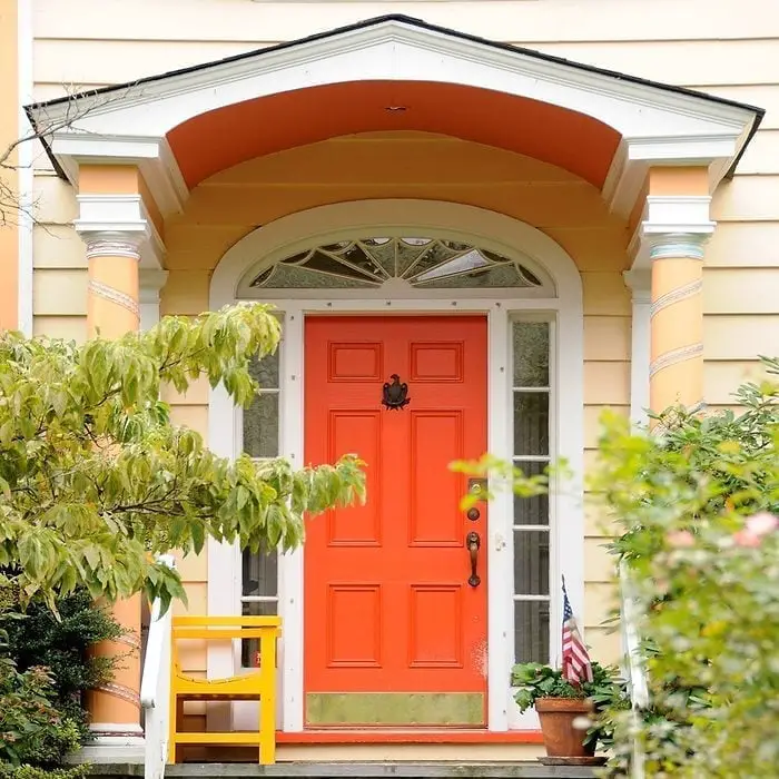
An orange front door against yellow siding is a bold palette choice that feels cheerful, not chaotic. The key is keeping the porch simple: a white chair and a green potted plant ground the warm tones without competing. The ratio of orange to yellow works because the door is the hero element and the siding acts as a bright backdrop, not a second focal point. What breaks the look would be adding another strong color like red or purple in the same space. Stick to neutral or green accents, and let the door carry the energy.
Modern black door with olive trees and integrated lighting
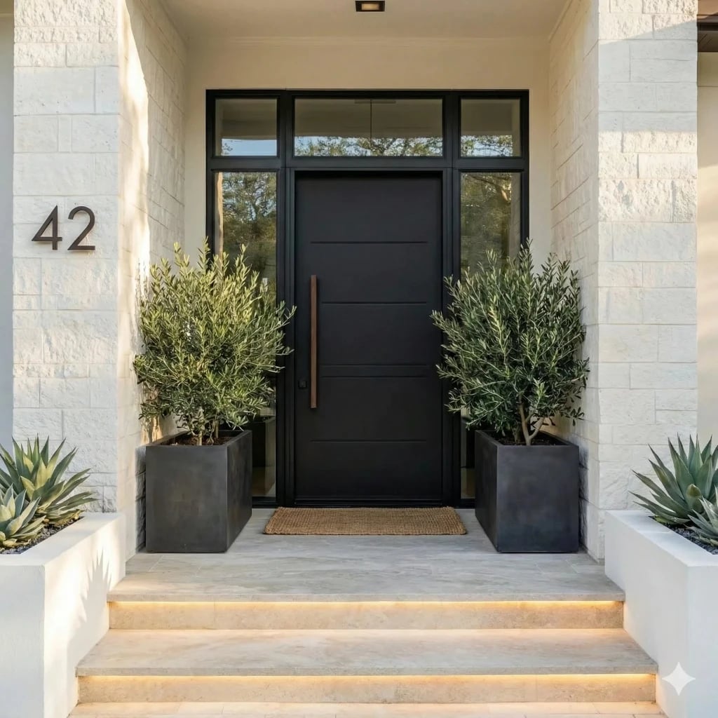
A modern black front door can feel stark, but this entry softens it with natural materials and layered greenery. The black door sits between olive trees and agave plants in large planters, while stone steps and a jute runner add texture underfoot. Integrated step lighting and an overhead light make the dark color work after sunset, preventing the entry from looking a dark hole. For a renter-friendly swap, skip the built-in lights and place solar-powered lanterns on the steps instead. The mix of black, gray, and tan keeps the palette grounded, while the green foliage breaks the monochrome scheme and keeps the look inviting.
Final Thoughts
Choosing a front door color is one of the simplest ways to refresh your home’s personality. From classic black to playful mint, the options here show how a single change can shift the whole mood of your entry. Keep upkeep simple: a high-quality exterior paint lasts longer, and a quick wash each season keeps the color bright. Pair your new door with hardware that complements its tone, and let the surrounding plants or decor do the rest. The best color is the one that feels like home every time you reach for the knob.