Red doesn’t have to shout. For 2027, the trick is letting it settle into a room the way good furniture does: present, confident, but never demanding attention from every corner.
These 26 ideas lean into red as a foundation, not just an accent, whether you’re layering it through textiles, paint, or the kind of ornaments that make a tree look intentional. Expect practical takes on balance and scale, not a color-drenched overhaul.
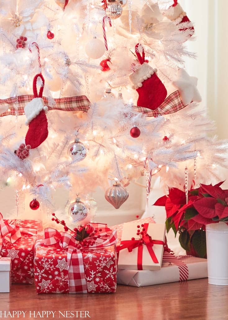
Festive red stockings on a white Christmas tree
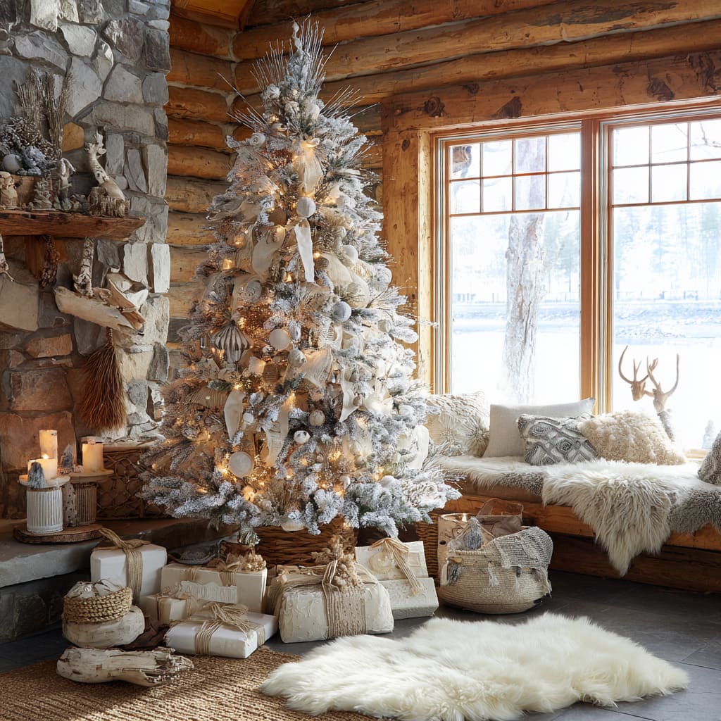
A white Christmas tree with flocked branches creates a clean backdrop for red stockings and poinsettias. The palette sticks to red, white, silver, and green, with warm string lights adding a soft glow. What defines this look is the ratio: the white tree takes up most of the visual space, with red used in focused accents like the stockings and poinsettias. The silver ornaments and wrapped gifts at the base break the color blocking, keeping the arrangement from feeling flat. It is a compact vignette that looks traditional without being busy. 26 looks that actually work.
Elegant burgundy wreath and garland display
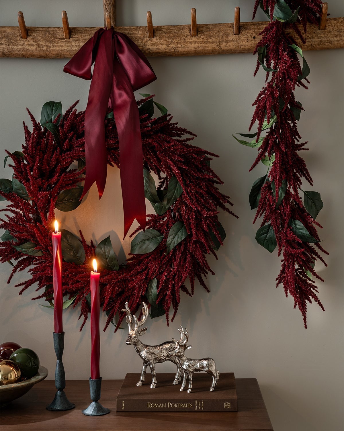
This burgundy satin wreath with a matching garland is a clear example of how material choice sets the tone. The satin ribbon gives the wreath a refined finish, while the greenery and silver deer figurines add contrast. Candlelight softens the arrangement, making the red feel richer rather than harsh. What defines the look is the mix of matte greenery and glossy satin, with the paper elements and metal deer breaking up the texture. The palette stays in red, green, and gray, which keeps it from feeling overly festive. It is a style that works for those who want holiday decor that leans elegant rather than playful.
Living room with red sofas and festive tree
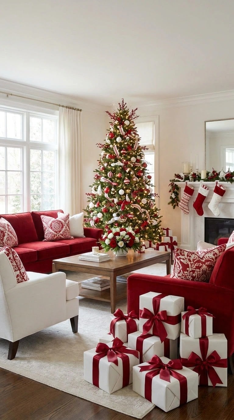
Can a red sofa coexist with a Christmas tree without the room feeling like a holiday display all year? Yes, if the layout gives each piece its own zone. Here the sofa faces the fireplace, and the tree sits centered in the room with the coffee table in front of the sofa. The palette has red, white, green, and gold, with the red sofa and the tree’s red ornaments tying the two zones together visually.
The white armchair breaks up the red seating, and daytime natural light from windows keeps the room feeling airy. The tree lights add warmth in the evening, but the room works during the day too. For anyone with red furniture who wants a festive setup, this layout proves that a traditional style does not require starting from scratch.
Glittering red, white, and green ornaments

A stacked teardrop ornament in glitter red sits next to a fabric banner in green and white. The mix of glitter and fabric gives the vignette two distinct textures within the same red, white, and green palette. What defines the look is the scale: the stacked ornament acts as a focal point, while the banner fills the space around it. The matte fabric breaks the shine of the glitter, keeping the arrangement from feeling too uniform. It is a detail that works best clustered with other ornaments or placed alone on a mantel.
Cozy red buffalo check pillows and throws
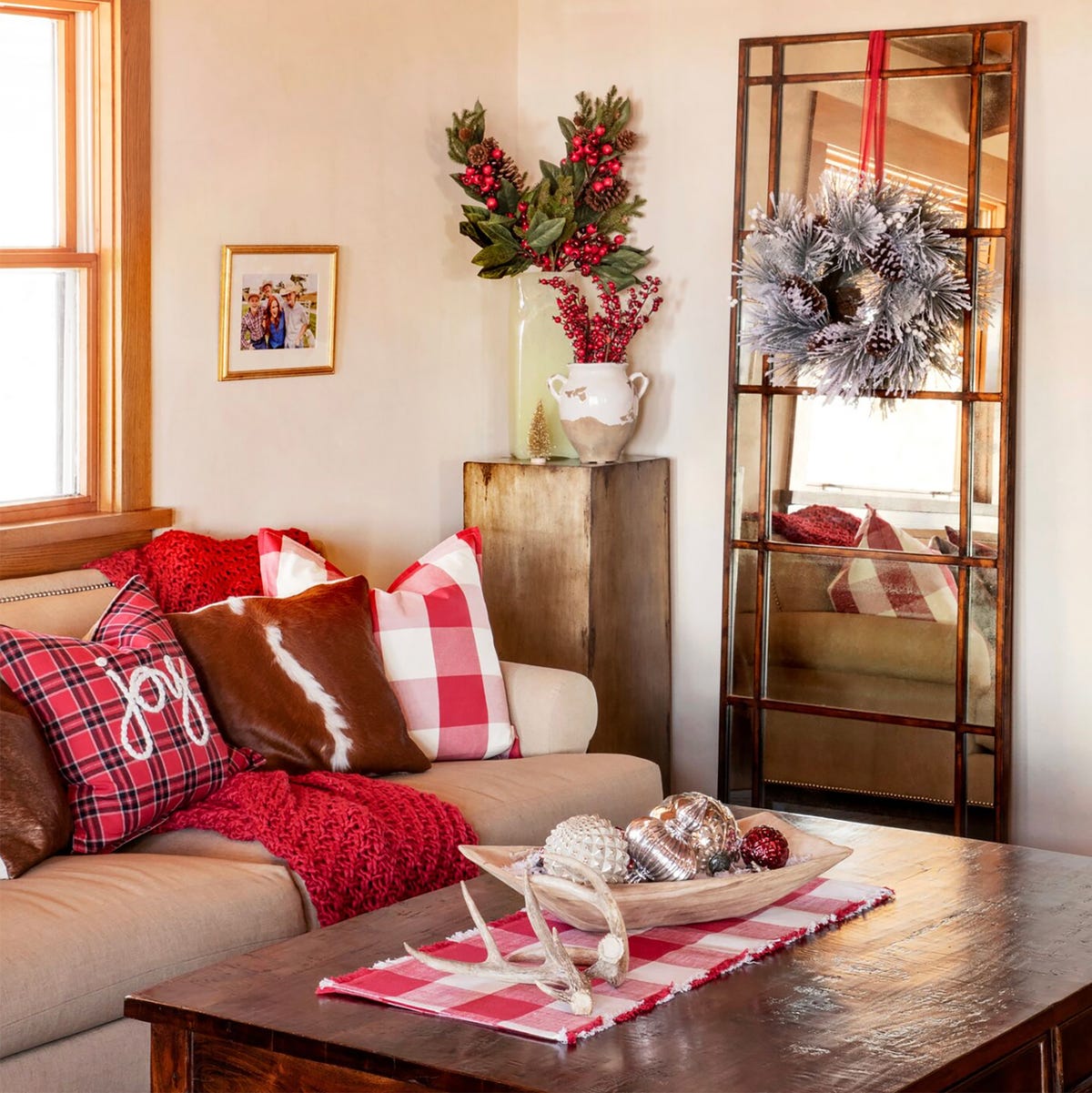
To add pattern to a neutral room, start with pillows. Here red buffalo check pillows sit on a sofa against the wall, with a coffee table and large mirror completing the scene. The palette includes red, white, beige, brown, and green, with the buffalo check acting as the main pattern. The faux fur and linen pillows break up the check, keeping it from dominating the room. Natural light softens the red, and the decorative bowl on the coffee table adds a touch of green. For those who want farmhouse style without committing to a full red sofa, pillows is where to start.
Modern dining room with deep red walls
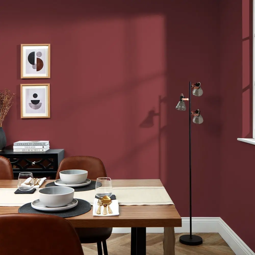
If you are torn between a feature wall and a full color commitment, deep red walls make the case for the latter. The room feels bold, with the red acting as a backdrop that lets wood tones and brass accents hold their own. A wooden dining table and leather chairs keep the space grounded, while a floor lamp and natural light prevent the red from feeling heavy. Gray tableware and a piece of framed art add contrast without competing.
The palette defines the room: red is the dominant note, supported by neutrals and warm metal. What breaks the scheme is the restrained use of brass and gray, which keeps the look modern instead of traditional. Try deep red removable wallpaper on one wall and test the color with a large swatch before committing.
Red berries in white vase on table
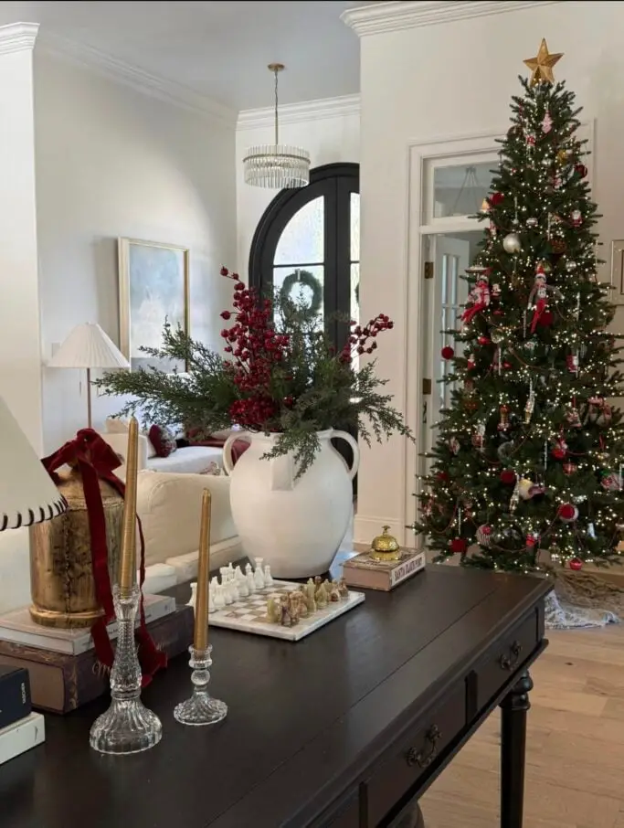
The red berry arrangement in a white vase works because the container is quiet. A white ceramic vase lets the red stems and small green leaves take center stage, and the contrast keeps the vignette from feeling busy. Place it on a console table near a lamp or tree lights so the berries catch the glow. For a similar effect, try any single-color vase with a bright bunch of faux or dried stems.
Vibrant red and orange vases on white shelf
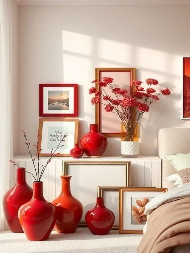
This collection of red and orange vases on a white shelf is a lesson in using color as a focal point without overwhelming the room. The warm reds and oranges sit against a cream and beige palette, with the vases arranged at different heights on the shelf and floor. A piece of framed art and simple bedding keep the look clean. The ratio here is about 80 percent neutral to 20 percent warm color, which gives the vases room to look intentional art rather than clutter.
Traditional living room with red and gold ornaments
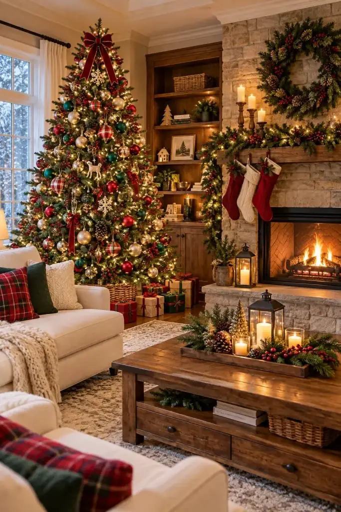
How do you decorate a Christmas tree so it feels full but not chaotic? Scale and proportion are the answer. In this traditional living room, red and gold ornaments are spaced evenly across the tree, with larger ornaments lower down and smaller ones toward the top. The tree sits beside a stone fireplace, with warm string lights and candles adding a gentle glow. A sofa and coffee table face the fireplace, keeping the layout balanced.
The defining style is classic holiday: red, green, and gold against cream walls and wood furniture. What breaks the look is the restraint, no tinsel or novelty shapes compete with the ornaments. Use only two or three ornament colors and vary the sizes.
Pine boughs and ribbon on dining table
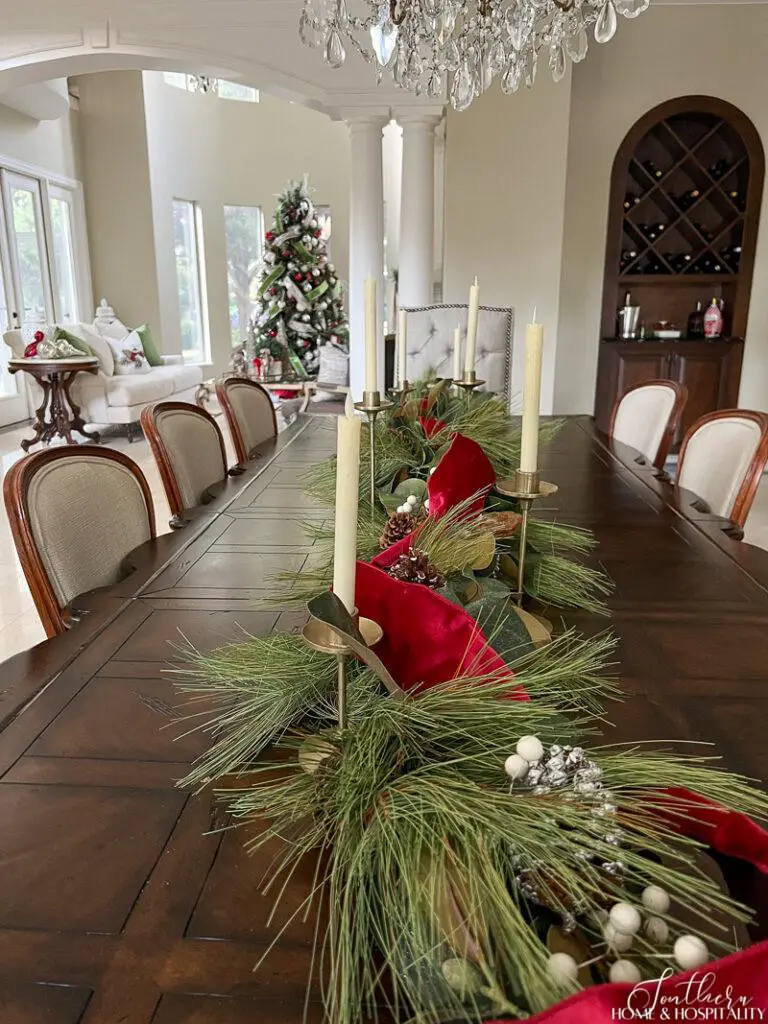
A red velvet ribbon running down the center of a long wooden dining table anchors the whole room. Pine boughs are laid along the ribbon, with brass candlesticks and glassware adding shine. The chandelier above and natural light from the window keep the arrangement from feeling heavy. What makes this work is the material contrast: soft velvet against rough pine and neat brass against matte wood.
Kitchen banquette with red abstract Art
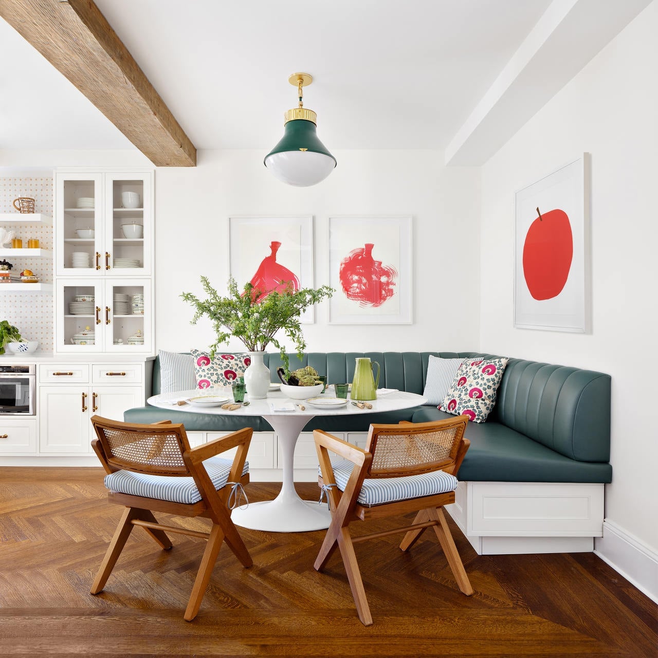
When a kitchen has a corner banquette, the layout is already working in your favor by carving out a dedicated dining zone without wasting floor space. A tulip table and cane chairs keep the look lean, while a single piece of abstract art in strong red gives the whole corner a focal point that the neutral leather and white walls need. The red fits the space because it has no competition nearby; the green of a plant and the blue in the art feel like supporting players, not distractions. To recreate it, look for a large canvas that leans on the counter instead of a permanent mount.
Deep red corduroy sofa with bookshelves
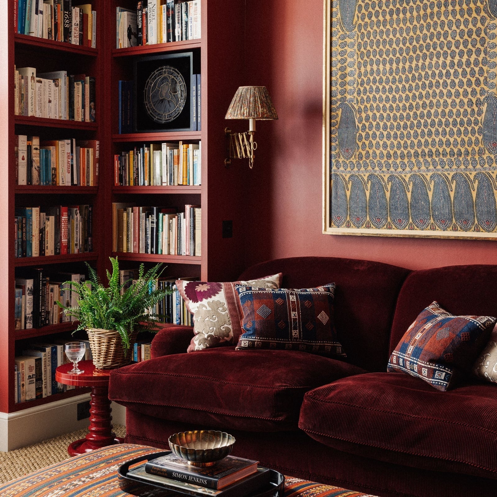
A deep red sofa might sound like a bold commitment, but the palette around it matters more than the color itself. Here the red corduroy looks warm and traditional rather than loud because it sits against beige walls, blue patterned pillows, and the gold tones of brass wall sconces and framed textile art. The bookshelves behind it are filled with a mix of books and objects, so the eye moves across the whole wall instead of landing hard on the sofa alone.
What makes this palette work is the ratio. Red takes up roughly one-third of the visual weight the sofa itself while the rest is neutral or cool. The wicker basket and wood tones add texture without introducing another saturated color. If you try this at home, keep the wall color light and let the sofa carry the red for the room.
Eclectic living room with red velvet sectional
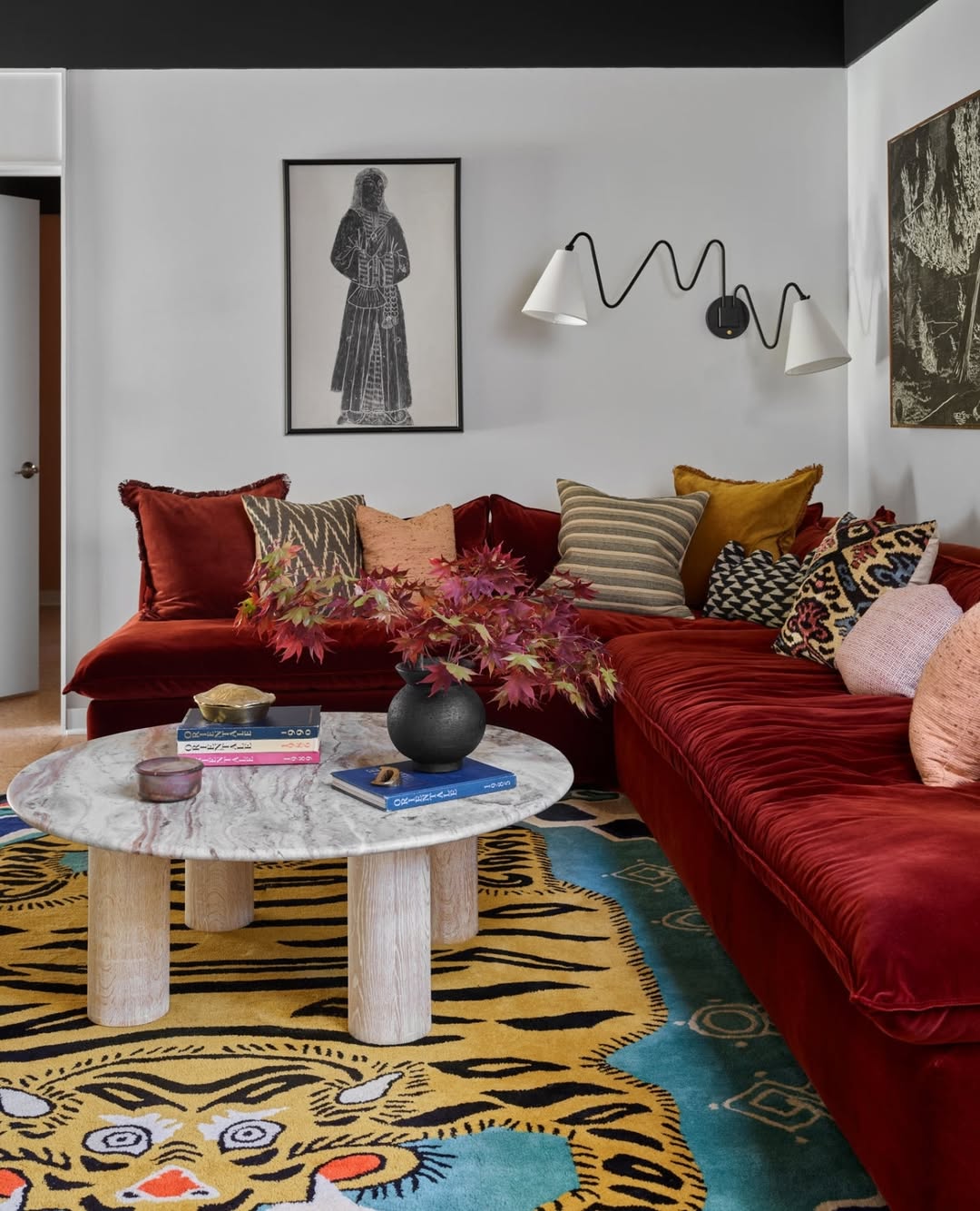
The red velvet sectional anchors the room, but the tiger rug pulls the eye down and prevents a showroom look. Velvet reflects light differently than the matte wood coffee table and linen throw pillows, so the mix of textures does the work a single color scheme would normally do. The wall sconces highlight the velvet nap without making the red feel flat.
Stone fireplace with festive red decor
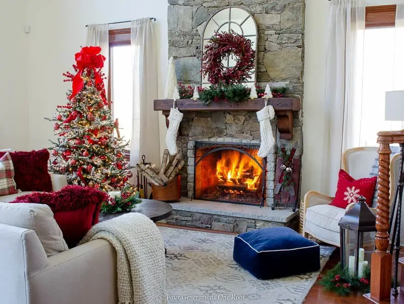
A stone fireplace with a roaring fire is the strongest light source in the room, and everything else should work with that glow rather than against it. The red decor on the mantel and the decorated holiday tree pick up the warm tones from the flames, so the palette stays in the same temperature range even when the tree lights are off. The armchair and ottoman are placed to catch both the firelight and the ambient light from the room, which means the seating area feels connected to the hearth without crowding it.
Dining room with red tablecloth and nutcrackers
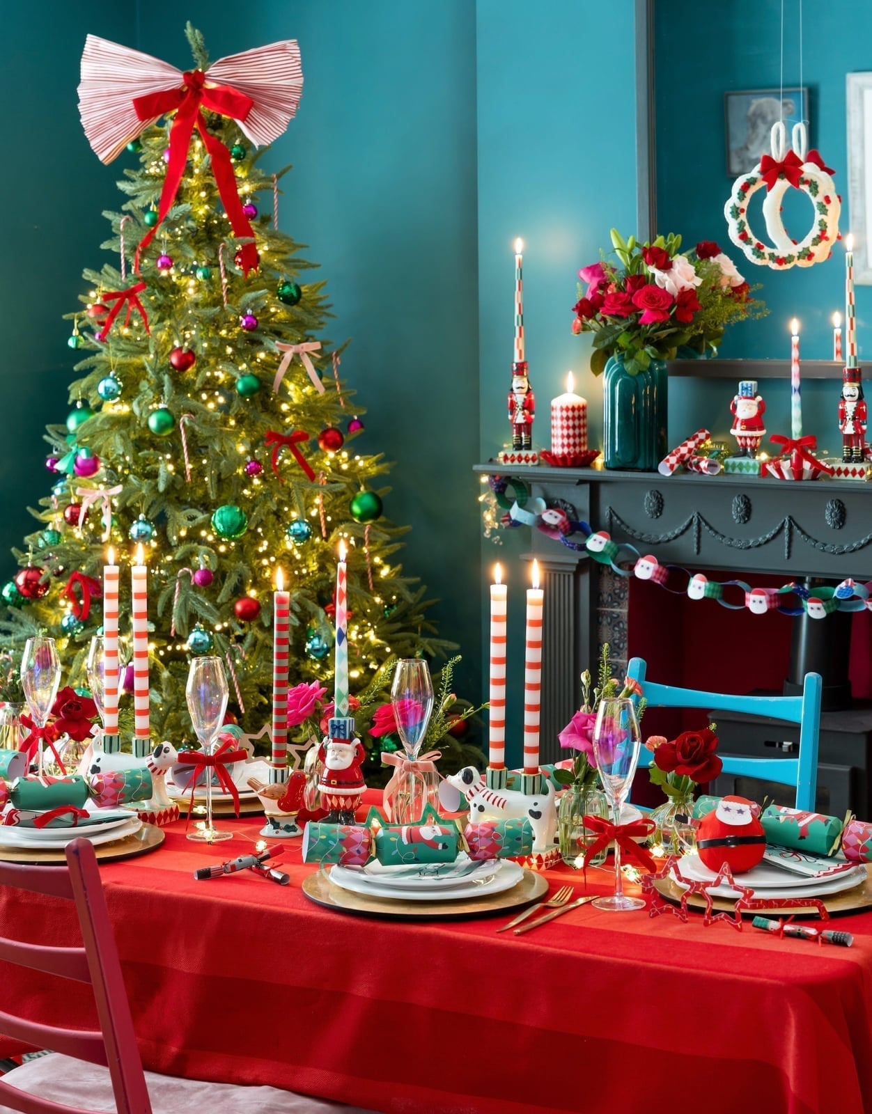
A red tablecloth sets the tone for a festive meal, but the real trick is how the rest of the room supports it without competing. The tree and fireplace mantel are off to the side, so the table stays the clear hero when you walk in. The nutcrackers add vertical interest without taking up table space, which matters when you need room for plates and glasses.
For storage, a sideboard or buffet near the dining table gives you a place to keep extra nutcrackers, candlesticks, and serving pieces that you rotate onto the table as the season goes on. That way the red tablecloth stays the main event and the accessories can change without a full reset.
Farmhouse centerpiece with red candle
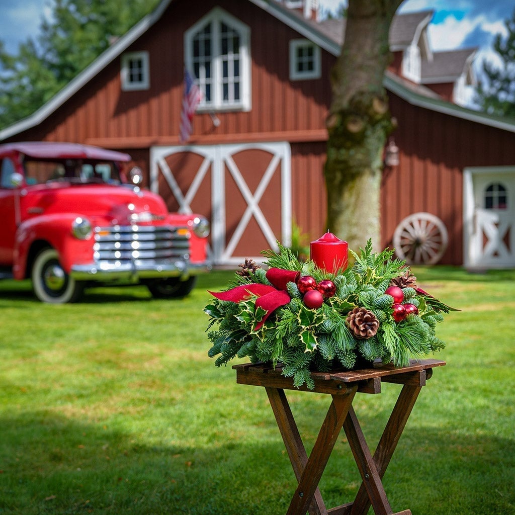
A red candle set in a bed of pine, holly, and pinecones is the anchor of this farmhouse centerpiece, with a ribbon tying the greens together. The palette includes red, green, and brown, and the wooden table underneath keeps the look grounded. A red vintage truck and red barn in the background lean into the rural theme without distracting from the centerpiece itself. The arrangement feels cohesive because the table surface is clear around it. Daylight makes the red candle the clear focal point, so the scene stays simple.
Gallery wall above red living room walls
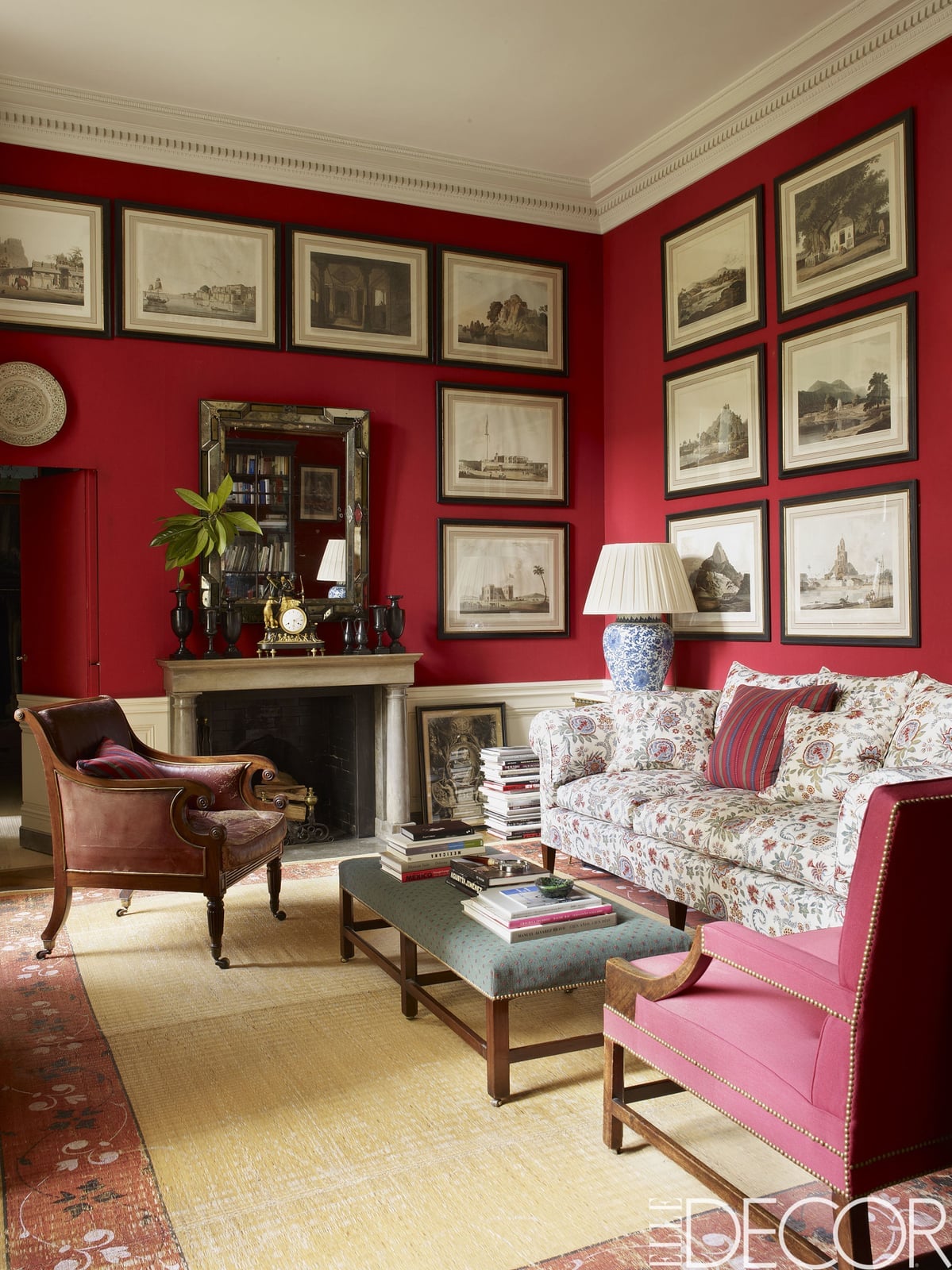
Against vibrant red walls, a gallery wall should let the artwork do the talking. In this traditional living room, the red walls provide a strong backdrop for a mix of framed pieces in cream, yellow, blue, green, and brown. The sofa, armchair, and ottoman are arranged around the fireplace, with natural light and a lamp adding ambient glow. The gallery wall itself mixes wood, brass, and glass frames. The style is defined by the ratio: the red wall takes up about half the visual weight, while the frames and furniture in lighter neutrals balance it out. The marble and linen accents break up the bold color without losing the room’s warmth.
Ornate red rug in a cozy living room
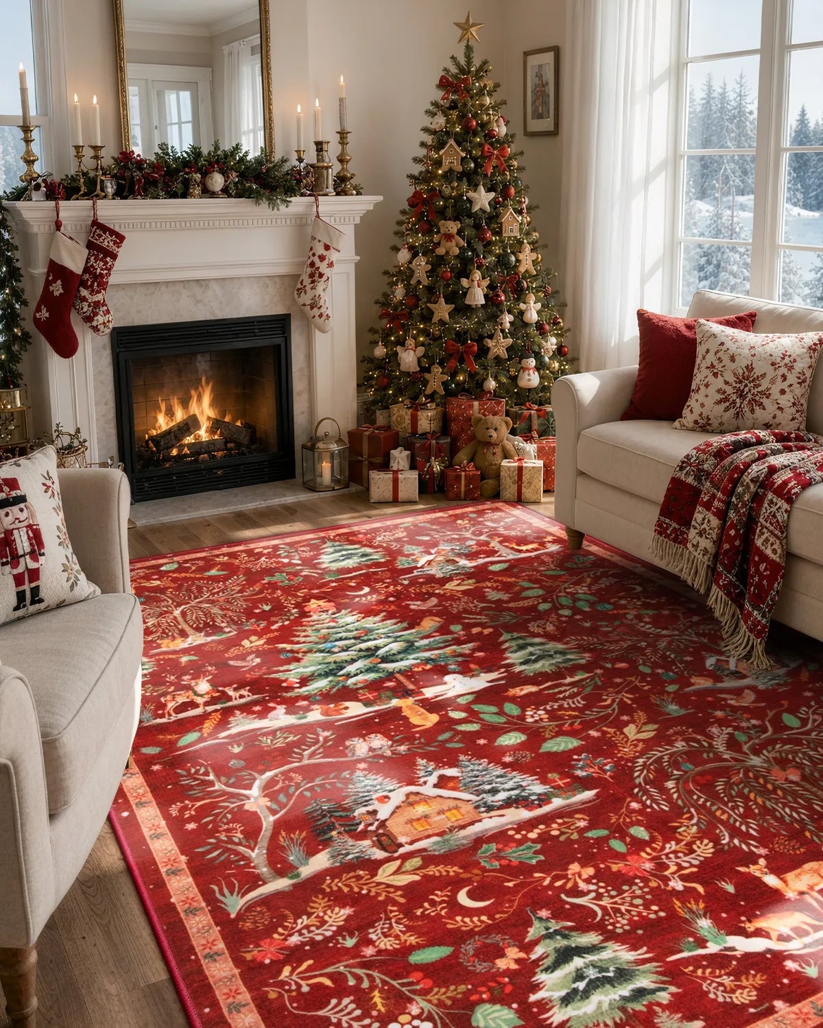
A simpler rug might disappear into this room, but the ornate red rug with its winter scene holds its own against the fireplace and the holiday tree. The palette of red, green, white, and gold ties the rug to the traditional style of the room, with marble, wood, linen, and brass as supporting materials. The fireplace glow and natural daylight work together to keep the rug from feeling heavy. The layout centers the fireplace, with the tree beside it and the sofa and armchair angled toward both. The rug’s pattern is what defines the room: it anchors the seating area and adds a layer of detail that the plain floor would miss. The gold accents in the tree ornaments and lamp bases echo the rug’s metallic thread without competing with it. What breaks the pattern is the solid white of the tree lights and the soft linen of the sofa cushions, which keep the eye moving rather than stuck on one element.
Modern farmhouse living room with red rug
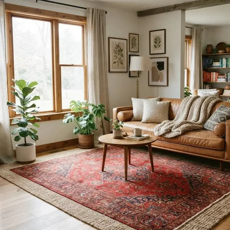
The red patterned rug here is a bold choice for modern farmhouse style, and it works because the surrounding room stays neutral. A leather sofa, round coffee table, and potted plants sit on a jute base layer, with the rug adding color without overwhelming the space. Window light and a floor lamp keep the room bright, so the red and blue tones in the rug feel deliberate rather than heavy. The rug defines the style: its ornate pattern is a counterpoint to the clean lines of the sofa and the simple wood of the coffee table.
Gothic porch decor with red skeletons
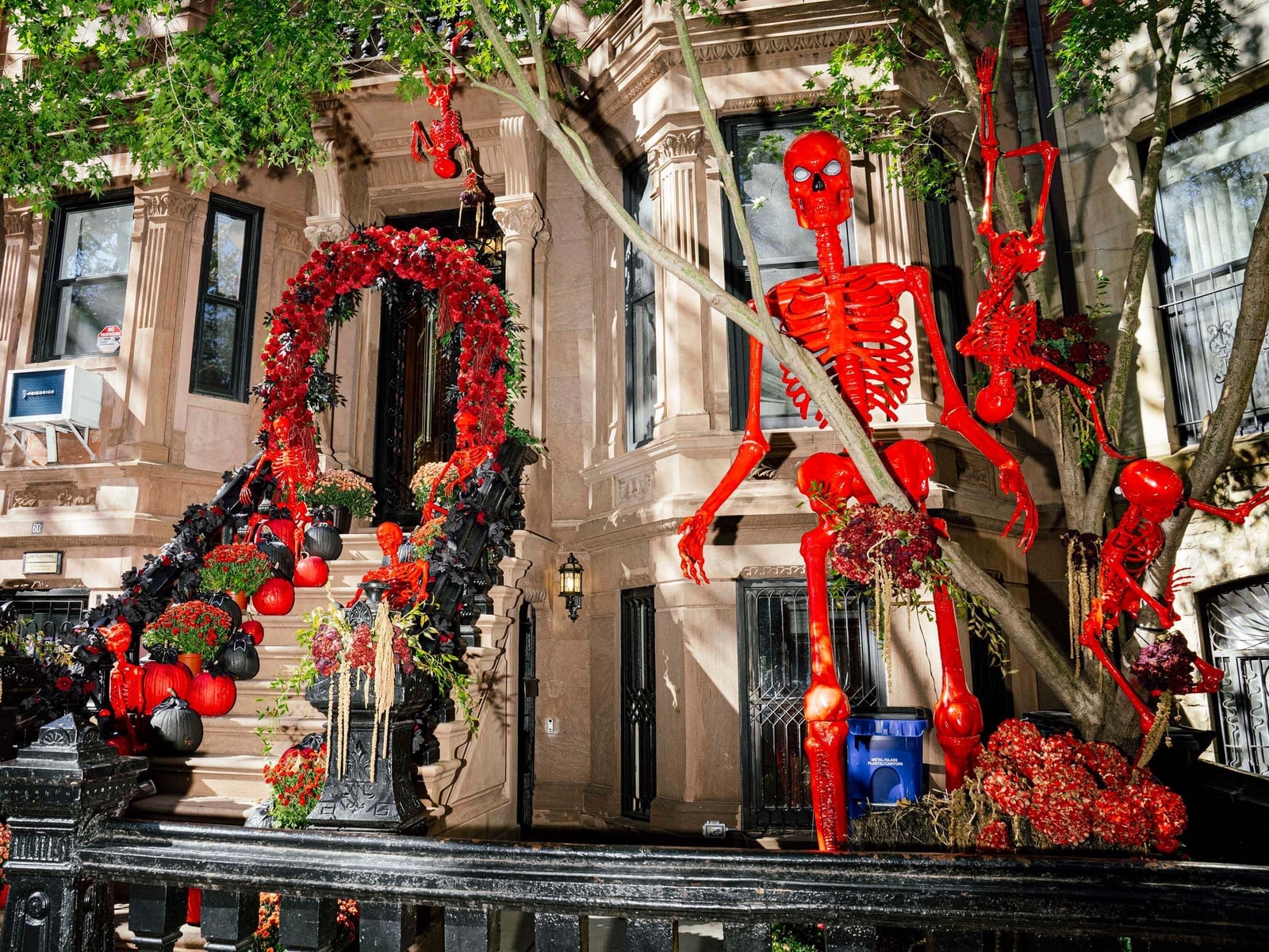
This porch goes big with large red skeleton figures framed by a floral arch, and the scale is what makes the gothic style work. The red and black palette is softened by beige stone and green foliage, so the scene looks dramatic rather than cartoonish. The natural daylight and outdoor sconce give the skeletons enough light to cast shadows, which adds depth to the wide porch view. The pumpkins at the base of the staircase tie the gothic theme to the season without clashing. The metal and plastic materials of the skeletons break the look, contrasting with the stone of the porch and keeping the scene from feeling too heavy. This is a style that asks for bold choices, and the scale of the skeletons delivers that without needing any other big pieces.
Luxurious red upholstered bed in bedroom
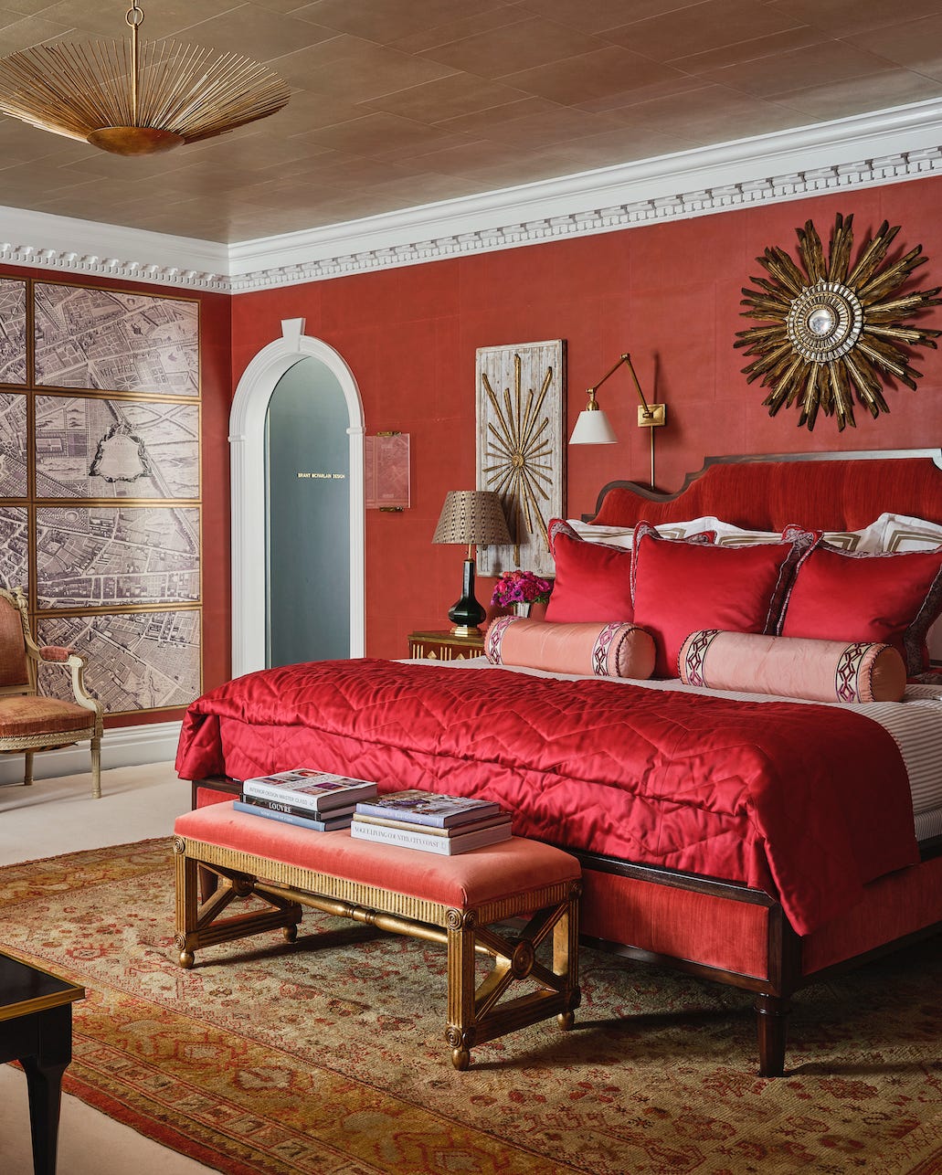
A statement bed claims the center of the room without competition. Here the red upholstered bed takes that role, with an ornate rug anchoring the seating area nearby. The palette stays in red, gold, cream, and brown, so the velvet headboard looks a rich accent. Wall sconces and ambient ceiling light keep the glow soft, which matters when the fabric is velvet, direct light can wash out its nap. The gold sunburst mirror above the bed repeats the metallic thread in the rug, tying the layout together without extra furniture.
Traditional porch with red flowers
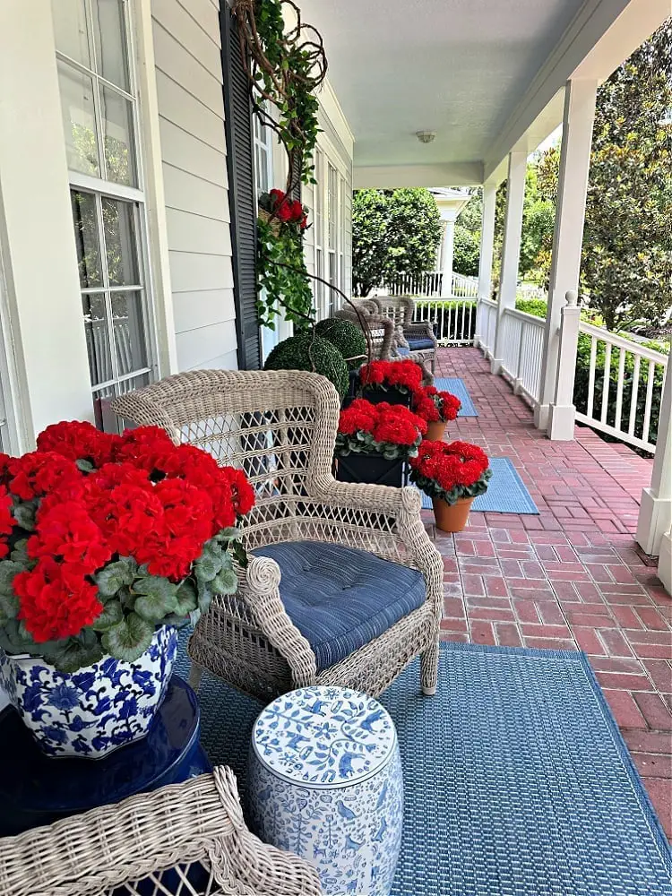
A wicker armchair sits beside a ceramic garden stool, with potted red flowers in a blue and white container. The palette balances red, blue, white, gray, and green, so the blooms stand out against the brick and gray tones. The blue and white pot breaks the red with a cool contrast for a traditional porch.
Garland with red ornaments on mantel
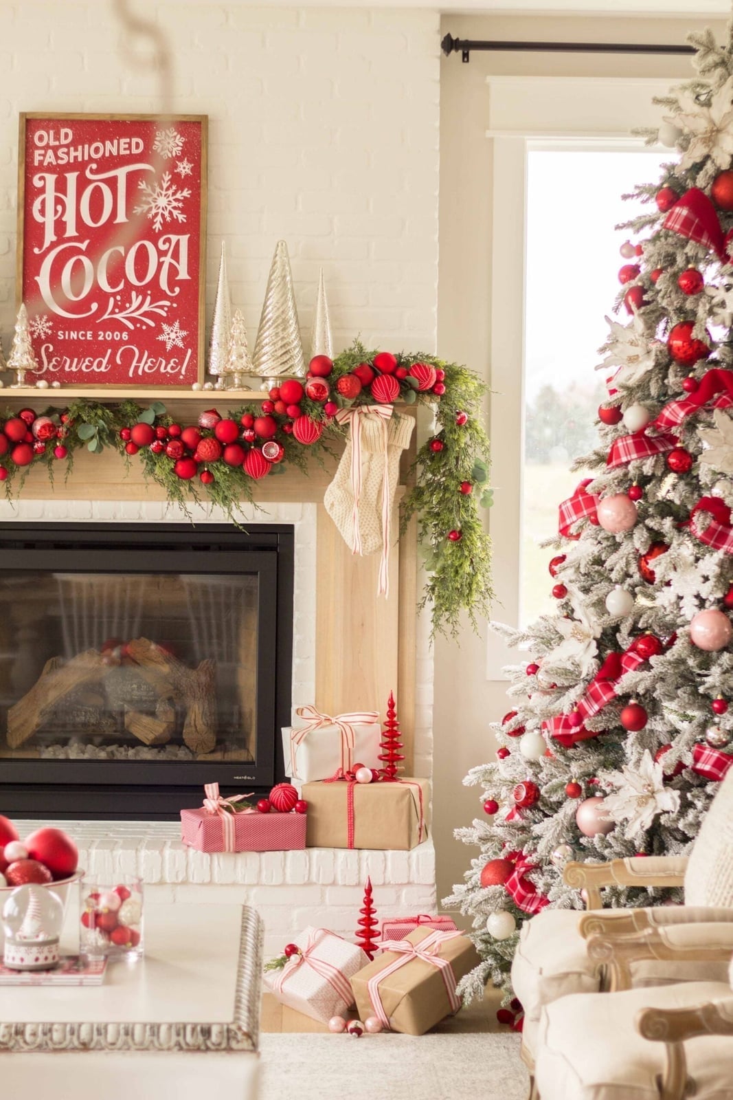
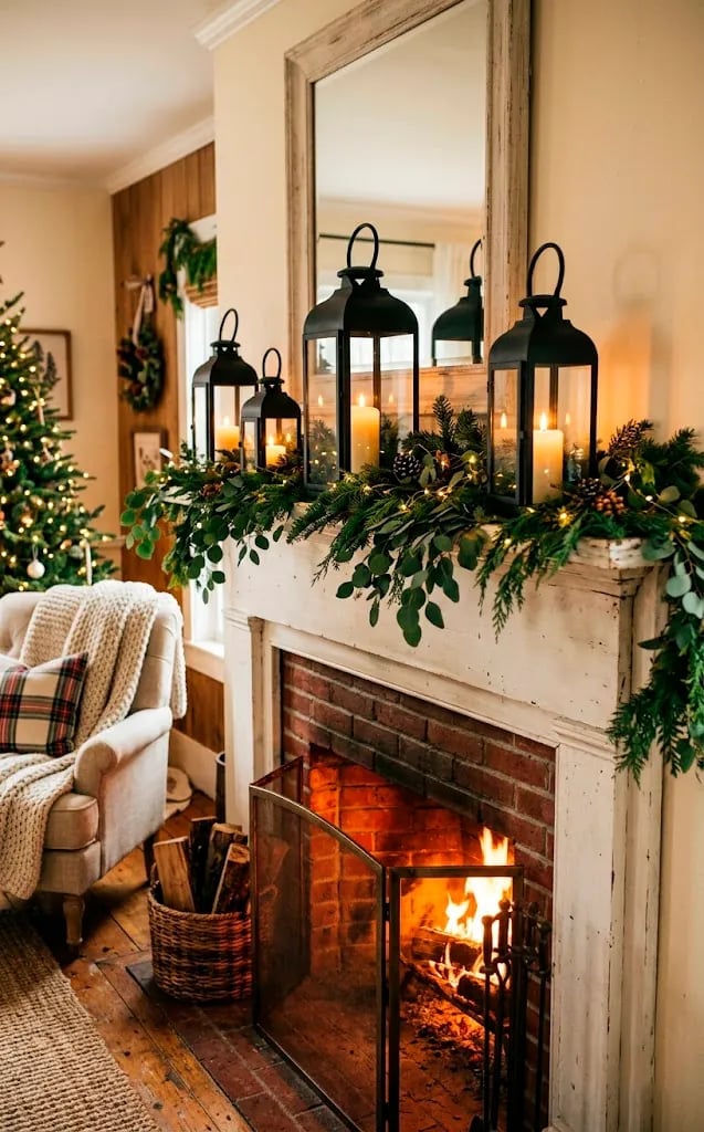
A practical rule for garland is to keep the greens full and the ornaments spaced so each one reads clearly. Here the fireplace is centered, with a decorated tree to the right and gifts and stockings below. The red and green garland uses glass ornaments and fabric accents against natural wood and brick. Daylight from a window keeps the reds bright without extra lamps, and the mix of greenery and glass gives the mantel a layered look that works for a rustic style.
Cozy living room with ornate red and blue rug, indoor
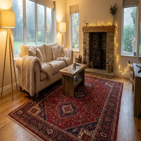
An ornate red patterned rug can feel formal, but here the room keeps it grounded with relaxed details. The sofa faces the fireplace, with the rug anchoring the seating area, while ambient floor lamps and string lights add warmth. The palette of red, blue, cream, and wood tones is balanced by the stone fireplace and linen upholstery. The rug introduces a strong pattern, so the rest of the room stays simple, no competing prints on the sofa or walls. This layout succeeds because the rug defines the zone without demanding attention from every surface.
Christmas tree with nutcracker ornaments

Nutcracker ornaments bring a playful detail to a traditional tree, mixing wood figures with glass baubles and ribbon. The palette of red, gold, green, black, and white keeps the look festive without straying into clutter. Fairy lights and ambient window light let the nutcrackers read clearly against the pine, and the mix of shapes, round baubles, flat ribbon, carved figures, gives the tree a collected feel. A storage note: wood ornaments store well in padded boxes to protect painted details.
Formal dining room with red floral centerpiece
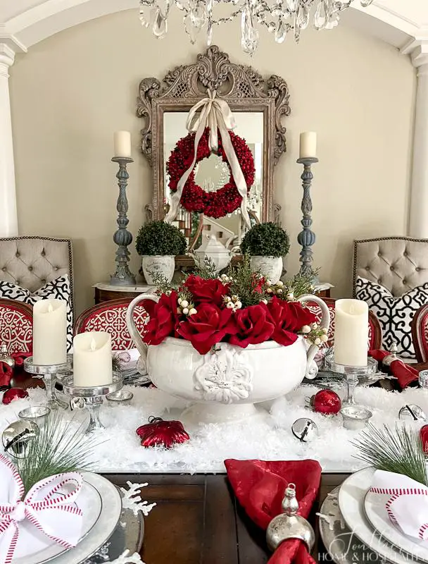
The red floral centerpiece is the anchor in this traditional dining room, and the surrounding palette lets it stay the focus. Cream and beige on the walls and upholstered chairs keep the backdrop quiet, while silver accents on the mirrored console and chandelier add a cool contrast that balances the warmth. Green stems in the arrangement introduce a natural counterpoint that does not compete with the blooms. This approach works for any formal table: let one saturated element lead, then pull the remaining items into a neutral or metallic range. The ratio is roughly 10 percent red to 90 percent everything else, which makes the color feel focused rather than overwhelming.
Final Thoughts
Red works best when you give it a job and then step back. A single bold piece or a wall of deep crimson can define a room without the need for constant red accents everywhere else. Let the neutrals around it breathe, and let the red pieces earn their place through texture and proportion, not volume. The takeaway: red is a team player when you treat it like one.