Unique Christmas wrapping paper is the fastest way to make a pile of gifts look like it came from someone with a plan. This guide gathers 20 looks, from marbled unicorns and toile scenes to matte black with rosemary sprigs, so you can pick a direction and wrap the whole pile in it.
Each idea covers the paper itself, the ribbon or label that finishes it, and how it sits under a tree or on a table. There is something here for a traditional house, a modern one, and the person who wants Krampus on the box.
Enchanting Unicorns and Marbled Textures for Elegant Christmas Gifting
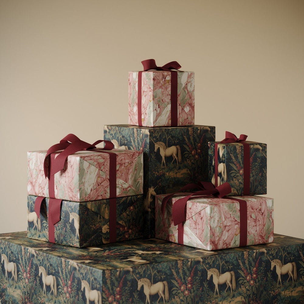
The palette defines this look: soft pink, green, blue, and gold come together on a stack of gift-wrapped boxes. The unicorn pattern keeps the design playful, but the muted tones and even studio light keep it from leaning too young. A second busy pattern in the same stack would disrupt the balance. The gold and pink balance each other, so the hero element, the unicorn paper, stays central to the arrangement. 3 looks that actually work.
Modern Rustic Charm with Illustrated Winter Scenes and Velvet Ribbons

This modern rustic look works because the materials do the talking. The wrapping paper carries illustrated winter scenes in blue, green, gold, and cream, but the velvet ribbon and greenery add texture without crowding the design. A flat lay arrangement keeps the rolls of paper and scissors visible, which makes the setup feel honest rather than staged. The ratio of pattern to texture defines this style: the winter scene covers most of the surface, while the ribbon and greenery sit as accents. Adding a second pattern would break the look, so rely on the natural variation in the greenery instead.
Sophisticated Stripes and Minimalist Styling for a Dramatic Holiday
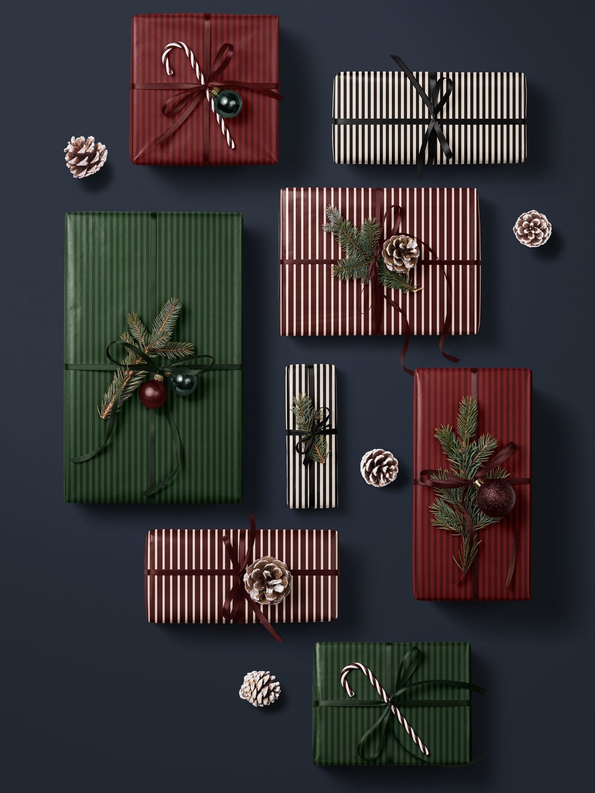
Stripes feel dramatic for the holidays through contrast. Deep red, forest green, black, and white stripes run across wrapped gifts arranged in a top-down layout on a tabletop. The dramatic, directional lighting casts shadows that give the paper depth, and pine sprigs and ornaments sit between the gifts without covering the pattern.
This minimalist style relies on negative space. The striped paper covers each gift completely, so a second pattern is unnecessary. A bow that matches the background color interrupts the lines cleanly. The pine sprigs already provide a natural break from the lines, and the ornaments echo the stripe colors without repeating them exactly.
Traditional Poinsettia and Holly Patterns with Luxurious Velvet
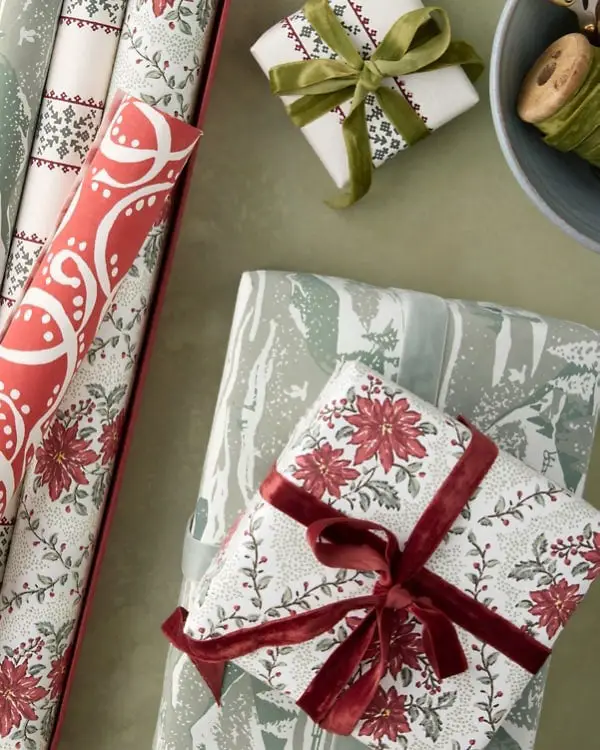
The poinsettia pattern on this paper covers the surface in red, green, cream, and white. The velvet ribbon adds a soft contrast to the crisp floral lines, and the soft, diffused daylight keeps the colors from looking flat. Materials matter here: the paper carries the tradition, but the ribbon makes it feel finished. Pairing the velvet with a shiny satin bow creates a mismatch. The matte quality of the velvet works with the paper’s matte finish, so any reflective element distracts from the pattern.
Gothic Christmas Motifs on Pink Paper for a Distinctive Vintage Vibe
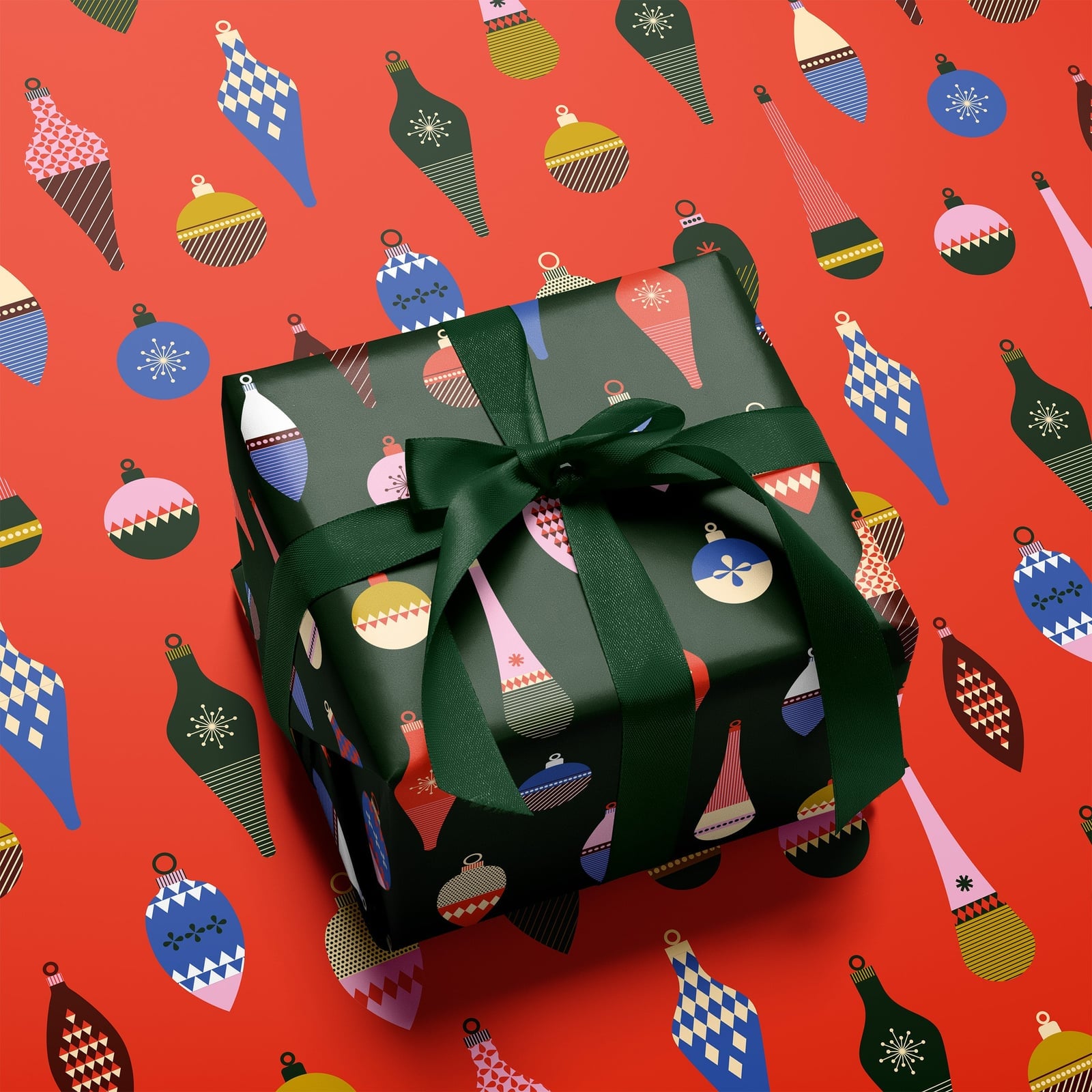
To mix unexpected colors, keep one constant. Here, the pink paper carries gothic-inspired Christmas motifs in black and white, with green pine sprigs adding a natural break. The moody, atmospheric lighting on a tabletop setup pushes the vintage feel forward. The pink covers the surface, while the black motifs sit as a pattern on top. The green from the greenery already provides contrast, so a ribbon in a different shade would pull the eye away from the gothic details.
Elegant Black and White Toile-Style Scenes with Natural Pinecones
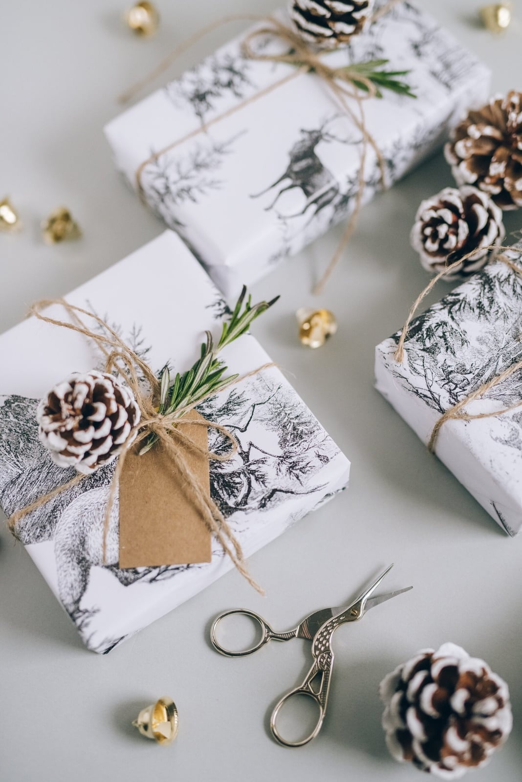
If a red plaid feels too expected, black and white toile-style paper offers a quieter kind of festive. The detailed nature scenes read as traditional but the monochrome palette keeps them from feeling busy. A plain brown twine and a single pinecone are all the trim you need, no ribbon, no bow. The brown adds a natural warmth that stops the black and white from feeling cold. The ratio here is about ninety percent pattern to ten percent natural accent. Keep the simplicity by avoiding a second pattern or a colored ribbon; the whole point is the restraint.
Matte Black Wrapping with Rosemary Sprigs and Chalk-Like Labels
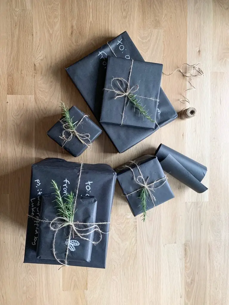
A matte black paper with a rough texture takes light differently than a glossy one. It absorbs it, so the form of the gift reads more than the shine. A sprig of rosemary tucked under the twine adds a soft green line and a scent that lasts through unwrapping. A small white label with hand-lettering keeps the package from looking like a blank box. This is a look that works on a dark wood table or a light one, because the contrast comes from the herbs and the label, not the background.
Alternative Christmas with Krampus Illustrations and Striped Ribbons
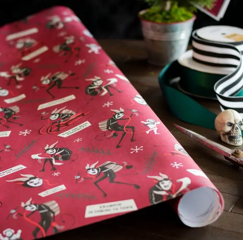
This paper knows its audience and does not try to please everyone. The Krampus illustrations are detailed and slightly menacing, printed in black on a cream ground. The red and black striped ribbon is wide and adds a graphic punch that matches the boldness of the print. A metal pot in the styling cuts the paper’s dark tone with a reflective surface. The palette is red, black, and cream, three colors that work together because the cream keeps the red and black from feeling heavy. What breaks this look is a pastel or a gold accent; the whole point is the sharp contrast.
Cozy Barn and Tree Patterns on Cream Paper with Gold Accents
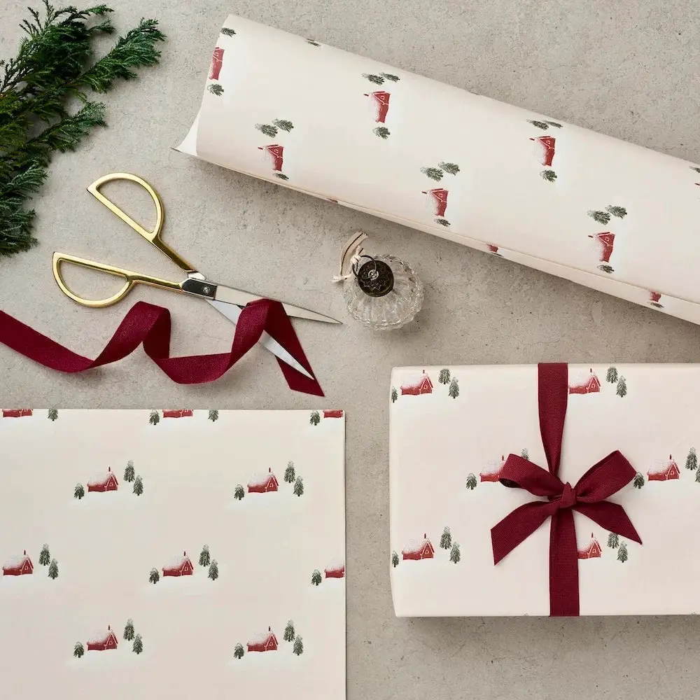
Can cream paper hold up to the mess of a holiday breakfast? It does better than white because the warm base hides smudges and the print does the visual work. The barn and tree pattern is small and repeat, printed in a muted red and green on a cream ground. A thin gold ribbon or a single gold bauble used as a gift topper adds a metallic note without overwhelming the print. The paper is a sturdy weight that does not tear easily at the corners. The gold accent is the break in the earth tones, and it needs to stay small, one strip of ribbon or one ornament, not both.
Traditional Snowflake and Festive Motifs Near a Decorated Christmas
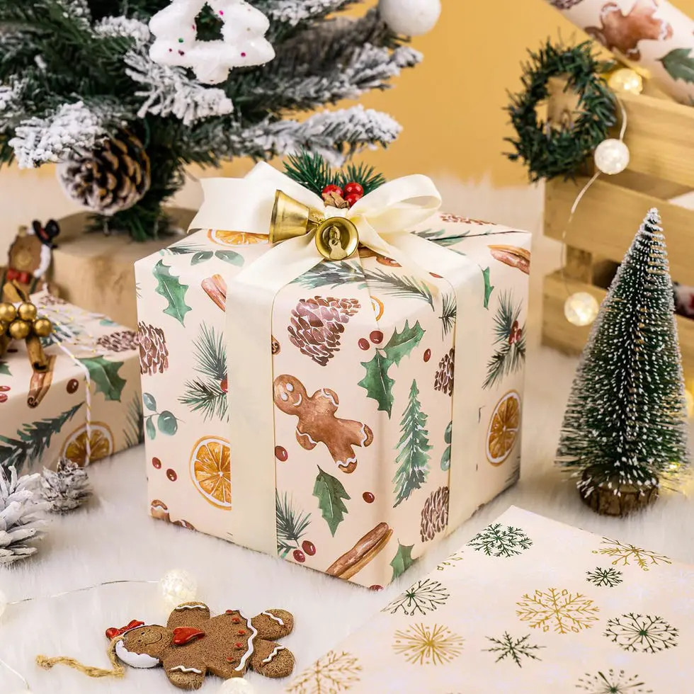
A traditional snowflake pattern on a red ground with gold foil details catches the warm light from the tree lights. The scale of the motif is small, so it works on both a thin book and a large box. A plain gold ribbon and a cream gift tag keep the look from feeling crowded. The arrangement of presents around the base of the tree uses the tree itself as the main visual weight; the gifts are a secondary layer. What breaks the grouping is mixing in a paper with a completely different scale, like a large plaid next to a tiny snowflake.
Whimsical Candy Cane and Retro Illustrations in Vibrant, Close-Up Take
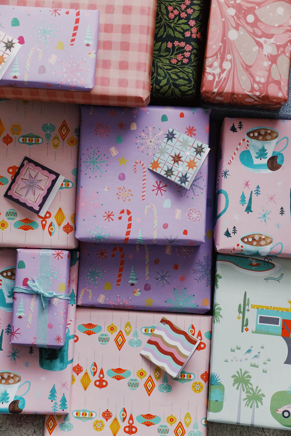
An unexpected palette works when the boldest color leads and the rest follow. Here, purple wrapping paper with candy canes sets the pace, and pink, teal, and orange accents on the other stacked boxes join in without competing. The bright, even light from an overhead shot keeps every shade clear, so the stack reads as playful rather than chaotic. The ratio matters: purple takes up most of the surface area, while the other colors appear in smaller, supporting doses. A single candy cane motif on the hero box gives the eye a clear starting point before scanning the rest.
Natural Rustic Elegance with Dark Green and Copper, Close-Up Take
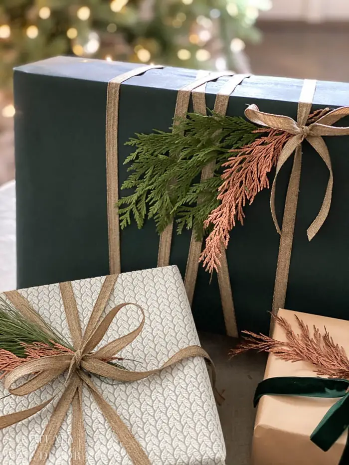
If a bright red and green palette feels too loud, a dark green and copper combination offers a quieter alternative that still reads as festive. The dark green paper absorbs soft ambient light, which keeps the color deep rather than glossy, while the copper accents catch just enough of that light to add warmth without shine. A beige twine wraps the box in a natural tone that connects to the greenery sprig tucked under the knot. The greenery is the material that makes the look feel gathered rather than store-bought. Its texture breaks the flat surface of the paper and gives the arrangement a natural, rustic finish. The copper accents appear in small touches on the paper or trim, so they read as intentional details rather than the main event.
Modern Kraft Paper with Gold Snowflakes and Festive, Close-Up Take
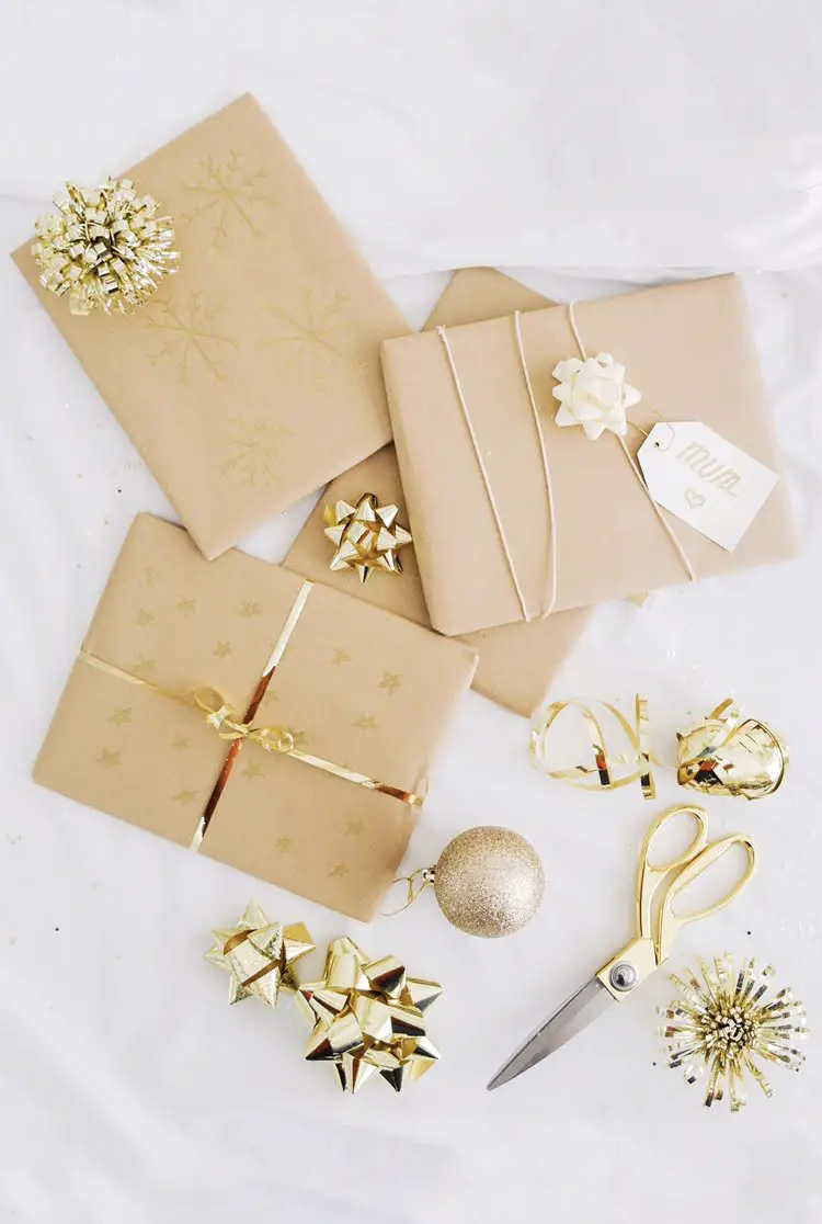
The gold snowflake pattern on kraft paper works because the gold reflects soft, natural light while the kraft ground absorbs it. The result is a contrast that reads as crisp without being harsh. The paper carries a simple repeated motif, so a full bow or a pair of scissors placed nearby in the flat lay adds the right amount of visual weight. The glitter in the gold accents catches light at certain angles, which gives the flat lay a subtle shift in texture without needing a metallic ribbon.
Joyful Traditional Patterns: Santas, Candy Canes, Close-Up Take
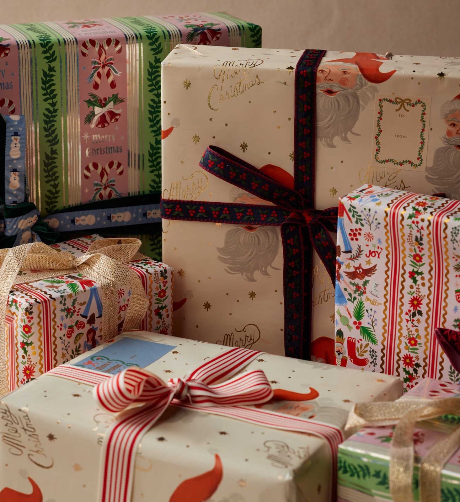
The red, green, gold, and cream palette across this cluster of wrapped gifts looks festive without needing a single motif to carry the whole look. The bright, even light keeps the gold accents visible and the reds from turning brown, which matters when you have multiple patterns in one stack. This style combines Santa figures, candy canes, and floral motifs printed on paper with a cream ground. The cream base gives the eye a pause between the stronger colors, so the cluster stays cheerful and organized. Adding a metallic ribbon in a different finish than the gold on the paper disrupts the balance. Stick with a matte or satin ribbon in red or cream to let the paper patterns do the work.
Humorous Cocktail Motifs and Witty Sayings for Modern, Close-Up Take
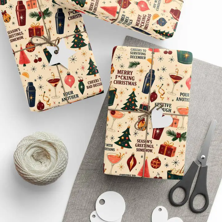
How do you keep wrapping paper that says something funny from feeling like a one-time joke? The answer is in how you store the leftovers. A flat lay arrangement of wrapped gifts, scissors, and twine shows the paper in a cream, brown, red, blue, and green palette, with the humorous text acting as the focal point. The soft, natural light keeps the paper from looking harsh, which matters when the tone is playful, not reverent.
The ratio of text to illustration sets the tone. The cocktail motifs are small enough that the sayings lead the design, but the drawings keep it from reading as a sign. Pairing it with a formal ribbon undermines the effect. A plain brown twine or a simple card tag keeps the humor from feeling dressed up. For storage, roll the leftover paper around a sturdy tube instead of folding it. Folding creases the paper and makes the text harder to read when you use it next year.
Nutcracker Figures and Classic Plaid for Traditional Christmas Wraps
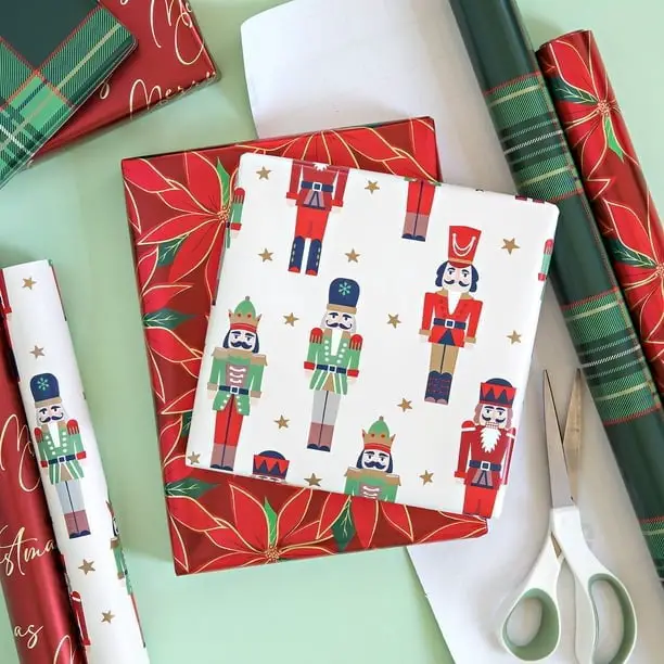
Nutcracker figures form the main pattern here, a nod to a classic holiday story that fits neatly into a red, green, white and gold palette. The paper carries the figures in a repeated layout, so the wrapping itself becomes the decoration. A matte finish keeps the look from feeling glossy or modern. Use a metal-edged ribbon rather than a fabric one for a crisp finish that holds its shape around the box. The trick is to let the nutcracker pattern lead and keep the bow simple so the design stays readable.
Mid-Century Modern Geometric Diamonds and Stripes in Retro Hues
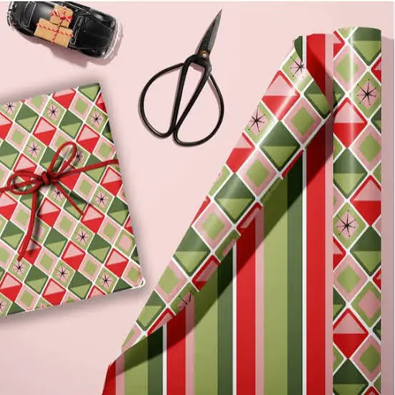
Small geometric diamonds on a mid-century modern print read well on a medium box, while a larger stripe might overwhelm it. This palette of green, pink, red and black carries a retro feel without tipping into kitsch. The balance of warm pink against cool green is grounded by black lines. Adding a bright metallic ribbon disrupts the mid-century palette. Stick to a thin black or white ribbon and the set stays cohesive under the tree.
Detailed Vintage Christmas Scenes with Luxurious White Satin Ribbon
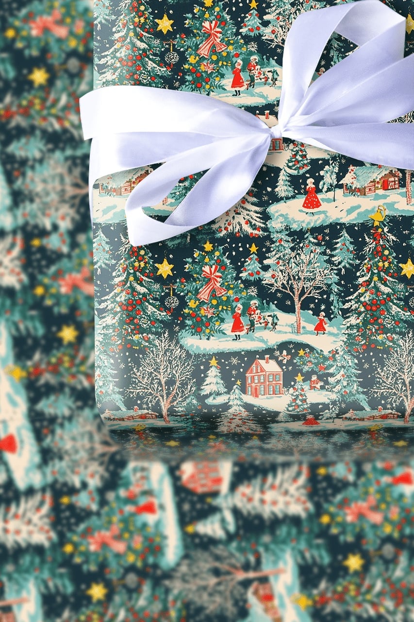
A vintage scene wrapping paper with detailed illustrations of houses, trees and carriages stands apart from the simpler graphic prints that rely on bold shapes. The difference is in the viewing distance: a bold print works from across the room, while this demands close attention. The white satin ribbon is not an afterthought here. Satin has a sheen that catches the low light of a room with only Christmas lights on, making the gift feel finished even in dim conditions. Tie the ribbon in a classic bow with long tails that trail over the edge of the box. The contrast between the dense, dark blue and green scene and the bright white ribbon keeps the package from reading as heavy.
Classic Plaid Patterns in Watercolor Style with Evergreen Accents
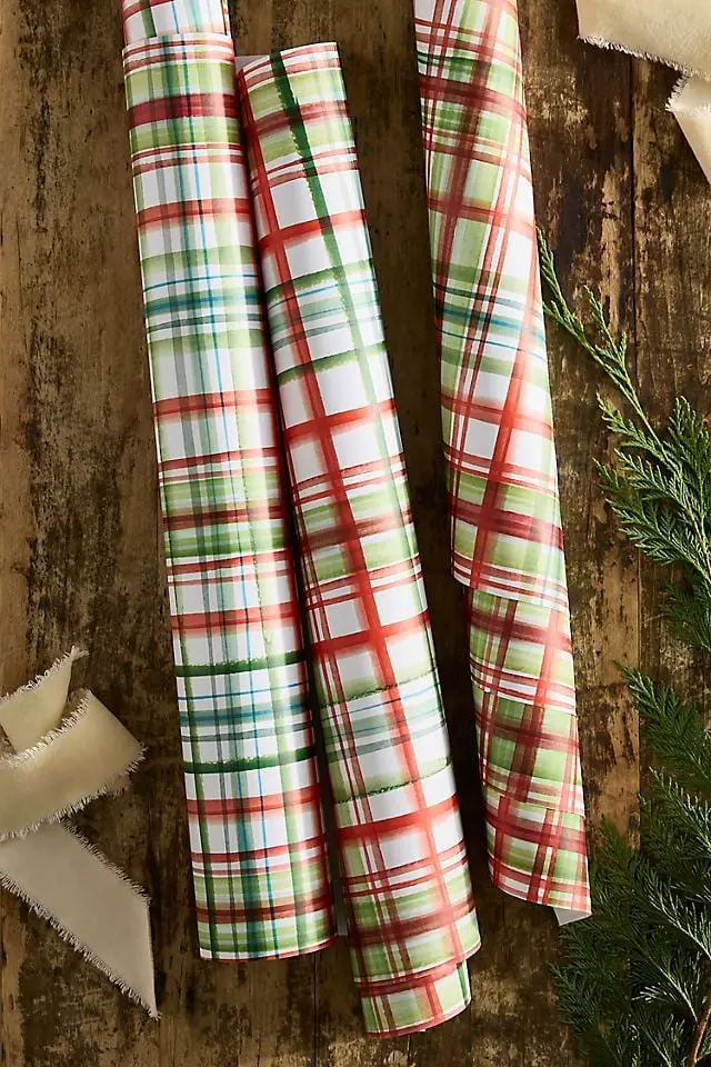
The watercolor application softens what could be a rigid plaid into something that looks brushed on rather than printed. Red and green cross at irregular intervals, and the white spaces between the lines keep the pattern from feeling heavy. Three rolls lined up next to each other show that the same palette works across different plaid scales. A narrow plaid suits a small gift like a jewelry box, while a wider plaid fills the surface of a larger box without looking busy. The paper has a slight texture that takes tape well without tearing.
Variety of Traditional Gingham, Bears, and Holly with Red Ribbons
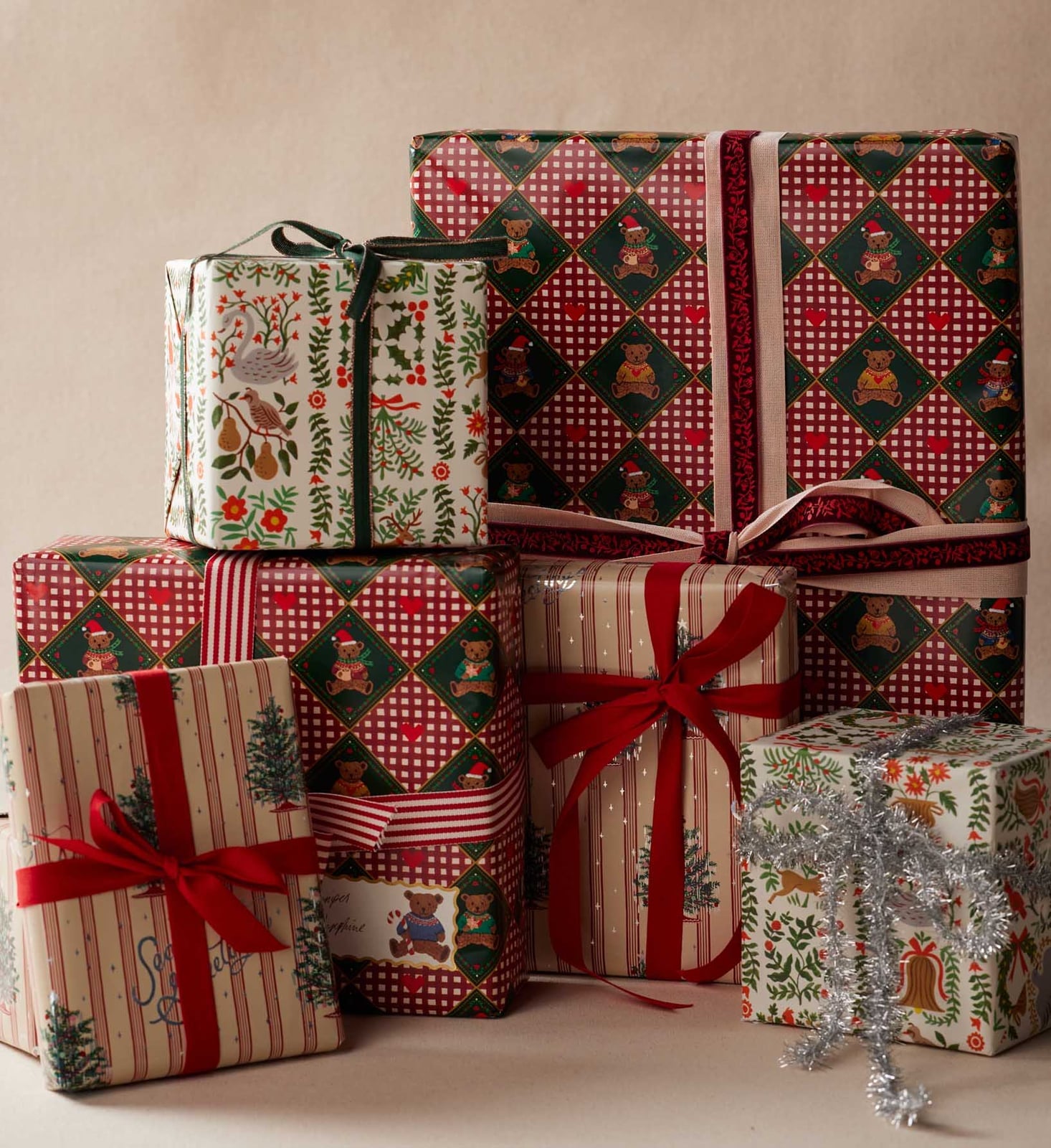
This is a collection of patterns that works best when you think about proportion across the stack. A small gingham box looks right on top of a larger holly print box, while reversing that order makes the tiny gingham feel lost. Red ribbons tie each one together, but the ribbon width should shift with the box size. A narrow ribbon on the smallest box and a wide one on the largest keeps the visual weight balanced. Cream backgrounds on some of the prints give the eye a rest between the red and green. The gold accents on the holly pattern catch light without needing a metallic ribbon.
Final Thoughts
The practical lesson across these looks is consistency. Pick one paper, one ribbon family and one label style, and the smallest gift reads as part of the same set. Mixing two patterns works when they share a color; mixing five rarely does.
Store rolls upright in a bin so they stay round and easy to roll out, and keep ribbon wound on cards. Paper creases and ribbon crushes, and a creased roll shows on the finished box. Choose a look you will still like on December 26, because the wrap is the first thing opened and the last thing remembered. Then wrap early, wrap simply, and let the paper do the talking.