Gift wrapping is the first impression, and a thoughtful choice sets the tone before the bow is even touched. This year, elegant wrapping paper moves beyond simple patterns into a statement of style, where texture, color, and motif work together to create a moment.
Whether you are dressing a holiday present or a birthday box, the right paper can make the package feel like part of the celebration. Here are 15 elegant wrapping paper looks that actually work, from classic golds to unexpected botanicals, each with a practical tip to help you finish the gift with confidence.
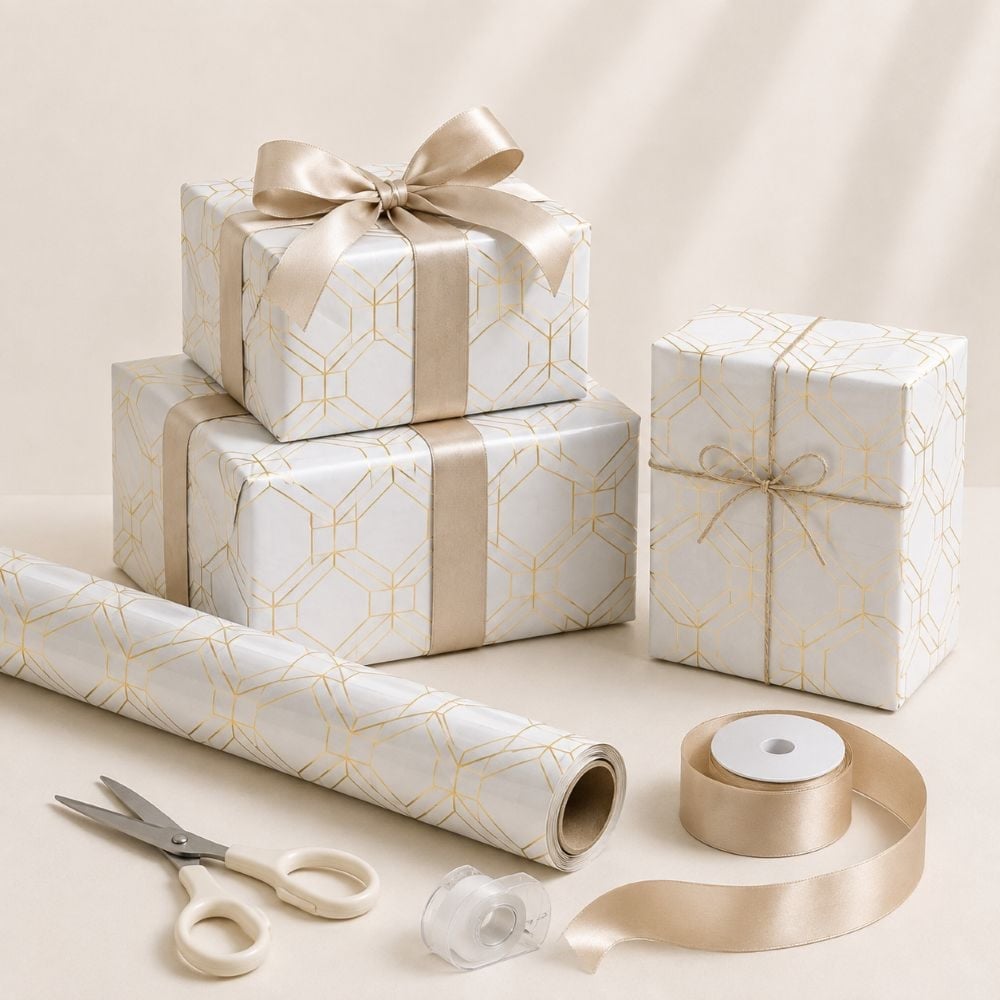
Modern Geometric Gold Pattern on White Paper
White paper with a geometric gold pattern reads as clean and intentional. The gold lines are thin and evenly spaced, so the overall look stays modern rather than ornate. A white satin ribbon keeps the palette simple, letting the pattern hold the attention. The ratio of white to gold is high, which makes this a good choice when you want something polished but not heavy.
Ornate Gold Christmas Tree Pattern on Dark Green

This dark green paper with an ornate gold Christmas tree pattern lands squarely on the luxury side of festive. The deep green background absorbs light, while the gold print catches it, creating a contrast that feels rich. A matching gold ribbon carries the metallic note across the whole package. What defines this look is the density of the pattern: the trees are close together, so the design reads as texture from a few feet away. The palette stays in the warm jewel zone, and the wood floor underneath adds a natural anchor so the gold does not float.
Burgundy Paper with Dark Brown Reindeer Motif
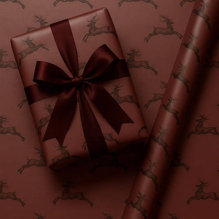
Can a dark palette still feel soft? With burgundy paper and a dark brown reindeer motif, the answer is yes. The brown tones down the burgundy, so the overall effect is warm rather than bold. A satin ribbon in a matching dark shade ties it together without introducing a new color.
The reindeer pattern is small and repeated, which keeps the design from looking too literal. This works well when you want a seasonal motif that does not shout. The flat lay setup shows how the paper pairs with a wrapped tube, proving the same roll can handle different shapes without losing its elegance.
Sage Green Botanical Pattern with Velvet Ribbons
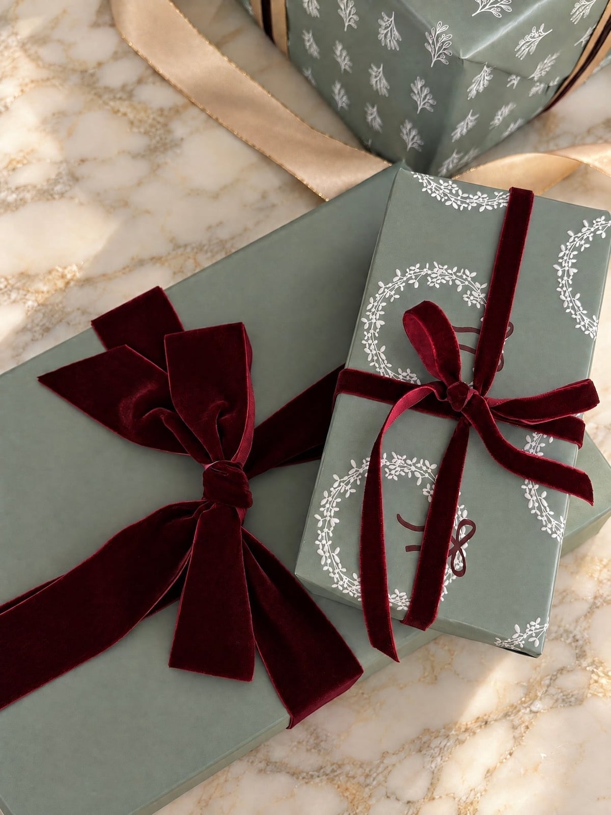
Sage green paper with a botanical pattern gets a tactile upgrade from velvet ribbon. The ribbon is wide and rich, with a slight nap that catches soft ambient light differently than the flat paper surface. One gift uses burgundy velvet, another white, which adds a subtle layer of contrast. The gifts sit on a marble surface, and the cool stone echoes the muted green of the paper. Velvet ribbon also holds a bow shape well, so the finish stays neat without constant adjustment.
Cream and Gold Floral Pattern with Gold Accessories
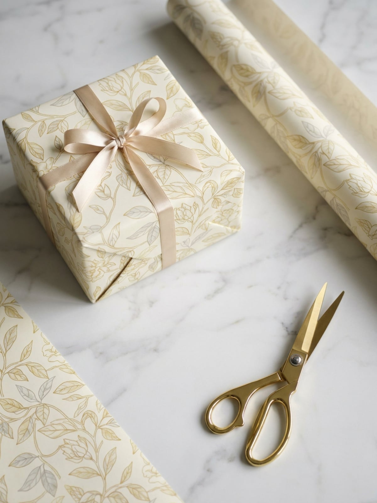
When wrapping paper has a delicate floral pattern, keep the accessories in the same color family. Here, cream paper with a gold floral print sits next to gold scissors and a matching ribbon roll. The bright, even studio light makes the gold leaf visible without glare, so the pattern stays readable. The marble surface underneath adds a neutral base that complements the warm cream and gold palette. This setup also makes a good reminder that the tools you use are part of the overall look.
Gray Floral Pattern with Twine Accent
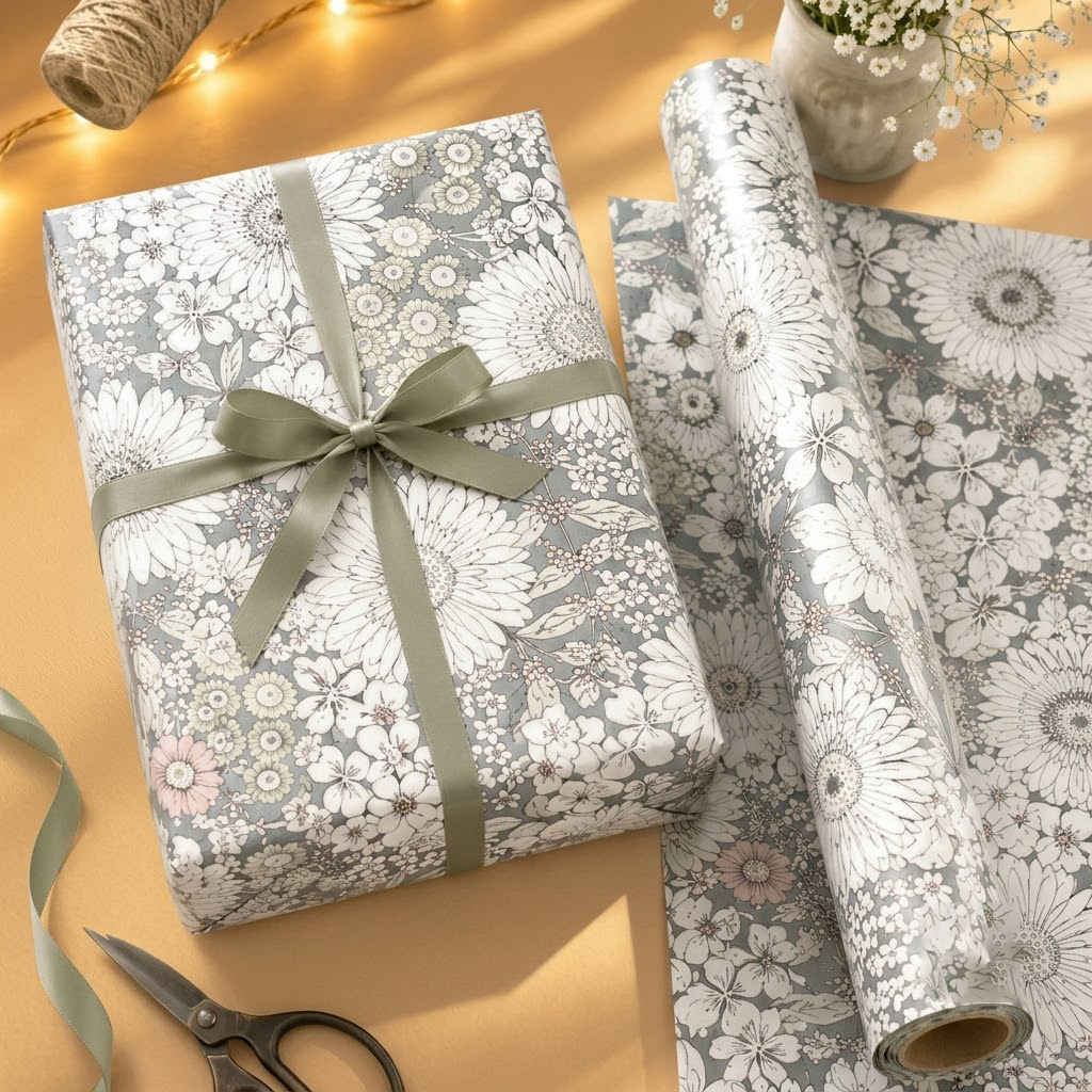
If the usual cream and gold paper feels too formal, a gray floral pattern offers a softer alternative without losing the elegance. The palette here stays in the muted range: gray and white blooms with touches of green and pink, printed on a neutral ground. The intricate floral detail is paired with plain twine tied around the gift. The twine keeps the presentation grounded, so the paper does the talking. A flat lay arrangement shows the roll of paper beside the finished gift, with scissors nearby to suggest a hands on process. The warm, soft ambient light keeps the scene from reading as stark. Adding a shiny ribbon on top of the twine crowds the texture. Stick to one natural accent per gift.
Navy Blue with Gold and Silver Star Pattern
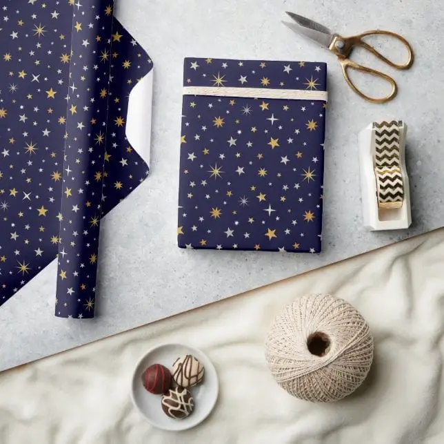
The navy background makes the gold and silver stars pop without competing with each other. That color ratio, dark base with metallic accents, works because the stars are spaced wide enough to let the navy breathe. A roll of paper sits beside the wrapped gift, with a tape dispenser and scissors completing the setup under even studio light. The overhead flat lay highlights the pattern itself. What breaks this look is adding a third metallic color or a busy ribbon that repeats the star motif. Let the paper carry the festive note and keep the closure simple.
Botanical Patterns with Pinecones and Gold Ribbon
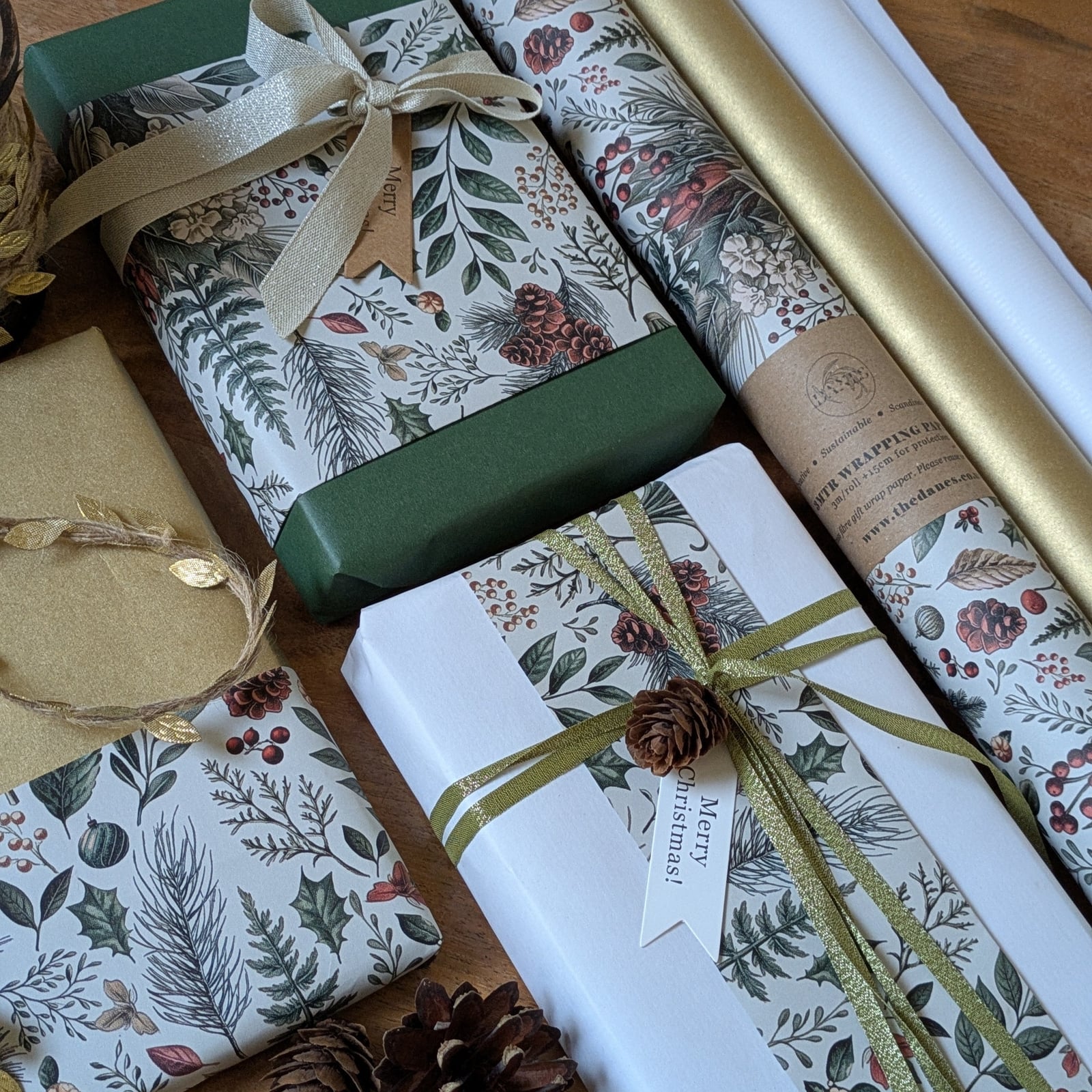
This paper works as a year-round option. The botanical pattern in green and white looks fresh in spring and still feels appropriate for winter gift giving when paired with pinecones and a gold ribbon. The overhead arrangement shows several wrapped gifts grouped together, with cardstock tags and twine adding layers without overwhelming the pattern. Soft natural light keeps the greens true and the gold ribbon from looking brassy. Avoid mixing in a second patterned paper in the same gift pile. Repeat the same botanical paper across all gifts to make the grouping feel cohesive.
Delicate Blue-Gray Floral with Peach Satin Ribbon
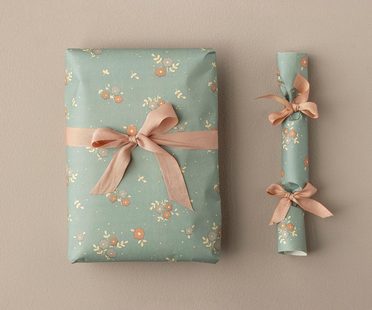
Can a soft floral pattern still feel substantial enough for a grown-up gift exchange? The answer is in the color pairing. The blue-gray floral paper sits under a peach satin ribbon, and the combination avoids the overly sweet territory that some florals drift into. The blue-gray tones down the floral, while the peach ribbon adds a warm counterpoint. A wrapped gift sits beside a wrapped cracker in a flat lay arrangement under soft studio light. The delicate floral pattern is detailed without being busy. Using a ribbon that matches the paper exactly flattens the contrast. The peach works because it is adjacent on the color wheel, not identical.
Pale Blue Lace Pattern with Gold Ribbon

A lace pattern printed on pale blue paper gives the gift a textured look without the fuss of actual fabric. Two stacked gifts sit in a top-down view under studio lighting, with a gold ribbon tied around the top box. The lace motif is delicate but printed clearly enough to hold its own against the metallic ribbon. Stacking a gift wrapped in a solid color underneath draws the eye away from the lace. Keep both boxes in the same paper to let the pattern repeat and the gold ribbon act as the single accent.
Soft Purple and Green Floral Patterns with Twine
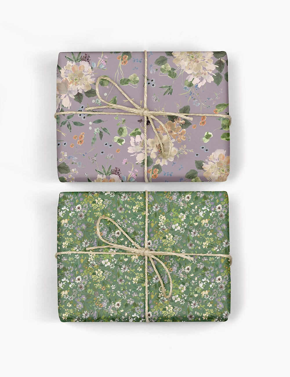
A palette that leans soft keeps a floral pattern from feeling busy. Here, muted purple and sage green blooms sit against a cream background, with brown twine as the only closure. The effect is delicate without being precious, and the natural fiber of the twine adds texture. This combination works for gifts where the recipient values understated luxury. The palette itself does the work, so the wrapping stays the focal point.
Vibrant Multi-Colored Floral Patterns
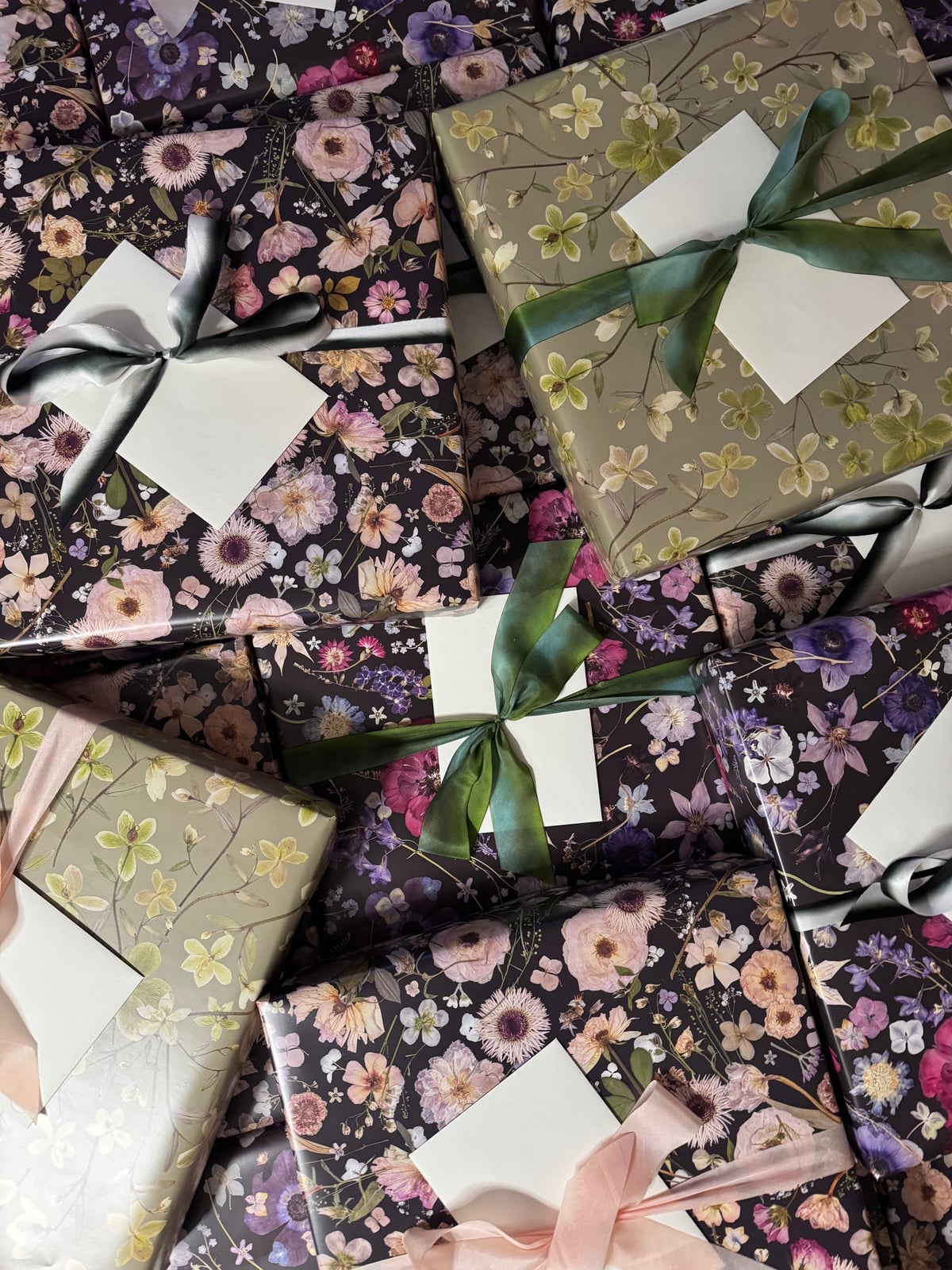
If soft florals feel too restrained, this is the opposite direction. Dense multi-colored blooms in pink, green, and gray cover the paper, and the gifts are stacked together so the patterns overlap. The look is maximalist, but it still lands as intentional rather than chaotic.
The trick is that the ribbon is kept neutral. A simple gray or cream ribbon lets the pattern dominate. When every element competes, the eye has nowhere to rest. Here, the paper is the show, and the rest steps back. This is a good approach for a gift that is meant to feel abundant, not restrained.
Blue and Gold Patterns with Festive Motifs
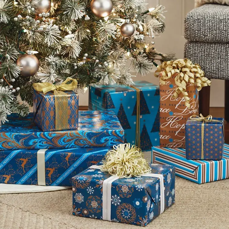
The blue here is deep enough to read as navy, and the gold pattern catches the ambient indoor light without needing direct sun. A small Christmas tree in the scene confirms the holiday context, but the palette itself feels formal. Gold on navy is a classic combination because it offers contrast without being harsh. The tinsel accents add a reflective note, but they are sparse enough to avoid looking cluttered.
Ornate Gold and Brown Pattern with Red Ribbon

This is a paper that does not need much help. The ornate gold pattern on a brown ground reads as old-world luxury, and the red ribbon is the only accent. Studio lighting makes the gold foil pop, but in a home setting, a lamp placed nearby would have a similar effect. The key is that the ribbon color matches the warmth of the gold rather than introducing a cool tone. Red and gold are a natural pair, and the brown base keeps the whole thing from feeling too bright.
Green White Botanical Patterned Paper Rolls
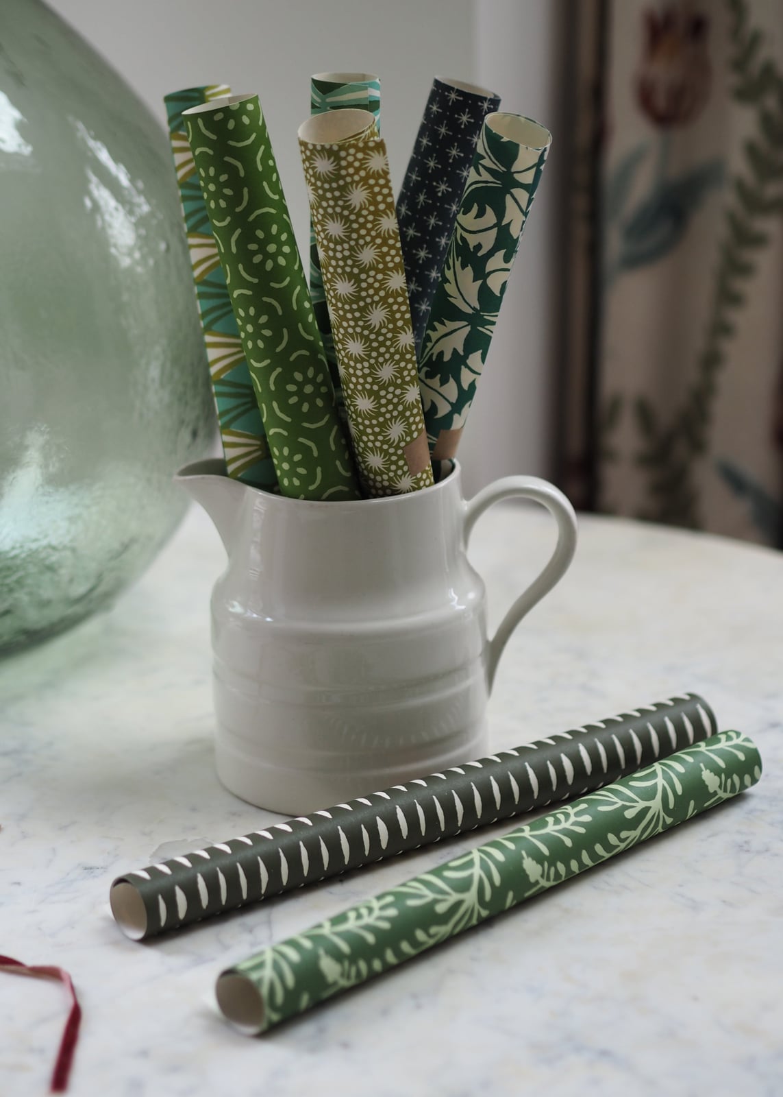
How do you store leftover wrapping paper so it does not get crushed or torn? The answer here is a tall pitcher or vase. The rolls lean upright, which keeps the edges from bending, and the botanical patterns stay visible as a display. The green and white palette is classic enough to work year-round, so the rolls can sit out as decor rather than being tucked away. For renters, this is a practical solution that does not require built-in storage. Just make sure the container is heavy enough to keep the rolls from tipping.
Final Thoughts
Wrapping paper is a small detail that carries big weight. The patterns, colors, and ribbons you choose reflect care and intention. Stick with one or two accent colors per gift to keep the look cohesive. Pair matte papers with satin or velvet ribbons for texture contrast. Store rolls upright in a bin to avoid creases. And remember, crisp folds and clean tape lines matter more than the pattern itself. The best wrapping looks effortless, but the thought behind it never goes unnoticed.